This site began as a port of Kyle Conrad's portfolio, and the part I ported most faithfully was his typography. His fluid type scale is the best-argued thing in the original, and I wanted a working system under me before I started having opinions about it.
What I inherited was five typefaces and a mechanism. Lock Serif Light for display headings, Hauss Bold for labels, Inter for body copy, and two faces that existed only to be swapped in mid-sentence: PP Pangaia Ultralight Italic wherever a headline contained an <em>, Sharp Roman wherever it contained a <u>.
The mechanism explains the list. Lock Serif ships exactly one weight, so a headline set in it has no internal emphasis available — you cannot go bold. Kyle's answer was to change the face instead, which is a real solution to a real constraint, and it is how the count got to five.
What the count was
The push came from outside. Yan Wang reviewed the site and spent more time on typography than on anything else. She counted eight fonts, four of them inside one headline, against a working guideline of two.
My first instinct was that she had over-counted by folding weights into faces. I checked instead of arguing, and the two counts turn out to measure different things.
Counting typefaces, five load on every content route. Counting the files that ship, weights included, you pass eight. And the home hero really did render four faces in a single sentence — display serif, a bold client name in Hauss, an italic phrase in PP Pangaia — with body Inter in the paragraph directly underneath, making five on screen at once.
That is what a specific critique buys you. "Too many fonts" is arguable forever. "Four in that sentence" is checkable in an afternoon.
The mechanism was the problem, not the faces
I had already tried to fix this once, on July 1st, by auditioning replacement faces behind a ?font= preview. Every candidate was rejected, and the useful part of that failure took six more weeks to see: I had been swapping faces while leaving the mechanism alone, and the mechanism was what made the site look busy.
So the second round tested the swaps themselves, by rendering real case-study headlines with and without them.
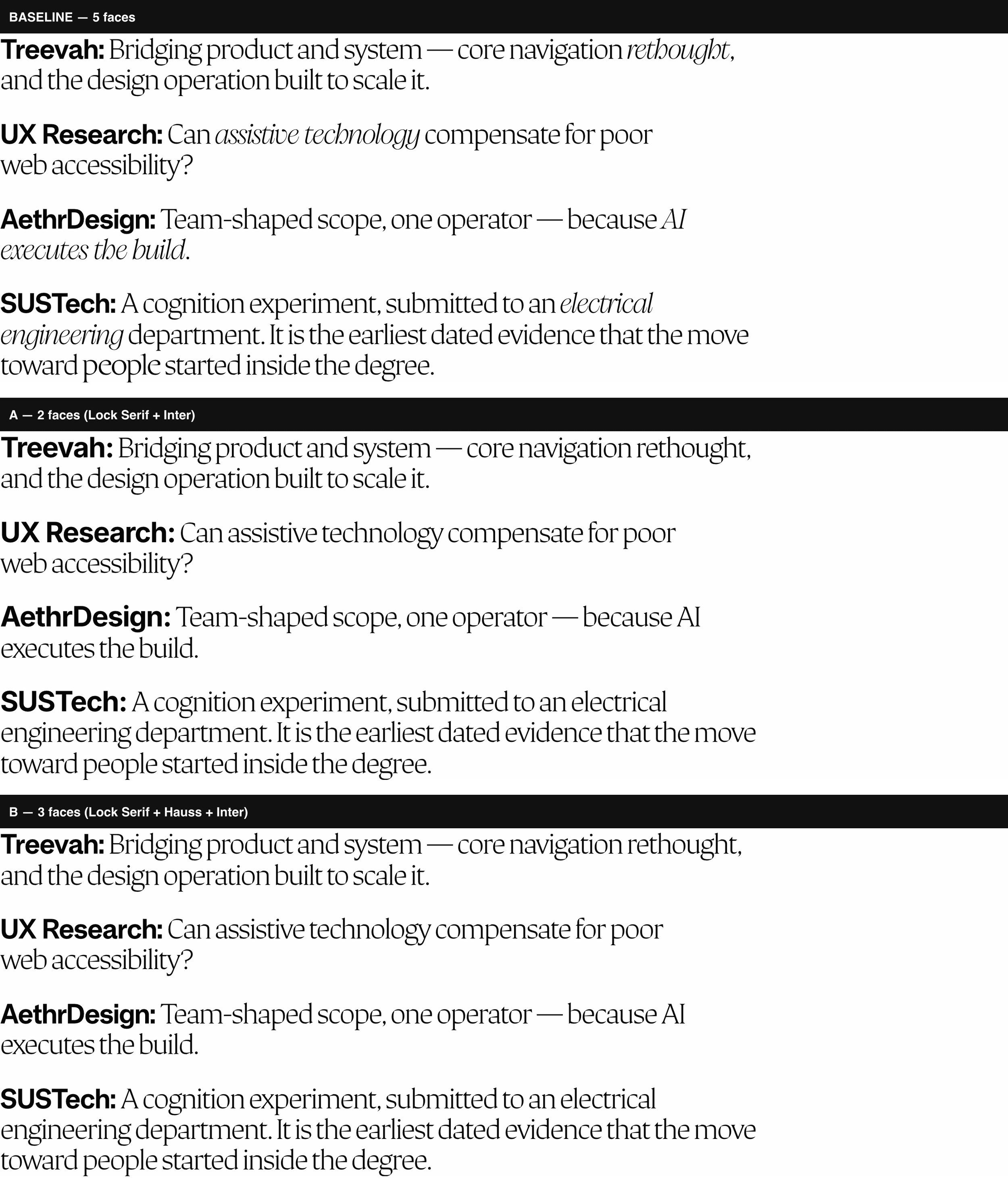
The <u> swap bought nothing. Sharp Roman and Lock Serif are the same genre, both light high-contrast serifs, so at reading distance the swap reads as the same face set slightly wider — a face change no reader can name, for 84 KB on the critical path.
The <em> swap had the opposite problem. PP Pangaia is a genuine contrast, and across the long home hero it lands as an accent. In a nine-word case-study title, three words in a fashion-editorial italic read like a caption borrowed from another site, and on the AethrDesign headline the swapped phrase wrapped onto its own line.
Deleting the two swap rules took the hero from four faces to two and a case-study viewport from five to three. Most of the critique was answered by removing two CSS rules and 145 KB of fonts, without changing a single typeface.
Compare the five faces and their measured proportions
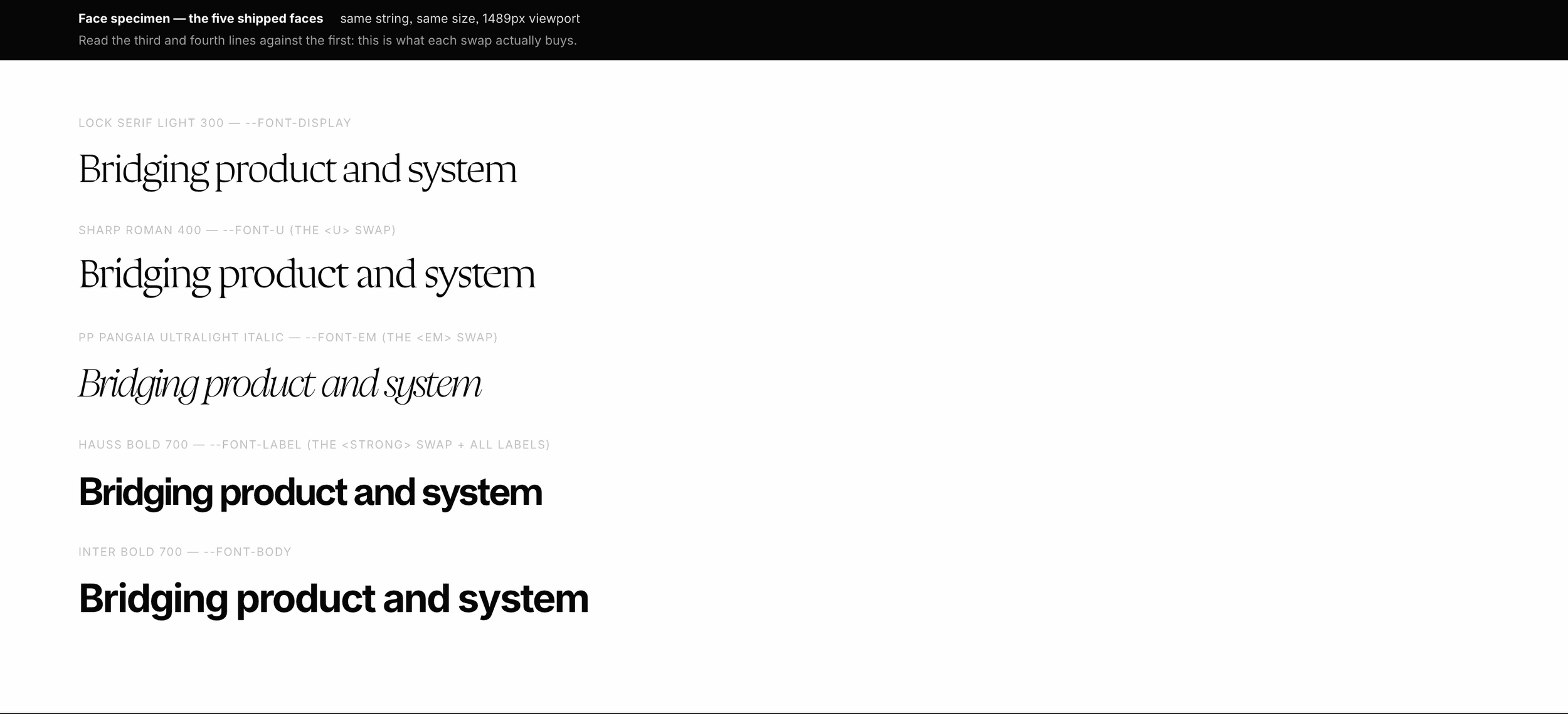
The comparison also settled something I would have got wrong by eye. A two-face version, with Inter taking the labels and the heading <strong>, looks like the obvious winner on a minimalism argument and reads worse. x-height and cap-height both live in a font's OS/2 table, so a short script gives the real proportions instead of an impression:
| Face | Role | x-height | cap-height |
|---|---|---|---|
| Lock Serif Light | display | 0.503 | 0.700 |
| Hauss Bold | labels | 0.500 | 0.700 |
| Inter Regular | body | 0.546 | 0.728 |
The inherited pair sits on the same geometry, matching to three decimals on the cap. Inter is the one face off it, nine per cent taller on the x-height, which is the measured reason a bold client name in Inter outweighed the headline it introduced. My eye was right; my explanation had been "it feels heavy," which is not something you can act on.
The face I did not know I was shipping
While I was writing documentation about a three-face system, the site was serving four.
Tailwind v4 reserves --font-mono as a theme key: it emits --default-mono-font-family: var(--font-mono), and its preflight points code, kbd, samp and pre at that value. I had declared --font-mono on :root for the dark HUD on /lab. That single declaration repointed every inline <code> on the site at Martian Mono, and pulled a 24 KB font onto routes documented as shipping none of it.
Three separate comments in my own CSS asserted the invariant, and all three were correct about the thing they were checking, which was the var() consumers. Nobody had checked the variable's name.
So the rule I would keep if I could keep only one: count the faces from a network trace, never from the call sites. A typeface can ship without any rule in your stylesheet naming it. Renaming the slot to --font-hud-mono was the entire fix, with no rule added and none deleted.
What the lede was actually failing at
The next note was mine. Case-study ledes are long paragraphs set at display size, and in Lock Serif they were handsome and hard to read. My diagnosis was that serifs read worse than sans at length.
That diagnosis is wrong, and the correct axis is display cut versus text cut. Lock Serif is drawn for headlines — CoType's own copy says so — and an eighty-three-word paragraph is outside the range it was drawn for. Measuring confirmed it: the lede ran about ninety characters per line against a comfortable band of forty-five to seventy-five. Moving the standfirst onto the family's sans brought it to seventy-eight, and the testimonial from ninety-nine to seventy-one.
That fix worked and still left a hole. The right answer to a display cut carrying long text is the text cut of the same family, and Lock ships no text cut. I had reached for a different face because the correct one did not exist.
Two families
The last round is the one I would repeat. Instead of a specimen page, I put each candidate system behind a ?type= parameter on the real site, so every variant could be read against real headlines, real ledes, real sidebar metadata and real captions, at both display densities.
What shipped is Lyon Display for headings, Lyon Text for the standfirst, and IBM Plex Sans for labels and body. Two families, three files. The lede went back to a serif, and this time to the right one: the text cut of the display family, at the size where Lyon Text's small x-height reads as elegance rather than as the liability it is at fifteen pixels.
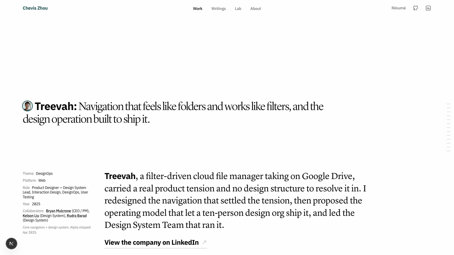 Lock Serif + Lock SansLyon Display + Lyon TextLock Serif + Lock Sans: A case study hero set in Lock Serif with the lede in Lock Sans, a sans-serif standfirst paragraph. Lyon Display + Lyon Text: The same case study hero set in Lyon Display with the lede in Lyon Text, a serif standfirst paragraph.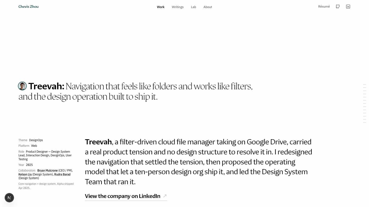
The cost belongs next to the win. Lyon's cap-height is 0.664 against Plex's 0.698, so the geometric argument the previous system was defended on does not survive the swap intact. There is exactly one place on this site where the display face and the label face share a line: the bold client name opening a hero. That seam now carries an explicit font-size: 0.951em correction, which is 0.664 divided by 0.698, shipped in the same change rather than after it.
The pairing rule got narrower and more honest at once. Match caps where two faces share a line; everywhere else, judge a face on the job it does.
Read the candidate rounds and the file checks
Every shortlist to this point had been filtered to free faces. When I stopped filtering on licence and started ranking on fit, the answer I had been walking past surfaced: Lock is not a face, it is a superfamily. CoType ships Lock Serif and Lock Sans on a unified skeleton, six weights each, and the two variable files measure identically at x-height 0.508 and cap 0.700. Six weights meant the original constraint was gone, which retroactively explains why the swap mechanism existed at all.
Seven of the delivered font files never made it to public/, all caught by reading the name table inside each file rather than trusting the filename. Six announce themselves as "TRIAL version only" and carry sixty-seven glyphs, missing the em dash that appears in nearly every lede on this site. A seventh has the family name Lock Serif OVERVIEW and a notice that it is not for retail sale.
Lock Sans was not the answer for body copy either. It is an editorial subhead face, drawn for labels, and at the twelve-pixel tier on a standard-density display it went visibly light and loose. So the body face got its own round.
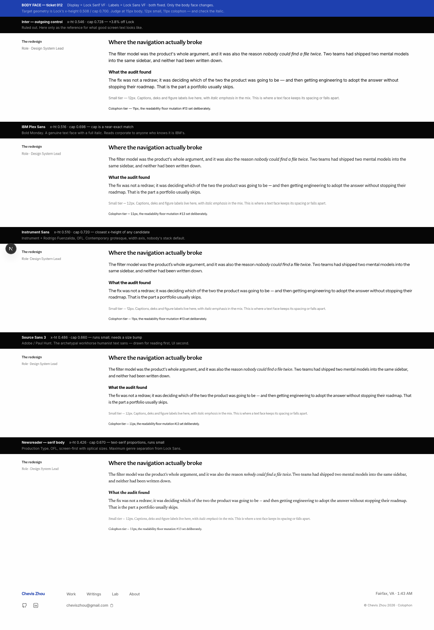
Two reactions from the final round sounded like taste and turned out to be measurable. The first was that Tiempos Text is hard to read at body size. The obvious explanations are that it runs too small or too dense, and both are false.
At identical size and column width it renders a larger x-height than IBM Plex and sets fewer characters per line. The difficulty is texture. It is a high-contrast newspaper face, so at fifteen pixels its thin strokes land near one pixel and anti-alias to grey while the stems stay black.
The second was that Tiempos Headline reads heavy even at Light. That one took a number: the same string in each face, with ink measured as a percentage of the line's area.
| Display face at Light | Ink coverage | vs. Lock Serif |
|---|---|---|
| Lock Serif Light | 13.65% | — |
| Lyon Display Light | 19.64% | +44% |
| Tiempos Fine Light | 21.02% | +54% |
| Tiempos Headline Light | 22.59% | +65% |
The third row saved money. Tiempos Fine is Klim's large-size optical cut and the obvious remedy for "too heavy," and it lands only seven per cent lighter than Headline. The weight is the design, not the optical size.
The current system is visible at /style-guide, which reads its specimens out of the stylesheet at build time rather than restating them, so the page cannot drift from the site.
What the road actually taught
Change the mechanism before you change the faces. The first round swapped typefaces and failed. The second deleted two rules and answered most of the critique without touching a face.
Prototype on the real site, not a specimen. Every round judged on a synthetic page produced a decision I later revisited. The round that ran behind a URL parameter on live routes surfaced consequences nobody had asked about, including the fact that the entire case-study metadata rail changes face when you change the body slot.
Measure the thing you are reacting to. Three reactions here were right as observations and wrong as diagnoses. Heavy, small, hard to read: each had a number behind it, and in two cases the number pointed at a different fix than the instinct did.
None of this claims the current pairing is final. It claims that every face on the site is there for a reason I can state in one sentence, and that when the next one changes, the argument it has to beat is written down.