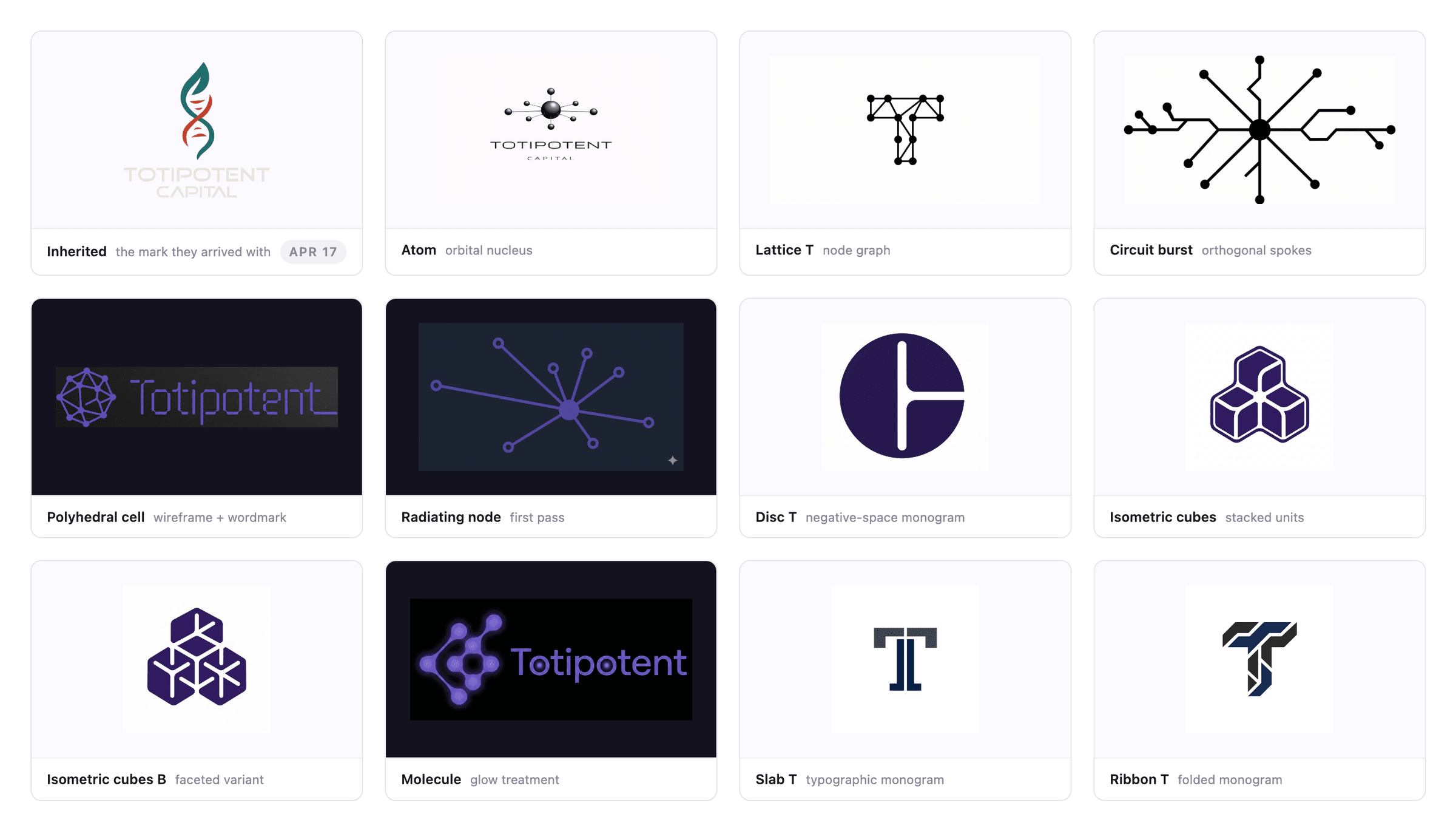
In August, Totipotent Capital told me they'd changed their mind about a mark I had finished in June. Nothing was wrong with it. They wanted the alternate that had been sitting near the back of the brand book for two months, because it was simpler to reproduce in print, on collateral and on swag.
Manufacturability beat concept two months after concept had won. That is not the outcome anyone plans for, and it was probably the right call.
Swapping the artwork took an afternoon. Updating everything the retired mark had quietly been deciding took considerably longer, and that is the part of identity work I keep underestimating. A logo is a drawing plus a set of rules the drawing generated, and most of those rules are written down as prose. Prose does not update itself when you change the picture above it.
The winning mark was a PNG
Mark 1B, approved in June, was a faceted geometric cell, and the whole brand book had been built around it. Mark 2 was a radiating hub that existed only as a 1482×832 raster. Worse, the client had hand-edited it, opening gaps between the spokes and the nodes and shrinking the nodes, and those edits existed only inside two screenshots.
So the screenshots became the spec. I measured the mark in them, derived the scale, and read off spoke width, node radius and hub radius. The gaps ran anywhere from 16 to 40 units, which is what nudging eight spokes by hand looks like once you measure it. The refinement was to keep the client's numbers and make the gap a single one.
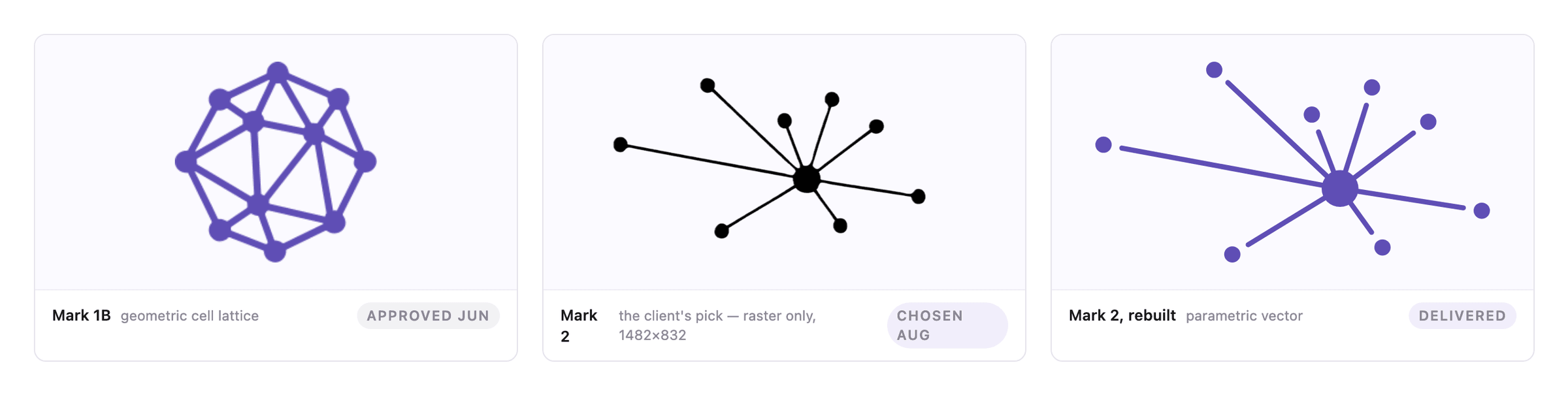
The rebuild was parametric rather than auto-traced. Tracing would have frozen the wobble. Rebuilding kept the eight spoke angles and lengths exactly and turned terminals, weights and spacing into parameters, which is what made the next round of notes cheap to answer.
One of those notes sounded like taste: make the dots echo the dot over the i. Using the client's own node size and their sizing rule, the mark's node lands at radius 6.47 against the wordmark's tittle at 6.63, within 2.5%. The arithmetic had already agreed, so the reply was one line instead of a proposal.
Read the measurements behind the rebuild
The mark measured 432px wide in the client's screenshots, which sets the scale at 1px = 2.985 units, and from there: spoke width 16.6, node radius 26.5, hub radius 59.7.
Two later notes were worth building rather than answering. "Roughly 20% taller than the wordmark text" resolves to a 17% shrink or a 36% shrink depending on whether text means the whole wordmark or only its cap height, so I built both and showed them side by side. And "add back a small serif break on the final t" read like a request for a detail, when the real defect was that the final t had no foot at all: stem, foot and tail were one continuous shape, which is why it had stopped reading as a letter. The fix was to drop in the middle t translated 389.05 units to the right, making it byte-identical to its three siblings.
What the old mark had been deciding
My first pass replaced the artwork the client had commented on and stopped there. So the brand book spent about a day describing a "faceted, crystalline" cell directly beside a picture of a radiating hub. Nobody caught it, because nobody reads a brand book front to back, including the person who wrote it.
Fourteen instances of artwork had to change: six lockups and eight standalone glyphs. That was the mechanical half, and it was fine. The other half was finding every sentence the retired mark had written.
Section 01 and the first design-narrative card were both arguments about a lattice, so neither survived. Both were rewritten around a hub, eight unequal spokes and free-standing nodes.
The minimum size moved too, and that one is not a rewrite job. Mark 1B was square and failed by losing facet legibility; Mark 2 is 2:1 and fails when the spoke-to-node gaps close up. The mark occupies 32.8% of the lockup, so holding it above its own 48px floor pushed the digital minimum from 100px to 150px, and added a mark-alone row that had not existed: 48px for the standard cut, 28px for the compact one. The improper-usage list went from five entries to seven, because "don't close the gaps" is a rule that only makes sense about this mark.
None of that ports across untouched, and none of it shows up in a side-by-side of the two marks, which is why it is the part that gets skipped.
The other build, where the source was one file
Maxematics, a tutoring practice run by a high-school student named Max, ran the same summer and hit the problem from the other side.
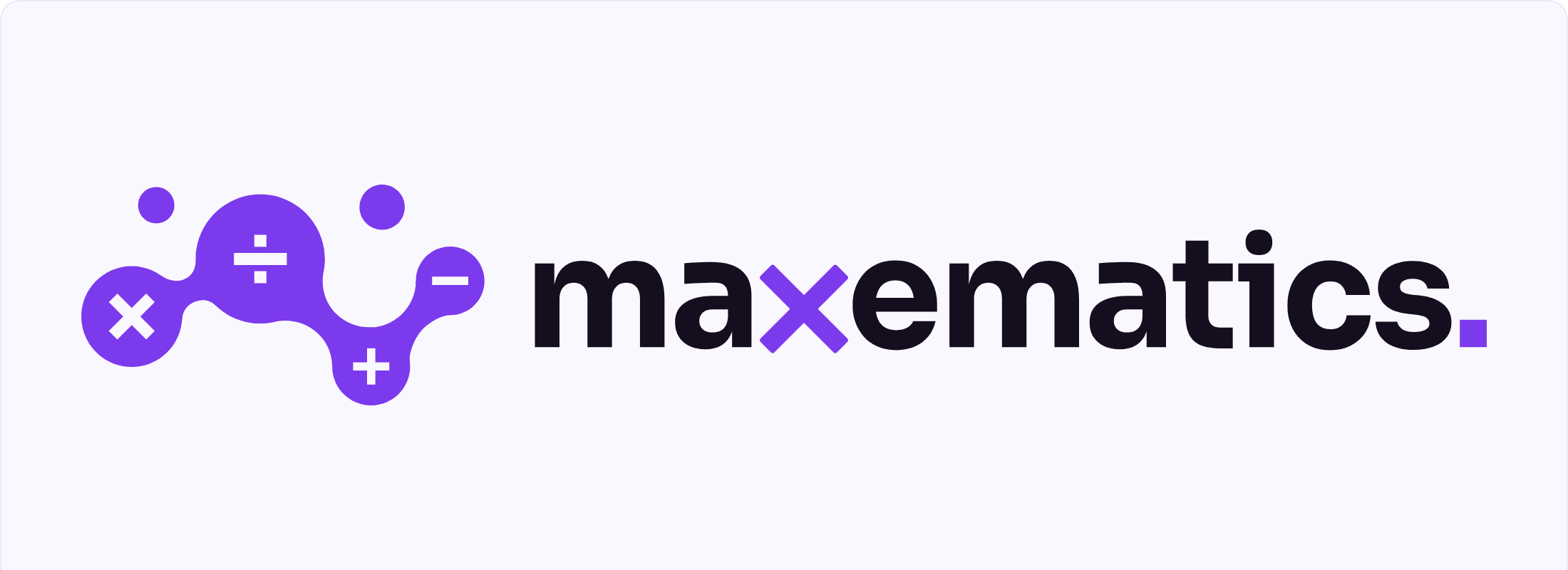
The name is a portmanteau, and portmanteaus fail silently: if a reader doesn't catch max inside it, their eye autocorrects to "mathematics" and the founder's name disappears. The obvious fix is to set MAX in capitals, and I built that version to check it. It collides — capitalising three letters raises a second stack of mass eight pixels from the logomark's tallest point, and the mark is already the loud element.
That failure pointed at the real distinction. Emphasis — case, weight or colour — works by adding visual weight, which is the one resource the mark has already spent. Substitution leaves every letter at the same size, weight and colour and swaps one for a different form, which costs no space and no ink.
In max, the x is the last letter of the name, the multiplication sign and the symbol for the unknown, and it was already drawn inside the logomark as one of four operators. At the roughly 20px the navigation bar renders, a weight difference loses most of its effect and a colour difference loses more; the × is a bolder, simpler shape, so it survives 16px, one ink and an embroidered polo.
See the ten treatments and the three vertical stacks
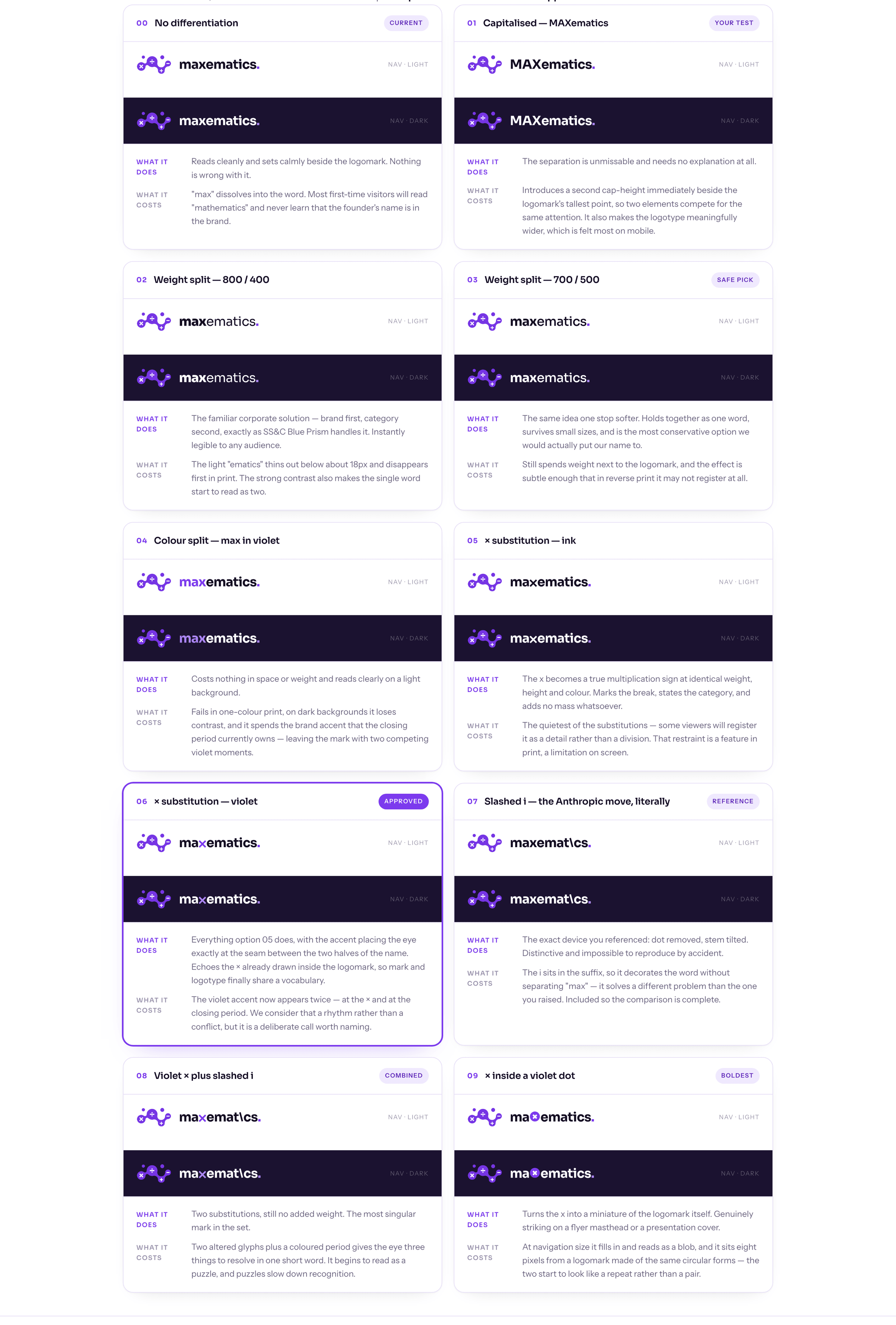
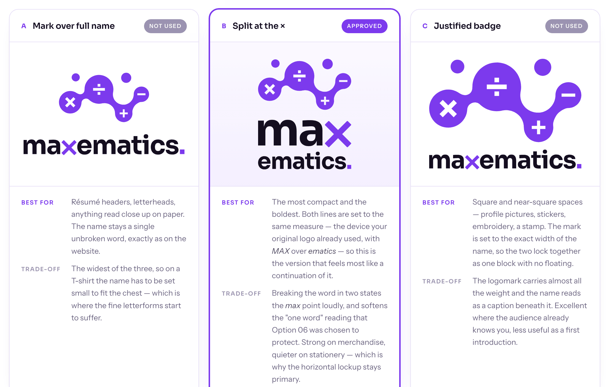
I built the treatments I was not going to recommend as well. The trade-offs are the useful part of the exercise, and a client who can see why the safe option is safe tends to make a braver choice than one handed a single recommendation.
The old identity existed as a raster logomark, which is the kind of thing a screen printer sends back. But the client's maxematics RGB.ai turned out to be what most .ai files are underneath, a PDF container, and true vector paths came straight out of page 2. The mark geometry had been in there all along. Only the colour had ever changed.
So the package is not a folder of exports. It is a 324-line geometry.py that defines the mark and the wordmark once in font units, with every lockup, colourway and format rendered from it. The logotype is Sora at weight 700, outlined rather than referenced, so nothing in the package depends on a typeface being installed anywhere.
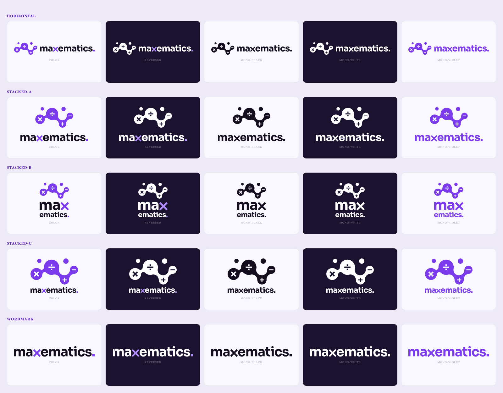
Where one source actually paid off was the fifth colourway: mono-violet, the whole mark in a single brand-coloured ink. It is one screen instead of two at a T-shirt printer, which makes it the cheapest way for a client to stay on brand, and it is the one everybody forgets to ship. It exists here because adding it cost a line of configuration instead of an afternoon of exports.
That is the contrast between the two projects. Totipotent's artwork was regenerable within a day; its brand book was not, because the rules lived in prose. The mark is what a client looks at. The system underneath it is what they live in for the next several years, and it has to survive the mark changing, which sooner or later it will.