The graph on this site's lab page maps my working system: notes, skills, automations and projects. It was built three times from the same data. The first two versions worked, and I rejected both.
Neither problem was visible in a written plan. Both only showed once a working version was on screen, which is why I now treat complete prototypes as a review step.
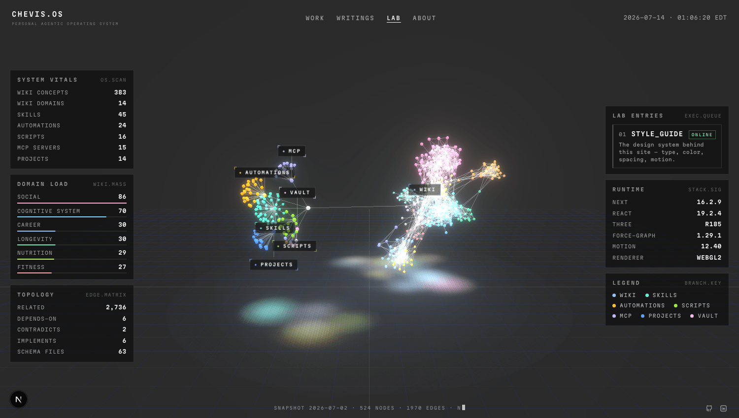
Version zero: a force cloud
The first version let physics settle the layout. Every branch had its own color, over a glowing grid floor.
It rendered correctly and communicated nothing. With every color competing, there was no silhouette to read, and it looked more like noise than a system. I rejected it on the first live review.
Version one: faithful to my folders
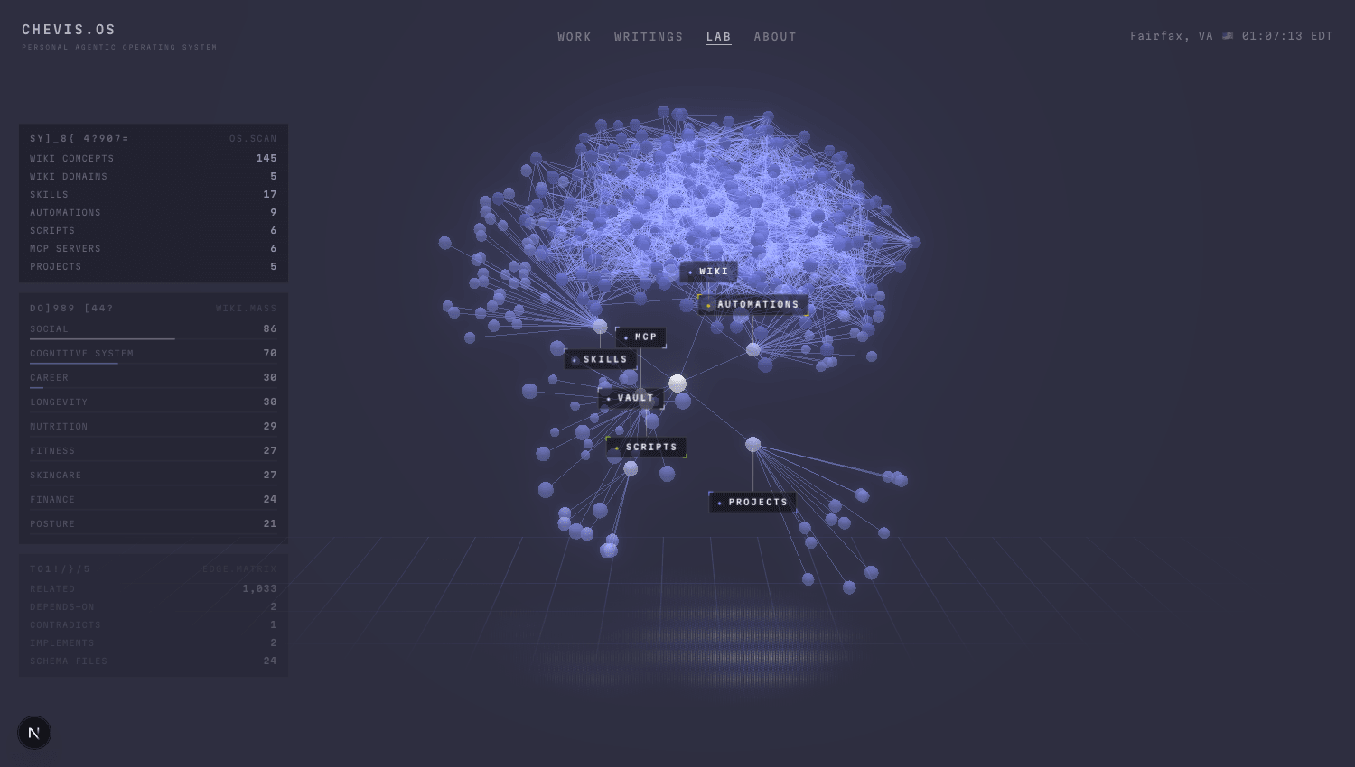
The second version swung the other way: a fixed radial tree in one quiet palette, with every branch matching my real folder structure.
It was calm and accurate, and it answered the wrong question. A visitor does not need to know where my files live. They need to see what the system does. Faithfulness to folders was the organizing idea, and on screen it was clearly the wrong one.
Version two: organized by meaning
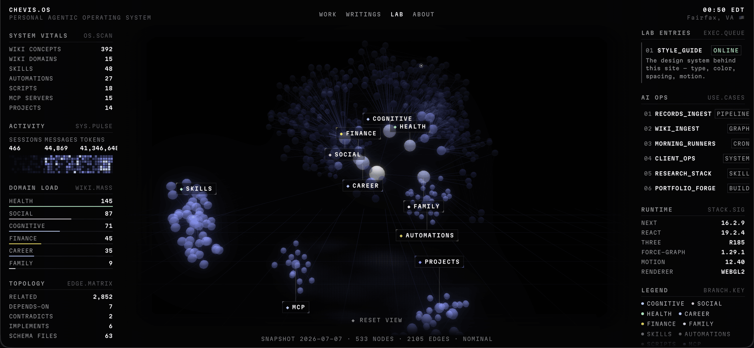
The third version kept the same data and grouped it by role. Content sits at the center, the tools that act on it form a ring around it, and projects have their own zone. Brightness falls from the center to the edge, so the eye starts where the system starts.
What made rejection cheap
AI implemented each version. I judged each build in the browser against what a visitor needed to understand, and decided what to discard. Because the earlier versions are tagged in git, discarding them lost nothing: each can be restored and compared.
That low cost changed my behavior. When a complete version is expensive to build, there is pressure to keep refining it. When it is cheap to rebuild, the right response to a wrong organizing idea is to replace the idea.
The review loop I use now
The graph went through a sequence I run on substantial features:
- Settle the open decisions before building, each with a stated recommendation to accept or overrule.
- Prototype what a document cannot settle, such as whether a layout reads, and judge it on screen.
- Plan the work in phases, each with success criteria I can check.
- Implement and verify against those criteria, with type checks and the rendered result.
- Review the diff in a separate pass before I accept it.
The order matters more than the tools. Decisions that depend on seeing the result get a working version before they get a plan, and nothing reaches the site until I have checked it against what it was meant to do.