A portfolio is a strange project. You're the client, the designer, and the engineer, and all three of you disagree. When you build and judge at the same time, every pixel stays permanently up for debate and nothing ships.
So I treated this site the way I'd treat a client engagement: start from references, set a scope ceiling, resolve every decision before code, then ship with production guardrails. And I built it with AI in the loop from the first commit — not as an autocomplete, but as the engineering partner executing decisions I'd already made.
Start from taste, not a blank canvas
Before designing anything, I collected the portfolios I kept coming back to — the ones that made me slow down and read: Yan Wang, Perry Wang, Julius, Dimitri Knight, and Kyle Conrad, whose fluid type system influenced this site's typography most directly.
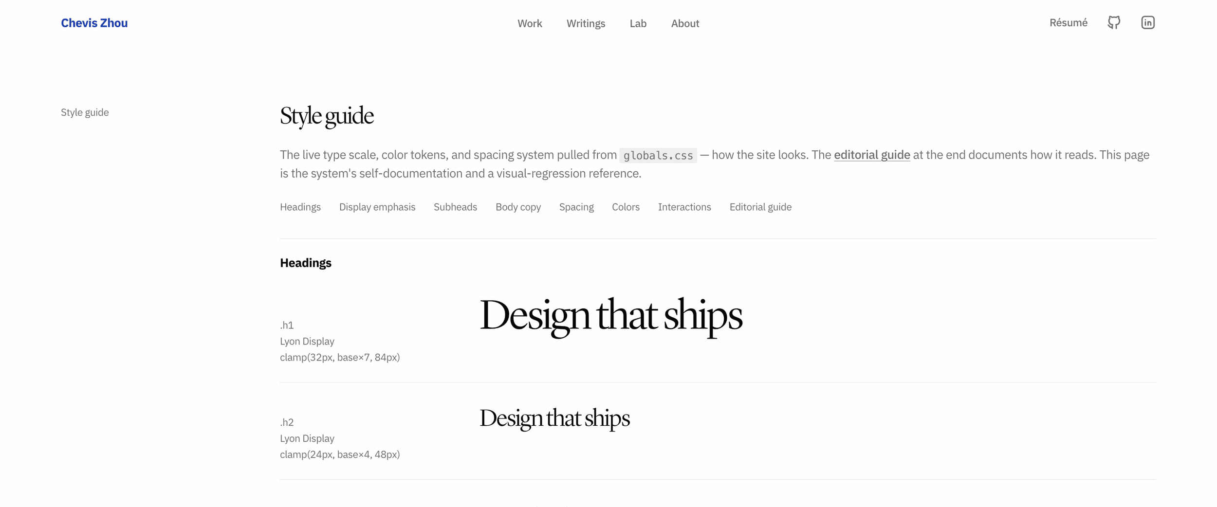
What I took from that shortlist wasn't any single layout — it was a bar for how considered a personal site can feel, and a set of structural convictions worth adopting. Everything here scales off a single fluid unit — --base: clamp(4px, 0.5vw, 16px) — so the whole site breathes with the viewport instead of snapping between breakpoints. Headings run on a two-family system with per-tag font swaps, so one headline can carry a serif voice and a grotesque emphasis without extra markup. Every deviation from that baseline gets logged with its reasoning: what the reference value was, what mine is, and why.

Design with AI, decide like a human
With the foundation set, the identity pass could have gone the usual way: open the editor and nudge colors until it feels right. Instead, I ran a structured interview with Claude — every open UI decision, one at a time, each question paired with a stated recommendation and its reasoning, so every choice was a reaction to a position instead of a blank page. Accent color, logo mark, hero copy, navigation, footer. Nothing got built until everything was resolved.
Two habits from that session I now reuse on client work:
Verify claims against the codebase, not memory. Before agreeing that a flush, shadowless sticky nav was safe, I confirmed the page background really is a uniform #fefefe on every route — instead of assuming it from my mental picture of "the visual."
Check plans against reality before they wire in. A reference nav plan assumed routes that didn't exist yet. Caught before implementation, that became "build the missing pages first," not a shipped nav full of dead links.
The design calls
The first call set a scope ceiling: nail the cosmetic identity now, defer the structural experiments. That single decision collapsed every downstream question from "what could this be?" into "what does this need to be right now?"
Within that ceiling:
Accent. The baseline I was mutating from carried a signature purple, #7a35ea. Mine is a deep cobalt, #1E40AF. It had to read sophisticated rather than default-blue, while staying rich enough that the swap feels deliberate, not templated.
Mark. My circular avatar with a thin accent ring, sitting inside the hero headline where a logo mark would go — the exact composition slot the baseline reserved for its mark, same size, same position. The rebrand cost is near zero; the identity signal flips completely. A face is the strongest identity signal a personal site has; a portfolio doesn't need a logo pretending otherwise.
Hero copy. The generic version of this line — "design engineer building delightful, considered product experiences" — could sit on a thousand portfolios. The other common pattern name-drops famous clients. My case-study clients aren't household names, and naming them would undersell the line rather than strengthen it. Mine leads with the differentiator instead: design, engineering, and psychology in one person.
Navigation. Before this pass, the nav lived inside the hero header: it scrolled away after the first viewport and reappeared only in the footer. The replacement is one global, persistent sticky bar — reversing my own long-standing preference for scroll-aware navs that hide on scroll-down. Reliable navigation beats minimal chrome. The bar sits flush on the page, no shadow, no hairline: it blends rather than competes. And the link set was scoped to routes that actually existed — the placeholder pages went up before the nav shipped, so every link resolved on day one.
Footer. One governing sentence, written before any layout: the site is the product; the footer is subordinate — whisper, don't scream. It shows up as three quiet details: a live Fairfax, VA clock, links that warm from gray to black, and an unassuming back-to-top. The sentence went verbatim into the build plan, so no future session could accidentally inflate the footer into a closing moment.
There's a second axis running under all of these that took me a while to name: "what I like" and "what's safe to ship" are independent questions, and conflating them ruins both. The commercial display faces are the site's most recognizable signature and its biggest legal exposure — so I kept the look and deferred the risk with a plan (license confirmation as a launch gate, below). The accent and the mark carried zero legal risk, so they were fixed immediately. Sorting every decision onto those two axes separately meant nothing got thrown away out of caution and nothing risky shipped out of attachment.
Ship it like production, not a side project
The second half of the work looked less like design and more like operations — and this is where building with AI pays off, because decisions written down once become decisions any session can execute:
Plans as the unit of work. Each build phase lives in a plan file with paste-ready prompts and explicit success criteria, so an AI session (or future me) can execute without re-deriving context. The footer philosophy above is literally quoted in the phase prompt as a governing constraint.
Deviations tracked, not absorbed. Plans drift on contact with reality, and the drift is where the information is. So each phase closed with a written state: what shipped, what's still pending on me, and anything that deviated from the plan — with the reason. The contact form, for instance, landed as a section on the About page instead of the standalone contact route the plan called for, to keep the four-item nav untouched. A future session resuming the work reads that and doesn't re-derive — or worse, "fix" — a deliberate call.
Isolation before deployment. The site was extracted into its own private repo before Vercel ever saw it, because the parent workspace holds family and finance records. The deploy pipeline must never have a path to the private data, even by accident.
Licensing as a launch gate. The display faces here are commercial. "Are these licensed for public web distribution?" was treated as a blocking pre-flight, not a note to self — and the deploy was sequenced around it. Ship first to the obscured *.vercel.app preview, verify the build works there, and refuse to touch DNS until the licensing answer was confirmed yes. If it hadn't been, the site would have stalled at an unlisted URL rather than putting unlicensed faces on a public domain. The answer came back yes, and only then did the domain step proceed.
Protocols as code, not memory. Image handling — never pre-convert, never double-compress, preserve color profiles — lives in a script that runs before every deploy, not in a checklist I have to remember.
Adapted, not hand-built. The contact form didn't get written from scratch. It's a licensed component from a commercial library I own, reskinned to this site's tokens — type scale, accent, spacing. Form layout and validation UI are solved problems; the design work was making a stock component look native to a system it was never designed for. Building it by hand would have produced a worse form, slower.
Documentation that tracks scope. Once the contact form started actually collecting names and emails, the privacy page got rewritten to describe the real data handling — email delivery, spam protection — instead of keeping stale "this site doesn't use forms" language. And the terms-of-service page got deleted outright: a personal portfolio with no accounts and no payments doesn't need one maintained for its own sake.
Loading states with a philosophy. Every image blur-ups from a tiny placeholder. There are no spinners on this site.
Animation that can't break the page. Page transitions are enter-only. An earlier experiment with exit-coordination taught me that browsers throttle animation frames in hidden tabs — anything that gates visibility on an animation finishing can leave you staring at a blank page. Now the content's visibility never depends on motion completing.
What I deliberately didn't do
Dark mode is deferred: colors are centralized as CSS variables, so adding it later costs nothing, and maintaining two themes now buys nothing. The deeper structural experiments are deferred too — the divergence continues incrementally, typography first, each step logged against the baseline it changes.
That's the honest state of it. A portfolio never proves you can design under constraints, because it's the one project that has none. So I manufactured them: curated references, an explicit scope ceiling, decisions before code, gates before launch. The case studies show the work. This page shows how I work.