 GMU: An eye-tracking pilot tracing the reading problems magnification left unresolved.
Capstone project at the Visual Attention and Cognition Lab, Department of Psychology, part of a 2-year M.A. in Human Factors and Applied Cognition.
For my M.A. capstone at George Mason, I investigated whether a magnifier could compensate for an inaccessible page layout. I ran sessions with three sighted students using simulated low vision, combining task performance with their comments and gaze recordings. The comparison exposed reading and navigation problems, alongside a flaw in what the simulation let us test.
Overview
Capstone project at the Visual Attention and Cognition Lab, Department of Psychology, part of a 2-year M.A. in Human Factors and Applied Cognition.
The magnifier enlarged the page. Participants still struggled to read it.
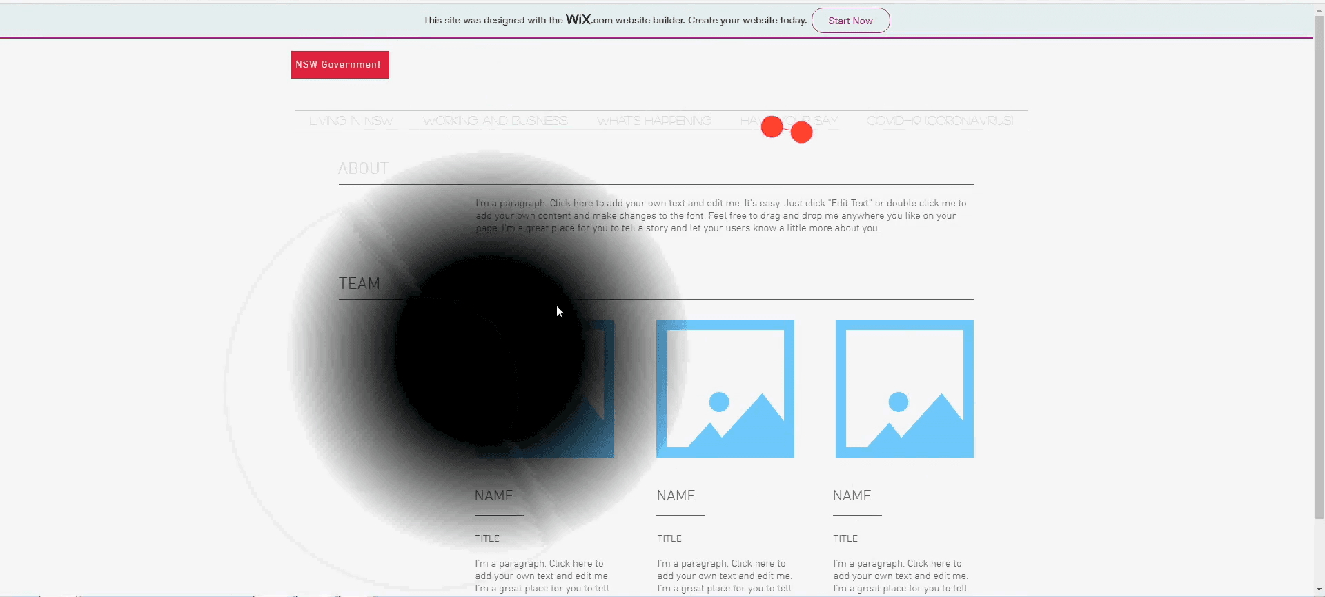
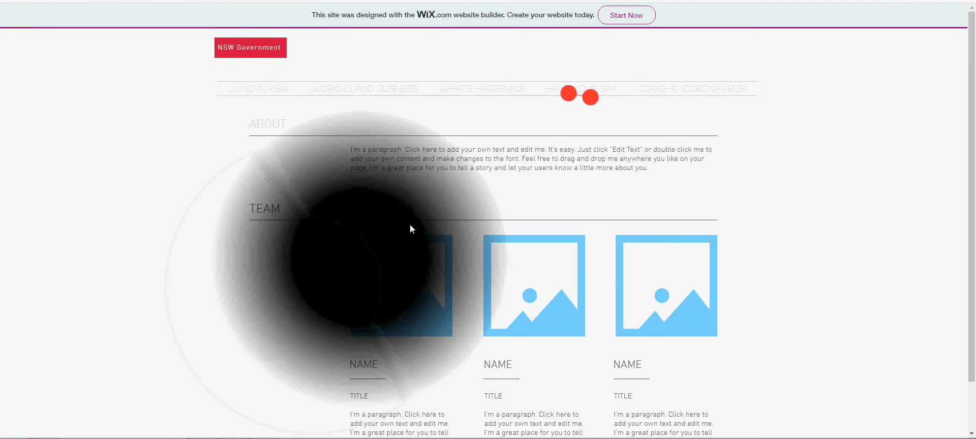
On our comparison website, one participant tried enlarging a passage and said: “Which really doesn't help considering that it's still really small.” Another used the shadow of the simulated blind spot to make out low-contrast text. These workarounds became the most useful evidence in the study: they showed what people did when the available tool did not resolve the problem.
The research question was whether following accessibility guidelines could reduce the need for magnification. Mary Nichols and I compared two versions of the same information through a low-vision simulator, recording task performance, usability ratings and eye movements. I ran the sessions and analyzed the evidence; Mary contributed the literature review, comparison-site redesign and surveys.
The pilot gave us specific reading and navigation problems to investigate. It did not establish whether people with low vision could do without assistive technology: our participants had normal or corrected-to-normal vision, and the simulator let them move the blind spot out of the way.
Study Design
The same tasks on two layouts, with several differences to account for.
Three graduate students completed three information-finding tasks on each website: locate a COVID-19 testing site, check local COVID-19 rules and find disability support. Each thought aloud while working. Two started on the accessible site and one on the comparison site, partially counterbalancing the order.
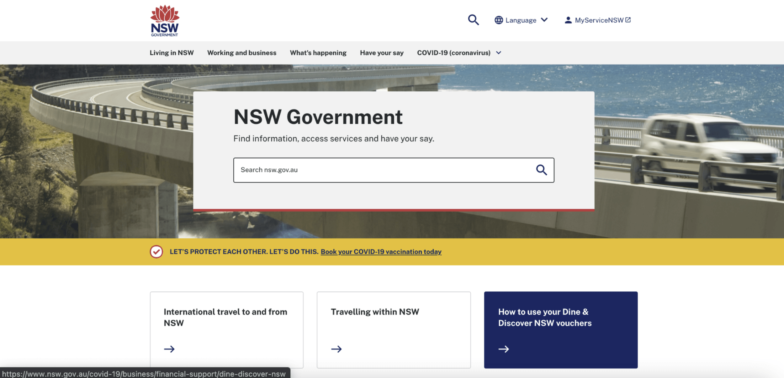
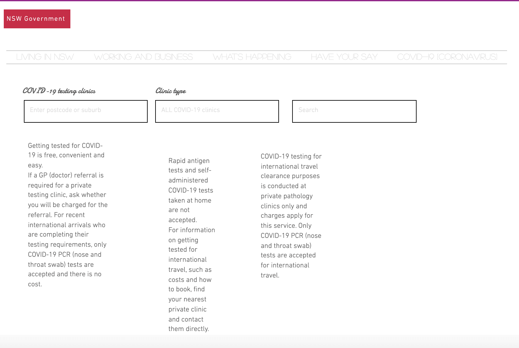
The accessible condition was the New South Wales Government website, selected for its use of WCAG guidance. The comparison was a Wix mockup carrying the same information. Contrast, typography, dropdown behavior and columns all changed together; the mockup also had fewer clickable areas. This was a comparison of whole layouts, not a controlled test of any single design choice.
Budget ruled out recruiting people with low vision, and the lab schedule left one week for sessions. We used a Silktide overlay with a central blind spot and blur. It followed the mouse pointer, so participants could move it aside and read with a clear center. Tobii recorded their eye movements independently; gaze did not control the simulation. A docked magnifier was available on both sites.
I combined task times and completion with System Usability Scale (SUS) ratings, think-aloud notes and the gaze recordings. The task data showed where people struggled; their comments and eye movements helped us examine what happened there.
Supporting detailRead the instrument settings and session procedure2 images · 1 min read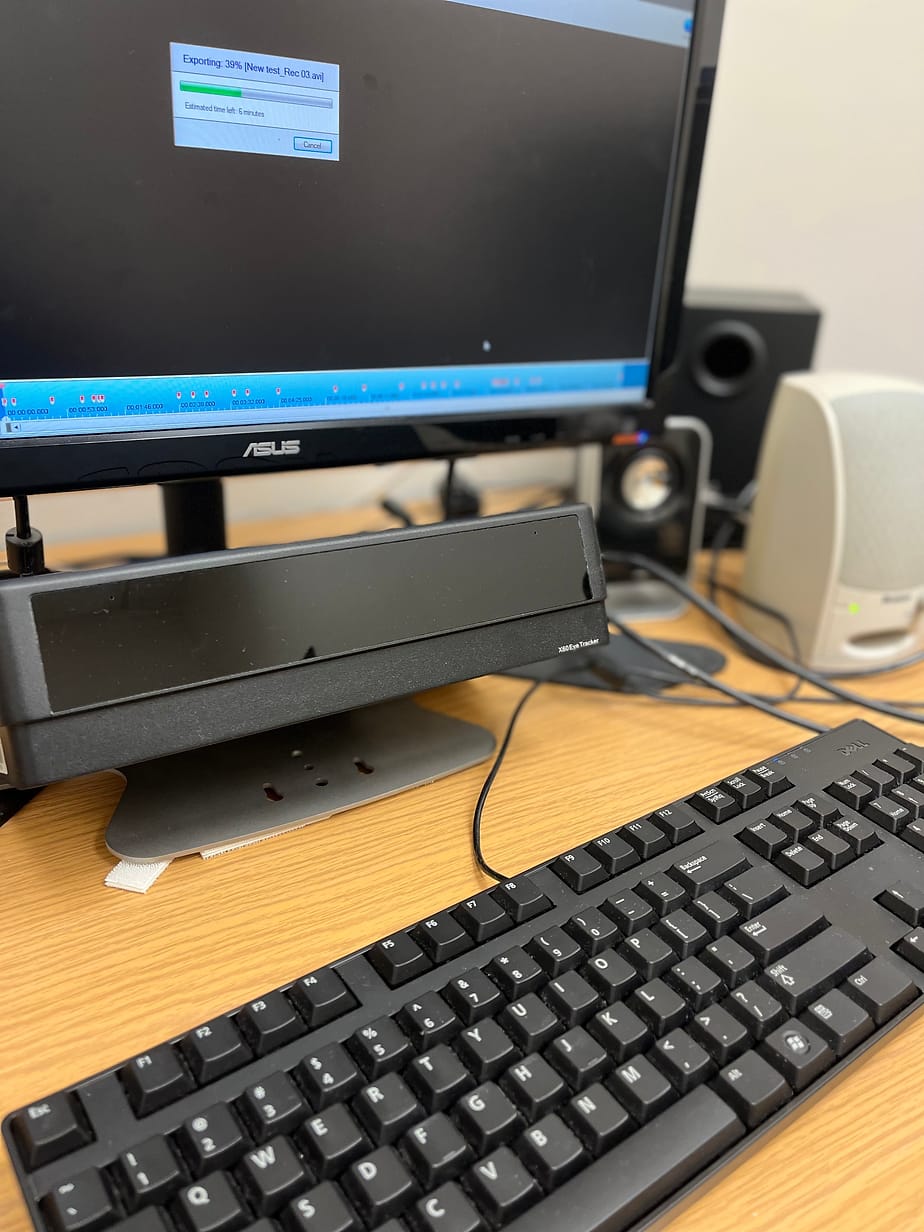
Instruments
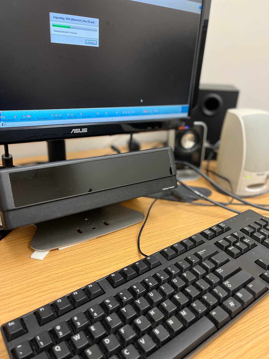
- Tobii eye tracker. Recorded fixations and saccades on both websites. The setup could not define areas of interest or generate heat maps, so gaze was read from the recordings rather than analyzed region by region
- Silktide Chrome extension. A 50% central scotoma with 20% blur, attached to the mouse pointer
- Zoom magnification software. Docked at the top of the screen so it did not cover the page, magnifying the area under the pointer
How the two sites differed
- Typography and contrast. The accessible site used sufficient contrast and readable sizes. The mockup used low contrast, a cursive display face and all-caps text
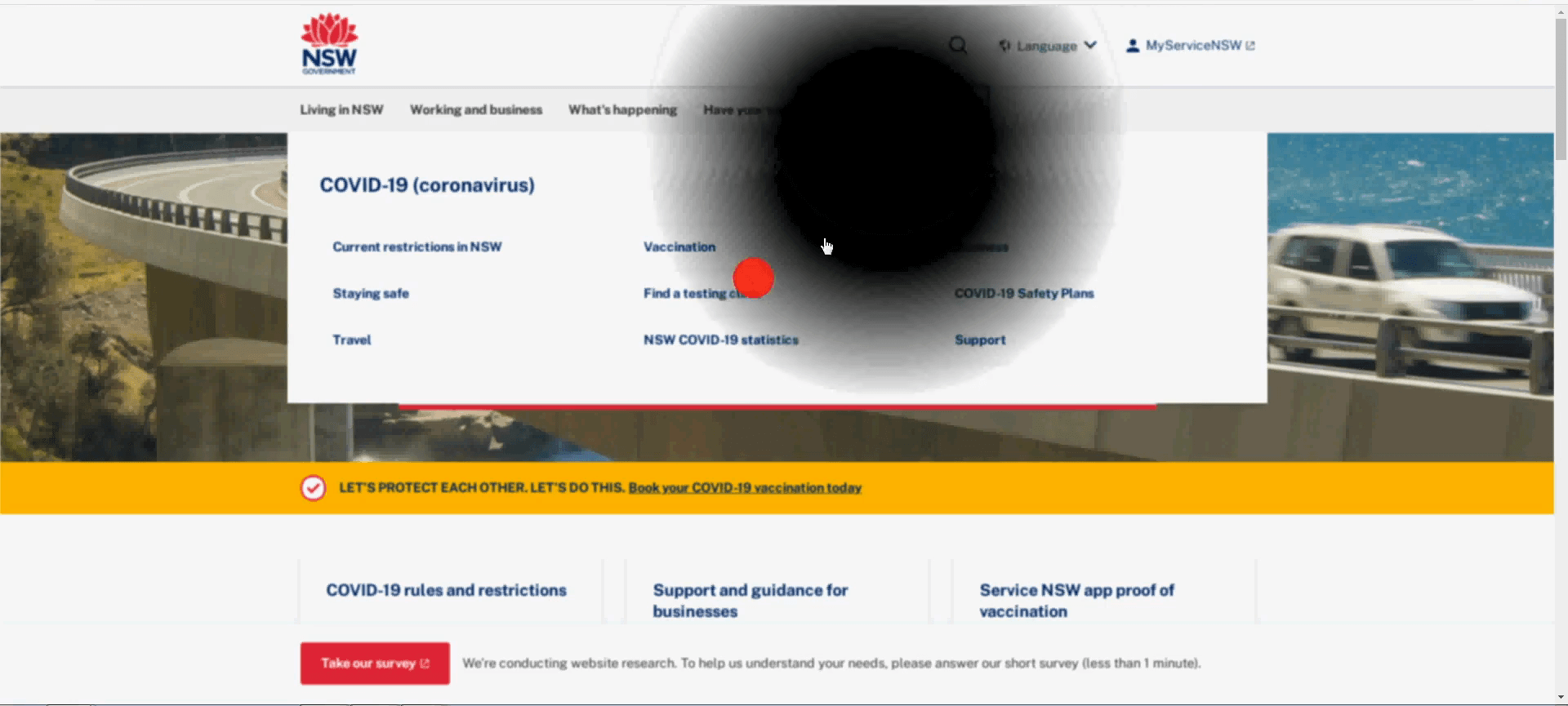
- Dropdown menus. The accessible site used multicolumn, multirow dropdowns with hover color changes and highlighted tab headers. The mockup used single-column dropdowns with no hover or selection feedback
- Column layout. The accessible site used even columns. The mockup used uneven, unnecessary columns, which break the reading line under magnification
Session procedure
Participants agreed to be recorded, calibrated the eye tracker, and were shown the simulator and the docked magnifier. They were asked to navigate and read as they normally would, thinking aloud. I took structured notes on what they said and did, then each participant completed a SUS questionnaire for each site.
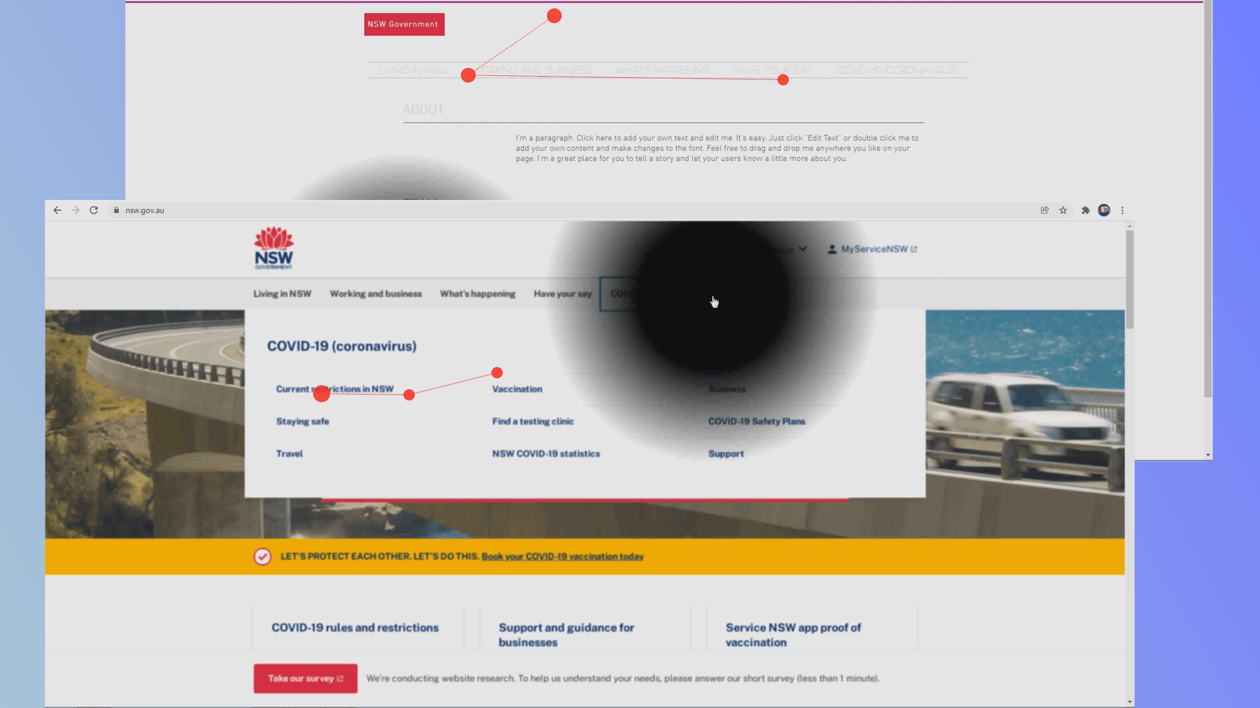
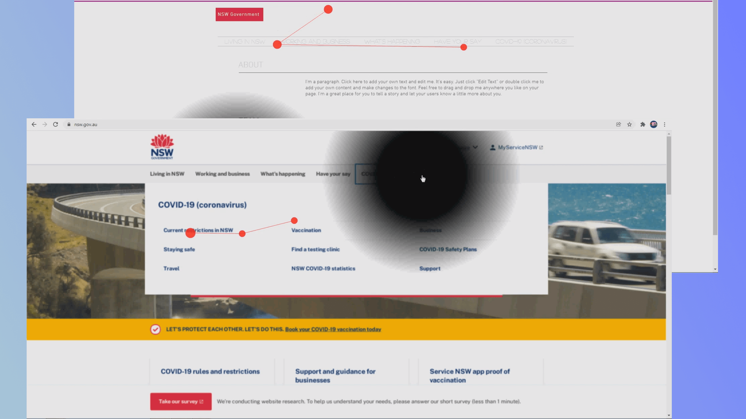
In a gaze plot, each red dot is a fixation, a point where the eye stops, sized by dwell time; the lines between them are saccades, the jumps from one fixation to the next.
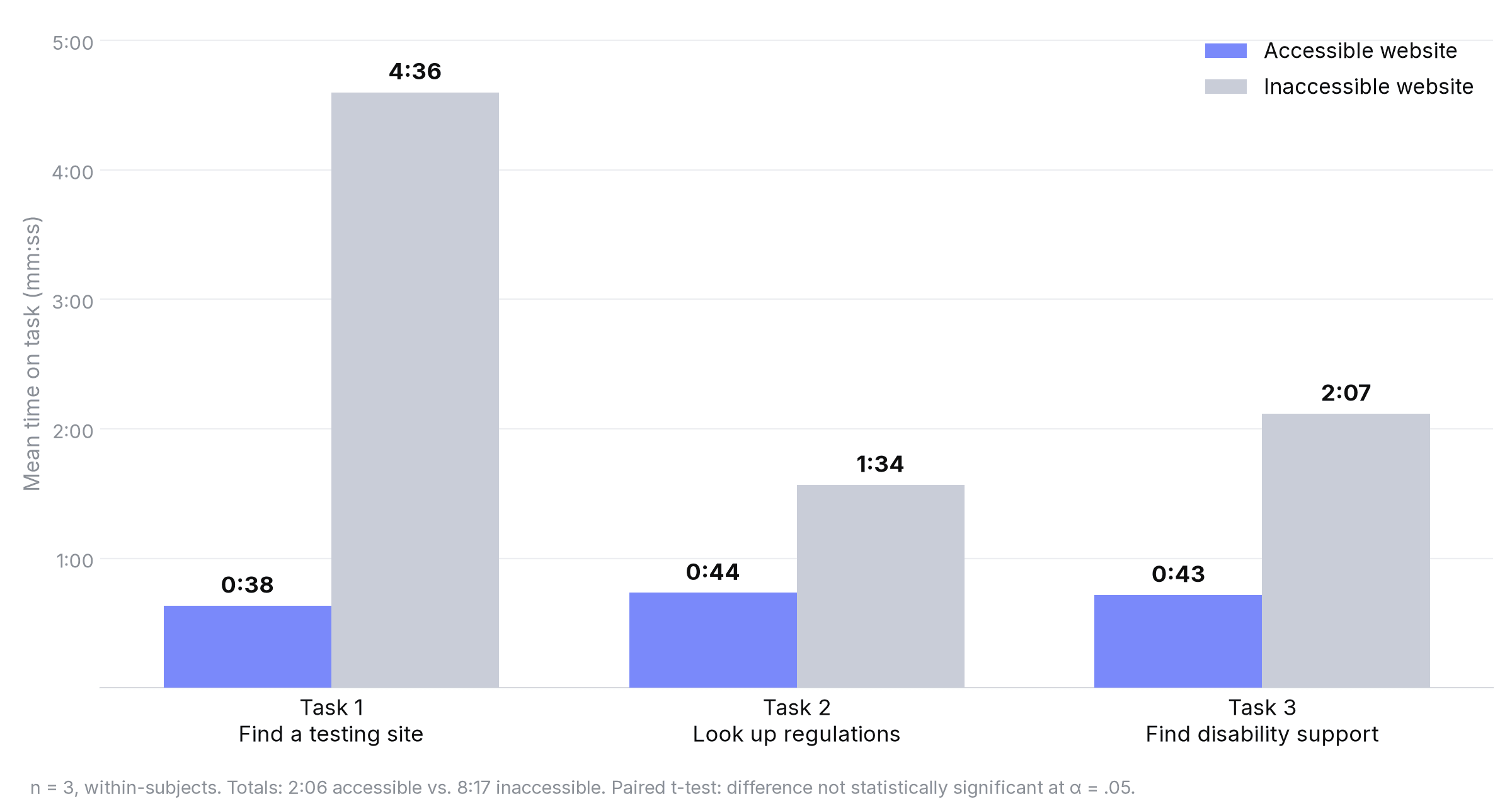
- 2:06Mean total task time on the accessible site, against 8:17 on the comparison site
- 3 of 3Completed every task on the accessible site; one of three did on the comparison site
- 88.33Mean SUS rating for the accessible site, against 64.17 for the comparison site
Quantitative Findings
Faster tasks and higher ratings described these sessions, not a population.
Across the three tasks, participants took a mean of 2:06 on the accessible site and 8:17 on the comparison site, a difference of about six minutes. Every participant completed all three tasks on the accessible site; two of the three failed at least one task on the comparison site.
Mean SUS ratings were 88.33 for the accessible site and 64.17 for the comparison site. These general-usability ratings agreed with the task data; three responses do not establish an accessibility benchmark.
My teammate Mary Nichols ran a paired t-test on task time in SPSS; the difference was not significant at α = .05. The time, completion and rating differences are what three people did on these pages, not an estimate of how large the effect would be in a wider population.
Qualitative Findings
The recordings showed how participants worked around the pages.
We used HyperResearch to code the session notes and think-aloud audio, then read the themes alongside the Tobii recordings. That let us connect a complaint about legibility with the part of the page a participant was trying to read.
On the accessible site
Participants called it “pretty easy” and “clearer,” and the session summary records no magnifier use. They read with the simulated blind spot moved off to the side. The multicolumn dropdown “isn't flying around everywhere,” and participants found links in it directly.
On the comparison site
All three reported difficulty reading, remarked on the low contrast and struggled with the dropdown, which “was the same color as the background.” They improvised: “I'm using the shadow to see.” Magnifier use varied. One participant relied on it; another did not use it at all. Where it was used, it did not make the smallest text readable: “I would definitely need the magnification for this part. Which really doesn't help considering that it's still really small.”
On visual inspection, fixations on the comparison site appeared longer and more scattered. Together with the comments, they suggested difficulty locating readable content. The Tobii setup could not produce an area-of-interest analysis, so I treated the recordings as context for the observed behavior rather than a separate quantitative result.
Supporting detailWatch the dropdown recordings2 images · 2 videos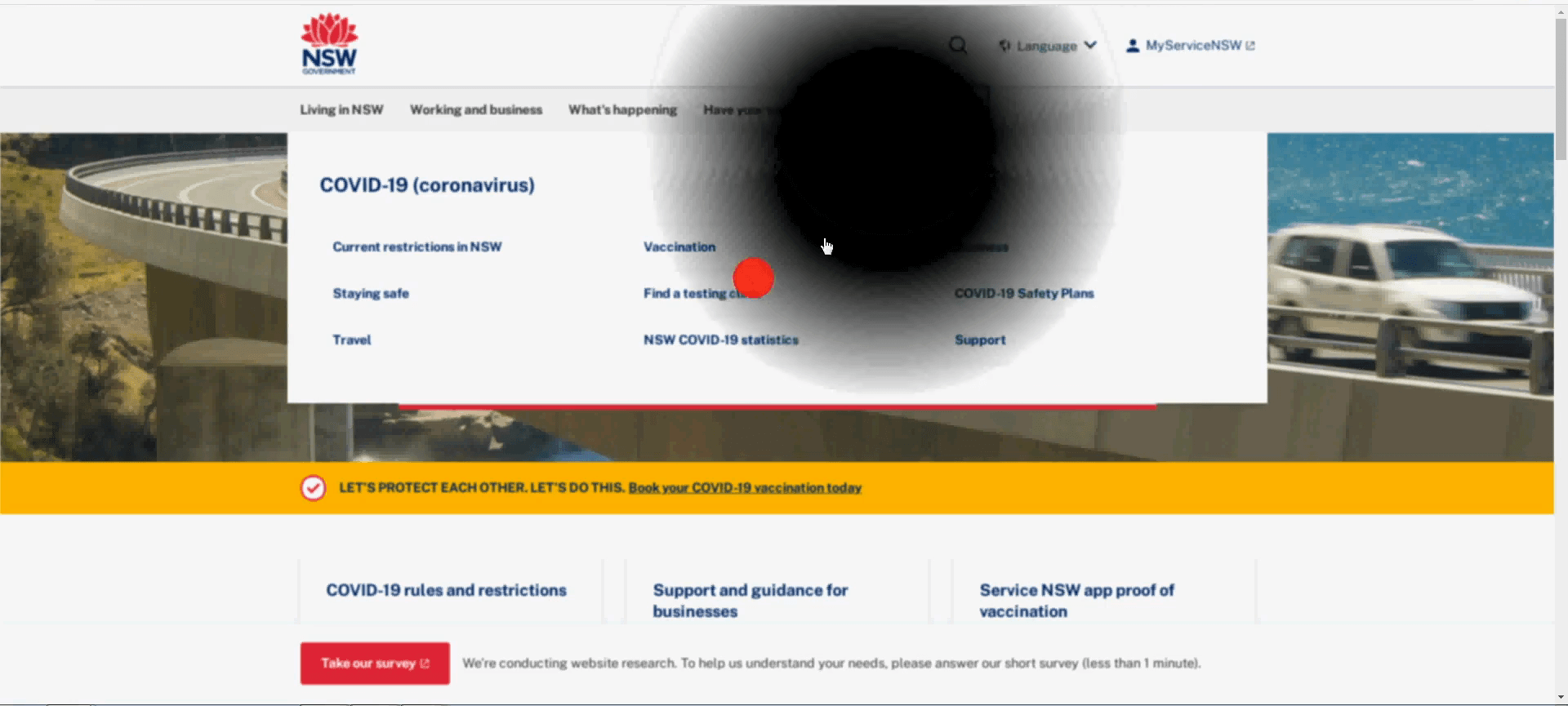
Conclusions
The next study needed a better comparison and participants with low vision.
On the tested accessible pages, all three participants completed the tasks without using the magnifier. On the comparison pages, magnification did not resolve the reading problems where it was used. Low contrast, small text and dropdown behavior were concrete candidates for redesign, supported by the session recordings and participants' accounts.
The task-time difference could not tell us which change mattered most. Contrast, type, menu behavior, columns and clickable area all differed. A follow-up would need equivalent interactions and one design variable changed at a time to test those explanations.
Limits of the evidence
The simulator created an especially important ambiguity: participants could read around a mouse-following blind spot. Their success without magnification therefore could not answer the original question about assistive technology. Three tech-comfortable graduate students also could not represent people living with low vision and the strategies they develop over time. Real users could show larger or smaller differences.
What a follow-up would change
Recruit people with low vision across age groups, control the page differences and use an eye-tracking setup that supports analysis by page region. The existing pilot supplies tasks and specific failure points for that work. Its strongest contribution is the distinction between an observed problem and an explanation that still needs testing.
Related Research
Other M.A. work explored grocery navigation, study design and well-being.
Alongside the capstone, I designed and tested a HelloFresh Market prototype with a competition team, developed two research proposals and wrote a seminar paper. These are separate projects; their methods and linked materials are collected below.
Supporting detailExplore the HelloFresh prototype and coursework research1 min read
Usabilathon 2022: HelloFresh Market
In November 2022, our five-person team placed second in Usabilathon, sponsored by HelloFresh. I worked on design and conducted user testing, with guidance from a HelloFresh mentor. We brought Market, an add-on grocery store buried five levels deep, onto the home screen, separated it from meals and added search to meal selection.
In an 11-person follow-up comparing the prototype with the live app, average time on the Market selection flow fell from 3:23 to 1:12. Participants unable to complete the defined path fell from four to one; eight added Market items, compared with six on the live app. These were session actions, not purchases. The case-study PDF reports a paired t-test that was not significant at .05.
Read the HelloFresh case study or the presentation deck.
Coursework research
- Smart-home apps proposal. A planned between-subjects comparison of Amazon Alexa and Google Nest, with 60 participants and five performance tasks grounded in Nielsen's heuristics.
- Shopping-emotion proposal. A study design based on Roseman's appraisal theory, linking four interface features to three cognitive appraisals and six emotions. It proposed 50 interviews, a 100-person survey and structural equation modeling in Mplus.
- Well-being seminar paper (PSYC 768). An application of Seligman's PERMA model to digital-product design and evaluation, compared with Self-Determination-Theory frameworks such as METUX.
Read the smart-home proposal, shopping-emotion proposal or PERMA paper.
The capstone's presentation and study boards in Figma provide further method and session detail.