Entagile: Designed it, then asked to build it — and taught myself Framer so I could.
Marketing website redesign and Framer CMS for a financial staffing agency.
Entagile, a financial staffing firm in Fairfax, needed its website and CMS rebuilt to earn client trust and reach new markets beyond tech and finance staffing. A developer had been assigned to implement my design. I learned Framer on my own time and asked to take the build myself — then shipped the whole thing, from user research and interactive prototyping through a production site and a CMS the marketing team could run without engineering.
Background
A financial staffing firm needed a site that matched its ambitions.
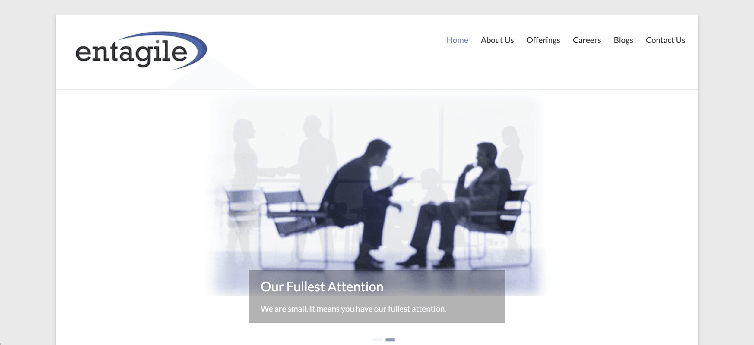
Entagile is a financial staffing firm partnered with clients like Freddie Mac, Fannie Mae, and Capital One, and universities including Johns Hopkins and the University of Maryland. By late 2021, their marketing website had fallen behind — the design read generic, stakeholder satisfaction was low, and every blog or job posting update depended on engineering time. The firm wanted to expand into new staffing markets, but the site wasn't making a convincing case to prospective clients, especially those arriving from social campaigns.
The project wasn't a homepage facelift. Entagile needed a full five-page site — homepage, services, careers (with sub-flows for current openings, registration, training, and career challenges), blog, and contact — plus a CMS the marketing team could own. During a four-month internship (December 2021 – March 2022, hybrid in Fairfax, VA), I owned UX research and design; a developer on the team was assigned to implement my designs. By the end, the scope had shifted — I ended up building the production site myself in Framer, a story that runs through the rest of this study.

Problem
Two audiences, one flat path.
The site served two distinct audiences — companies evaluating a staffing partner and candidates evaluating a career move — but treated them as interchangeable. Competitive analysis and 6+ user interviews surfaced the gap: social-traffic visitors (largely candidates arriving from LinkedIn campaigns) needed trust signals and entry points completely different from the corporate visitors finding Entagile through referrals or search.
Meanwhile, the marketing team couldn't publish blogs or job postings without developer help — a bottleneck that slowed campaigns and inflated overhead. Entagile needed a redesign that addressed both the conversion gap and the content velocity problem.
Research
User interviews revealed two paths hiding behind one homepage.
I benchmarked competitor UX/UI and ran 6+ user interviews to map pain points across Entagile's audiences. The clearest finding was structural: candidates and companies weren't just reading different content — they were asking fundamentally different questions on their first visit. Companies asked who do you work with? (social proof, specializations). Candidates asked what's in it for me? (training, mentorship, career challenges).
I advocated for a dual-audience information architecture that addressed both from the first scroll — one shared hero, two clear paths — and presented findings to stakeholders. Buy-in came from showing how the proposed structure mapped to specific needs from interviews, not just visual preferences.
Design
Every section speaks to both audiences — without splitting the page.
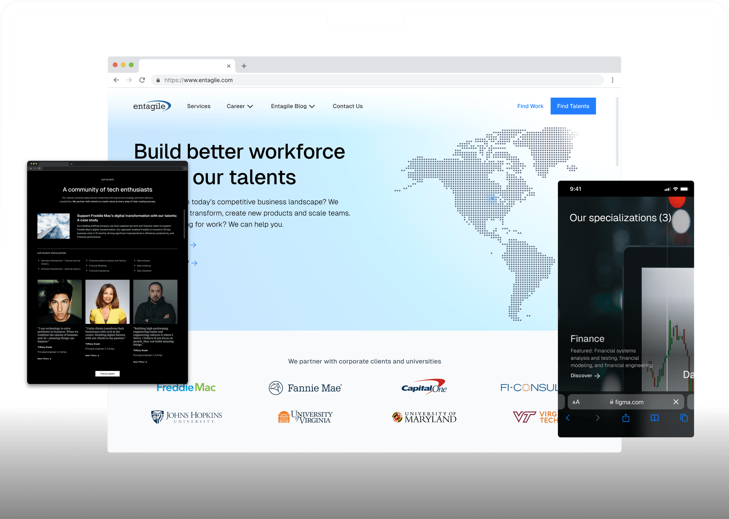
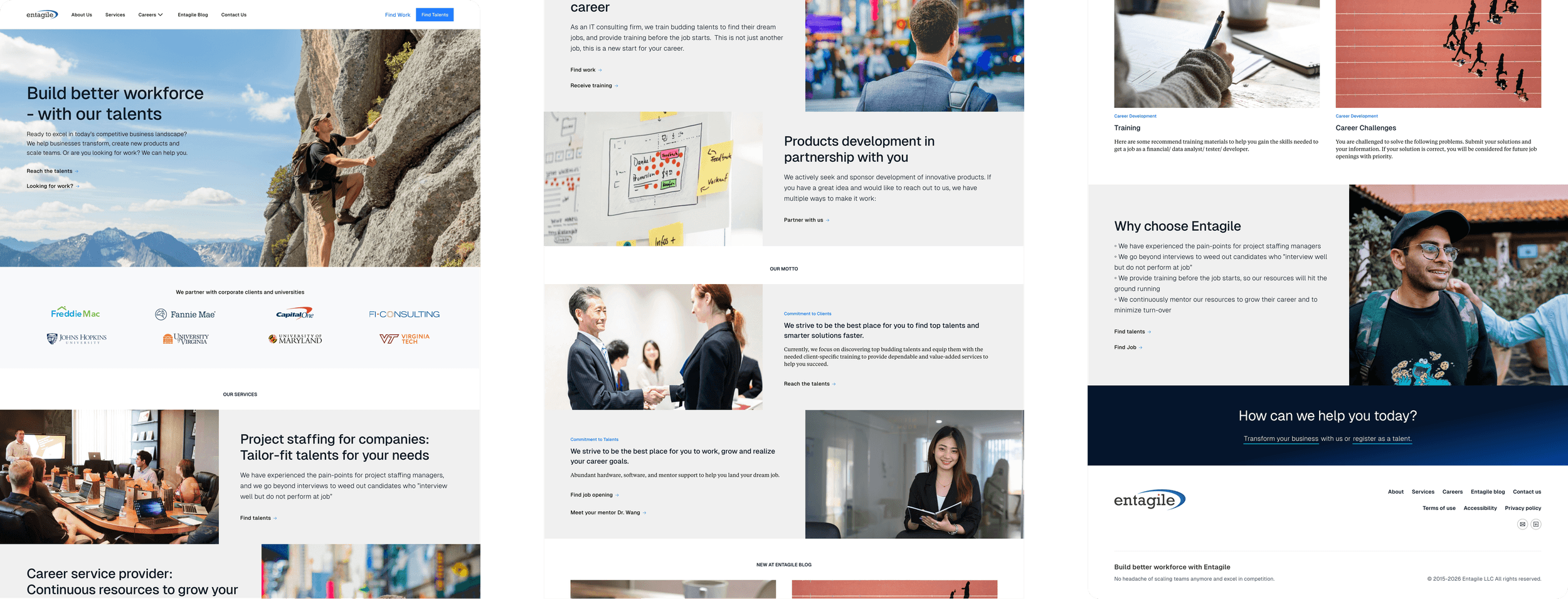
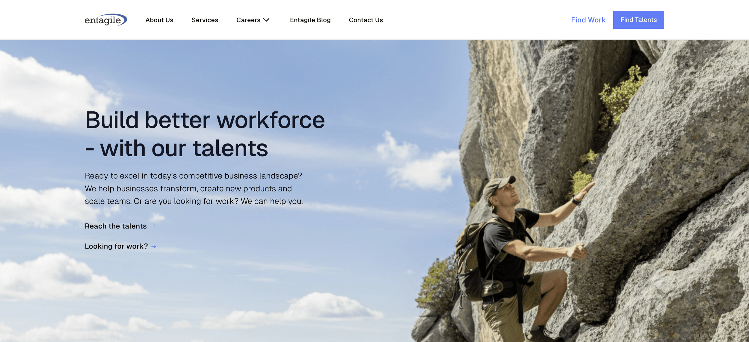
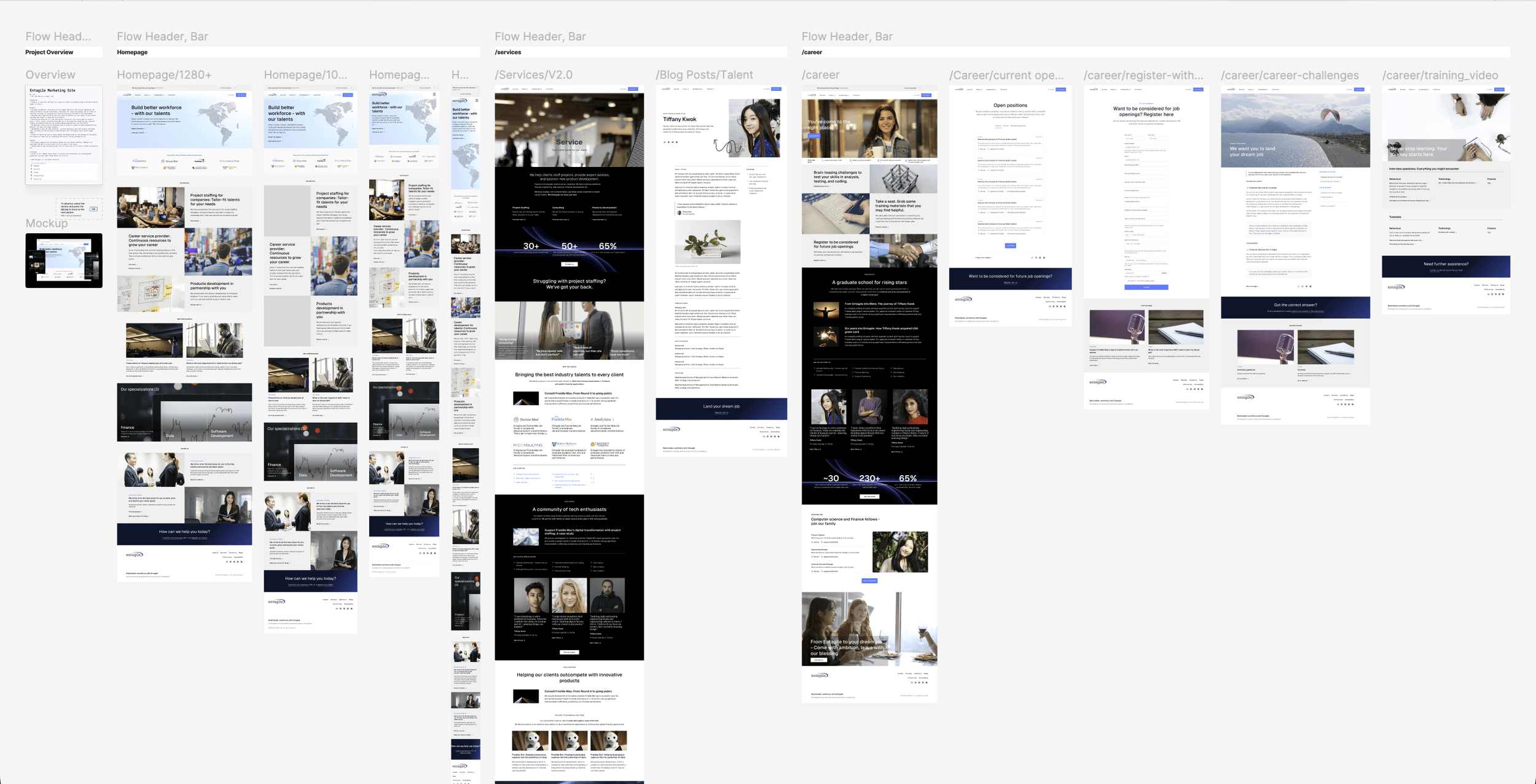
The homepage architecture put the dual-audience insight to work. The hero opens with a shared value proposition — Build better workforce with our talents — then immediately forks: "Reach the talents" for companies, "Launch my career" for candidates. A partner logo bar (Freddie Mac, Fannie Mae, Capital One, Johns Hopkins, Virginia Tech) answers the company question — who do you work with? — in the first scroll.
Below, three service tracks (project staffing, career services, products development) and three specialization areas (Finance, Data, Software Development) give both audiences concrete next steps. A dual-pillar motto section — Commitment to Clients alongside Commitment to Talents — mirrors the IA at the values level. The page closes with an integrated blog, a "Why choose Entagile" differentiator section, and a conversion-focused footer CTA.
Beyond the homepage, the career section alone had five sub-flows: current openings, candidate registration, career challenges (static and video formats), and training resources. I built fully interactive prototypes in Figma for all pages and delivered responsive designs at four breakpoints — mobile, tablet, desktop, and large desktop — plus a dev handoff asset package for the developer assigned to implement them.


Build
I asked to build it myself — and Framer made that a fair ask.
The build wasn't originally my job. A developer on the team was implementing my Figma designs, and we worked through the handoff the usual way — asset packages, breakpoint specs, back-and-forth on details that didn't survive translation. Around the same time, Framer was emerging as a serious site-building tool in the design community. I learned it on my own, then made a proposal to Victor: let me carry the design into production myself. It wasn't a knock on the developer — it was a bet that collapsing the designer-developer round-trip would get the site shipped faster and closer to the design intent. He agreed.
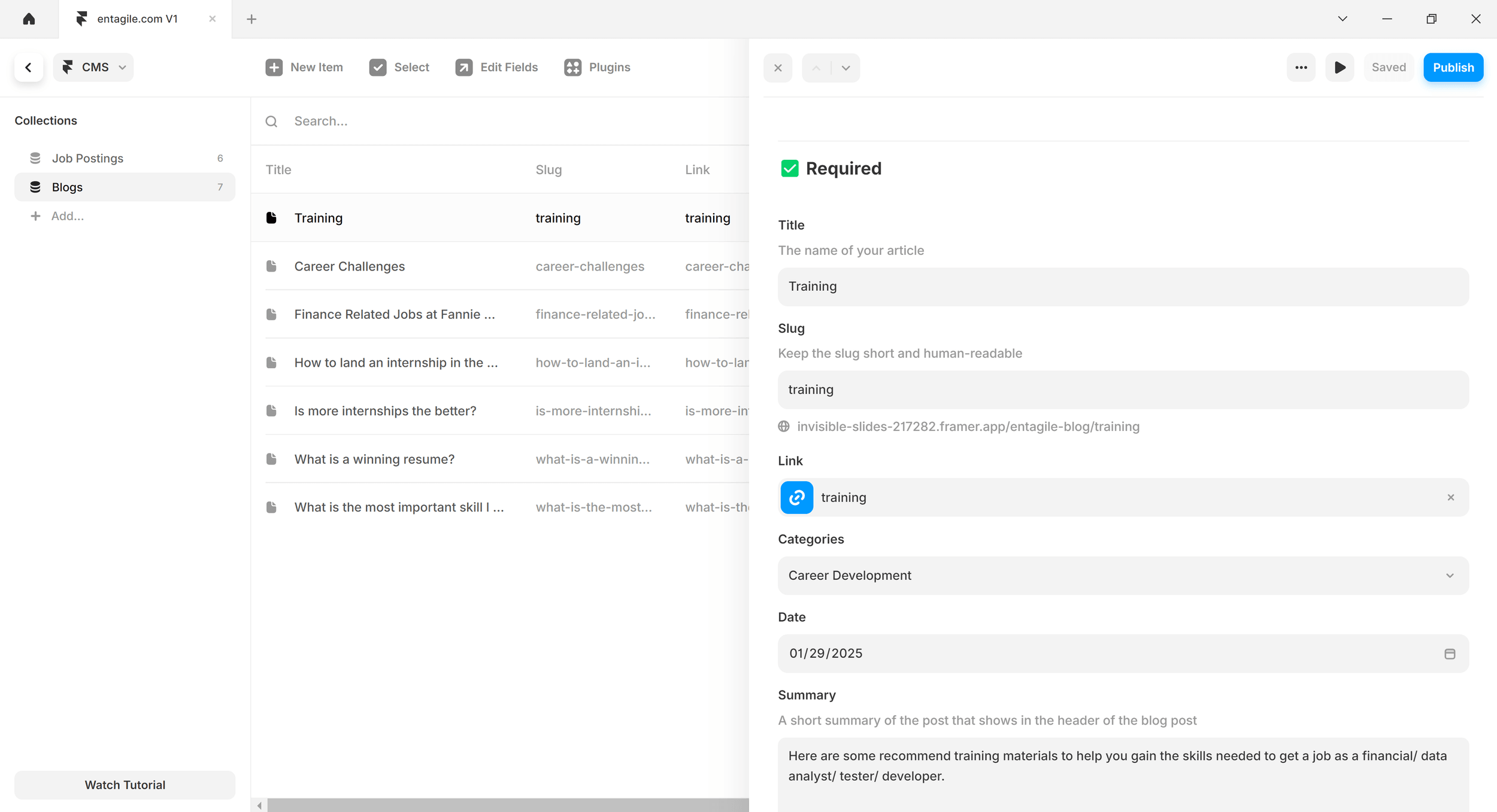
Building in Framer let me move from approved designs to production without a handoff gap. The integrated CMS gave the marketing team two content collections — Job Postings and Blogs — with structured fields for title, slug, categories, date, and summary. By launch, the team had published six job postings and seven blog articles on topics like career challenges, training resources, and landing internships — all without engineering involvement. Content that used to wait on a developer's queue now shipped the day it was written.
On-page SEO work — optimized meta descriptions and header structure — lifted organic click-through rates from SERPs by 9%. Accessibility targeting WCAG 2.2 AA improved clarity for every visitor, not just users relying on assistive technology. The new design increased average time on page by 46% and social-traffic conversion by 37%, helping Entagile expand beyond its core tech and finance staffing markets and contributing an additional $20K in revenue within the first quarter post-launch.


- 37%Increase in social-traffic conversion
- 46%Increase in average time on page
- $20kAdditional revenue in the first quarter post-launch
- 7Blog articles published by marketing — zero engineering involved
Testimonial“Chevis studied user research at George Mason University before I hired him as an intern. He's an extremely loyal, likeable, bright, and skilled product designer. His superpower is his empathy with users, and a unique talent to combine that with his skills for interface design. He's incredibly curious and always wants to learn more and dig deeper. His work on our marketing site is impressive and really surprised me at the time. Chevis is incredibly fun to work with, his energy level is nuts.”
Victor WangFounder & Managing Director, Entagile
Key Takeaways
Dual-audience architecture beats a generic page. Instead of one conversion funnel for everyone, the hero fork and mirrored content sections let each audience find their path without splitting the site into separate portals.
Information architecture should follow how people actually arrive. Social-traffic candidates needed a different entry path than organic company visitors. Research made that case to stakeholders better than any mockup alone.
Scope isn't fixed — but expanding it is a team conversation. This was my first US work experience, and the most useful lesson wasn't a design one. Taking over the build worked because I proposed it as a workflow improvement the team could evaluate — with the founder's buy-in and the developer's handoff context — not as a solo land grab. Raising your hand is initiative; how you raise it is teamwork.
A CMS is part of the UX. If the marketing team can't publish without engineering, the best homepage redesign still stalls the moment a campaign goes live. Seven blog articles published before my internship ended proved the system worked.
Output
Explore the Framer design.
This is the marketing site I designed and built for Entagile in Framer — desktop and mobile, with the CMS structure the marketing team would have run day to day. The design exploration behind it — wireframes through final screens, originally prepared for developer handoff — lives in the Figma design file.

It was never applied as-is. Victor didn't want the live site to expose that much detail about Entagile's business model — competitors could have copied it — so the production site shipped with a more conservative information architecture. He was still vocal about the quality of the design and development work.