 Treevah: Navigation that feels like folders and works like filters. A design operation is why engineering shipped it.
Core navigation + design system. Alpha shipped Apr 2025.
Treevah, a filter-driven cloud file manager taking on Google Drive, carried a real product tension and no design structure to resolve it in. I redesigned the navigation that settled the tension, then proposed the operating model that let a ten-person design org ship it, and led the Design System Team that ran it.
Overview
The gap between what a product team decides and what a developer can build is where products lose their quality. I made that gap my job.
Treevah is an early-stage startup building a cloud file manager to compete with Google Drive and Dropbox, a product whose entire bet is that files should be filtered, not just foldered. I joined as a Product Designer and left running the Design System Team: a four-person group inside a design org of about ten, sitting between the product designers on one side and the engineering team on the other.
This study is one argument told in two movements. The first is product: the navigation decisions that resolved Treevah's central tension between power-user control and everyday simplicity, argued in the open, with the CEO on the other side of the table more than once. The second is system: the operating model I proposed and was handed a team to run, which turned those decisions into structure the whole org shipped through.
The two movements are causally locked. The debates are why I had the authority; the system is how it scaled.
- 15+Rounds of user testing led on the Cloud Alpha prototypes
- 80+Design-system components built and adopted by engineering
- 4Person Design System team led, serving the wider product org
- ~1 wkCut from each UAT cycle in feature delivery
Context
A filter-driven file manager betting against Google Drive, with an unresolved product tension and no structure to resolve it in.
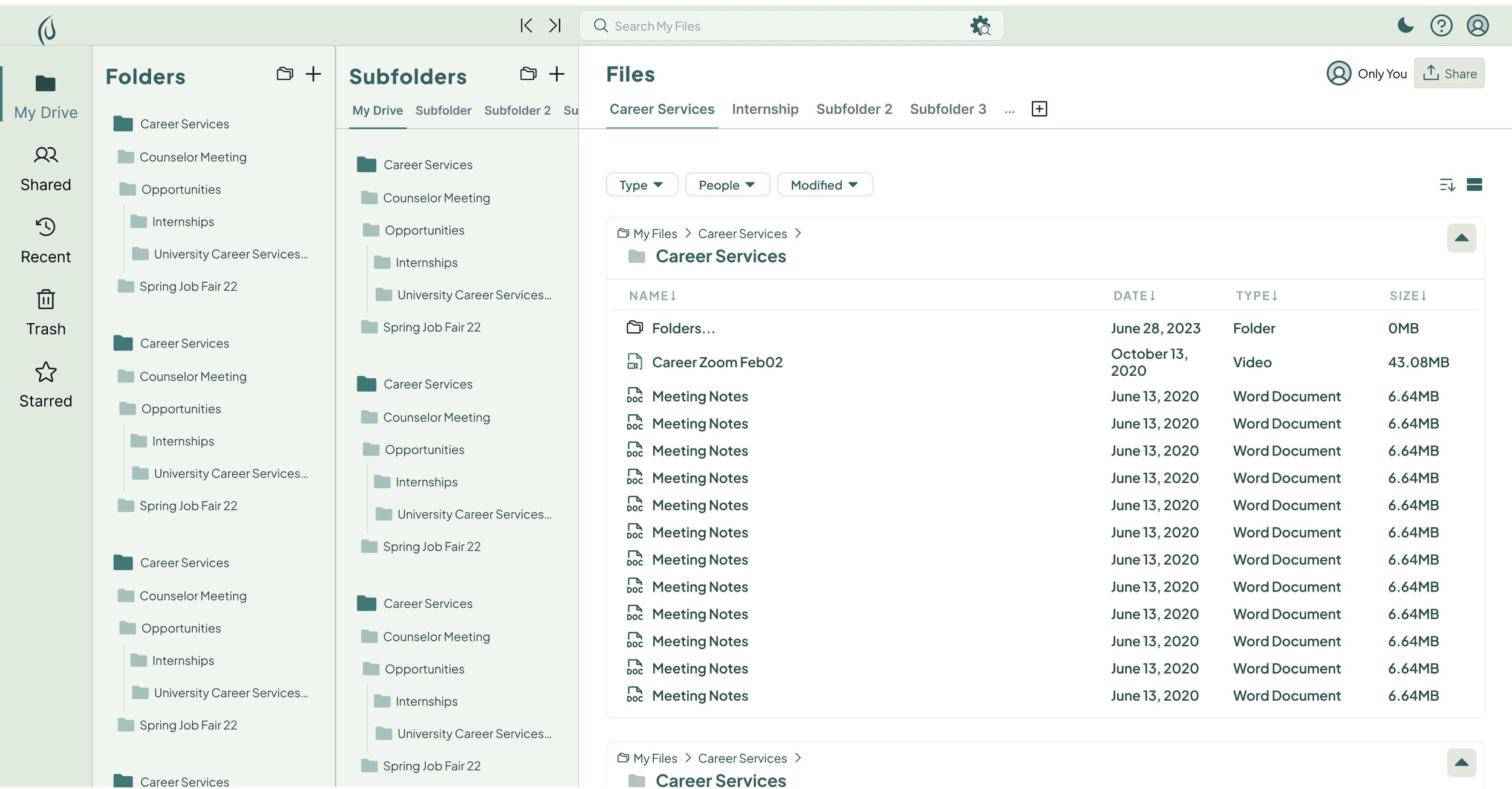
Treevah's pitch is speed through filtering: instead of drilling into one folder at a time, you hold several levels open at once — folders, subfolders, and files in parallel panes — and compare contents across them.
That compare-and-contrast ability was the product's biggest selling point, and it is also where the trouble started. The users it serves best are power users managing deep hierarchies; the users Treevah needed to win — the large majority arriving from Google Drive and Windows — carry a lifetime of the traditional folder mental model. Every navigation decision had to serve both without betraying either.
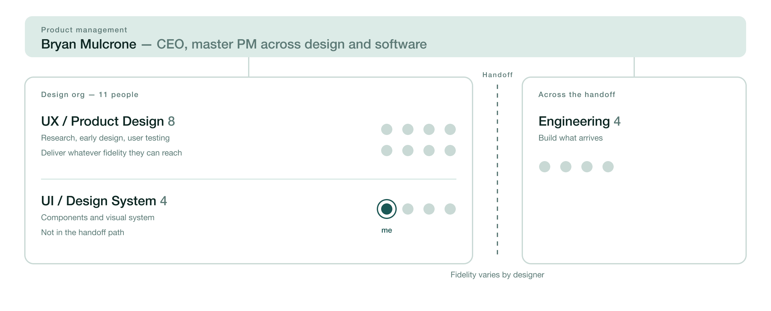
The org shipping this was a design team of about ten: five or six product designers, a four-person UI team, and the CEO acting as master PM across both design and software, with a separate engineering team on the other side of the handoff. What it didn't have was a way to land decisions. Product designers owned research and early design but not high-fidelity execution, so what reached developers was scrappy and inconsistent, and hard-won product arguments kept dissolving before they became build-ready screens.
Those are not two problems. A tension this deep is only resolved through argued decisions, and argued decisions only compound if a structure carries them into the product unchanged. Treevah, mid-sprint toward an alpha that shipped in April 2025, had neither, which is why this study has two movements.
Layout
I chose the layout our engineers could actually build well, and killed my own alternative to get there.
The first fork was the overall frame: a card-heavy, dual-sidebar layout in the Google Drive family, or a hierarchical, sectioned layout in the Microsoft Teams family. I opened the question in a February design review by putting Teams on screen and asking the team, on the record, whether we could copy its interface outright for Treevah.
I argued for the sectioned frame, and only half the argument was about users. Clearly divided rectangular sections give a stronger visual hierarchy and lower cognitive load than a card grid, and they flex further when the content inside them changes shape.
The other half was pragmatism I'd rather own than hide. A card-heavy UI is unforgiving: its color systems and elevation logic demand a level of UI specialization our engineering team didn't have, and my own research into card-heavy interfaces kept arriving at the same conclusion: it's no coincidence the colors are so hard to get right. We weren't a bench of senior visual designers from Google, and I priced that into the decision instead of pretending otherwise.
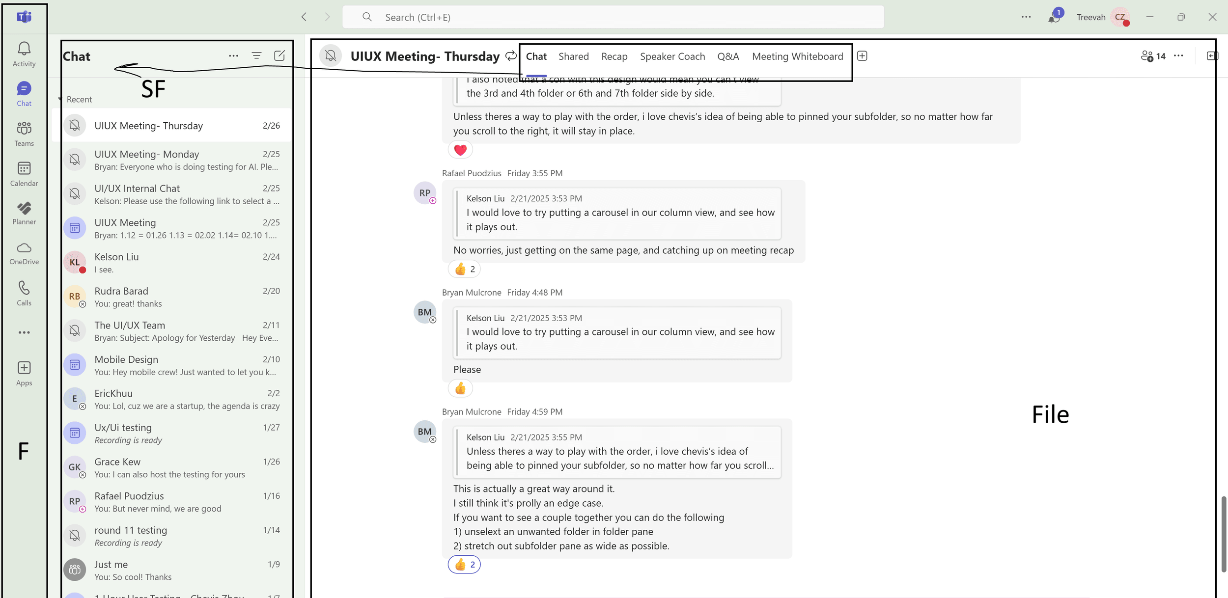
The layout then earned its shape the slow way. The starting state was two panes — Folders and Files — with the product's defining subfolder layer missing entirely. My first alternative merged the whole hierarchy into one combined sidebar tree, and it collapsed under its own weight: overflow at depth, duplicate entries in the pinned section. I labelled the file "[plan forfeited]" myself and moved on.
The three-pane structure that shipped is stronger for it: a plausible alternative died on the record first, and the record stays visible below.
Top: The starting state. Two panes, Folders and Files, with the product's defining subfolder layer missing entirely.
Bottom: The alternative I killed. One combined sidebar tree: overflow at depth, and the pinned section duplicating entries already in the hierarchy. The Figma page is still titled “[plan forfeited].”
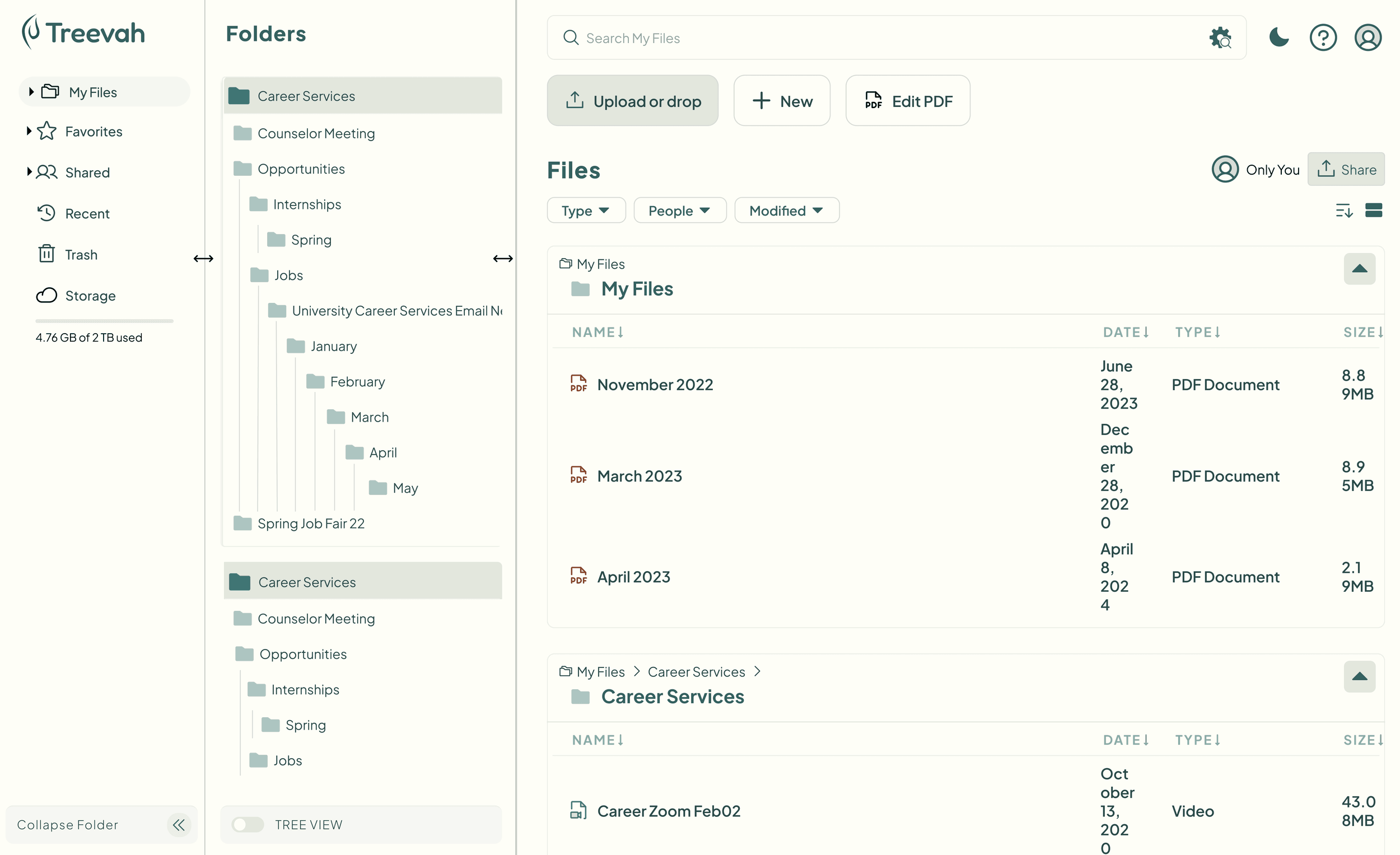
Navigating Depth
The CEO's objection was right, so I designed around it instead of arguing past it.
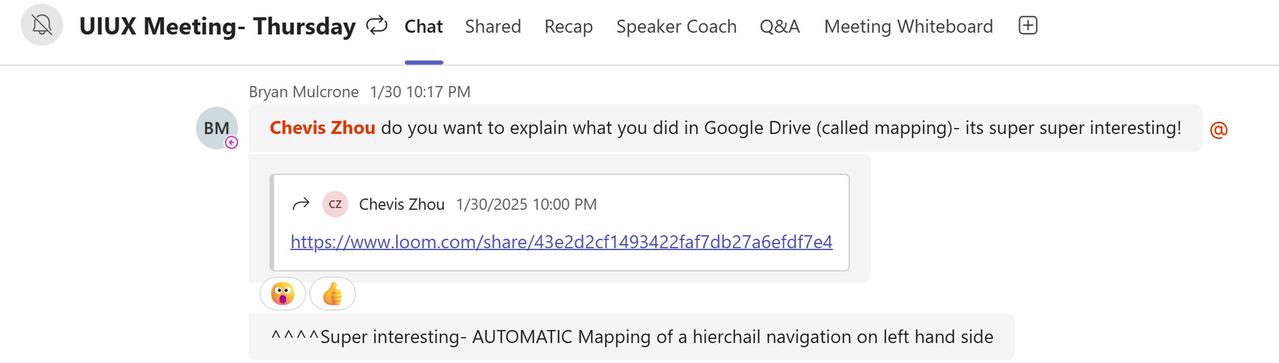
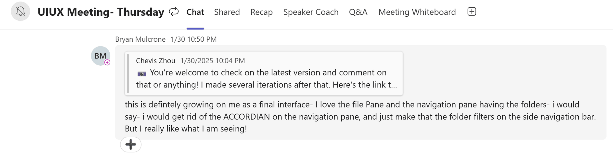
Depth became my problem before it was assigned to me. On the night of January 30 I posted a Loom walking through something I'd built for myself: a way of mapping a deep hierarchy automatically into a left-hand navigation, demonstrated inside Google Drive. Seventeen minutes later Bryan pulled it into the team channel and asked me to explain it to everyone. Fifty minutes after that, looking at the iterations I'd kept making, he said it was growing on him as a final interface.
None of that was my assignment. I keep doing this kind of thinking on the products I work on whether or not it's been handed to me, and this is the thread where it paid: the navigation problem became mine to run because I'd already been running it.
Top: 10:17 PM. The CEO pulls my Loom into the team channel: “do you want to explain what you did in Google Drive (called mapping)- its super super interesting!”
Bottom: 10:50 PM, after the iterations that followed: “this is defintely growing on me as a final interface,” with one note to drop the accordion from the navigation pane. That accordion went on to be tested against tabs in §7.
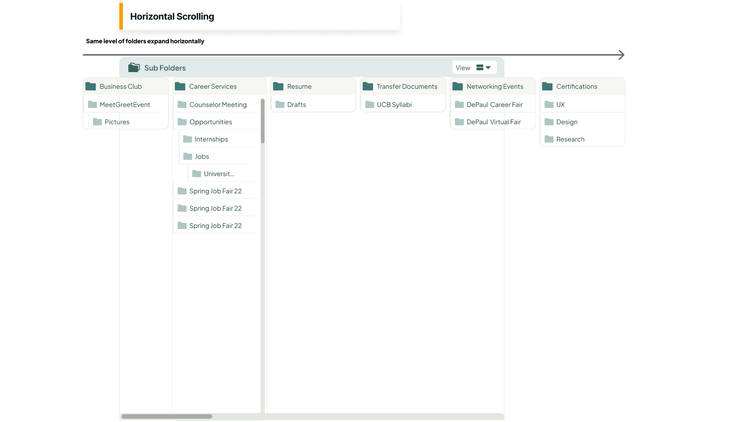
Depth was the hard problem. Treevah had been handling deep hierarchies with free horizontal scrolling — panes multiplying rightward, the way Dropbox and macOS column view handle it, and it was failing in ways the usage data kept confirming:
- Names truncated until expanded.
- No stable focal point when panels collapsed.
- Pinning that fought the reset behavior.
- Constant layout shift that left the collapsed state visually unstable.
After a snap-scrolling intermediate that fixed the randomness but not the clutter, I proposed a carousel: subfolders expanding vertically inside a fixed panel, one paged panel at a time, three levels per panel.
Bryan Mulcrone — Treevah's CEO, and the master PM across both teams — pushed back on the record, and his objection was the right one. A carousel shows one panel at a time, and comparing files across folders at once was Treevah's biggest selling point. I couldn't argue that away, because it was true.
So the design absorbed it instead: breadcrumb navigation went in for users who traverse linearly, subfolder panels became pinnable so a panel you rely on stays put outside the hierarchy, and a panel slider gave precise control over which levels stay in view. The exchange never slowed the work down: the debate was the iteration mechanism. Each concession is a feature the shipped product kept.
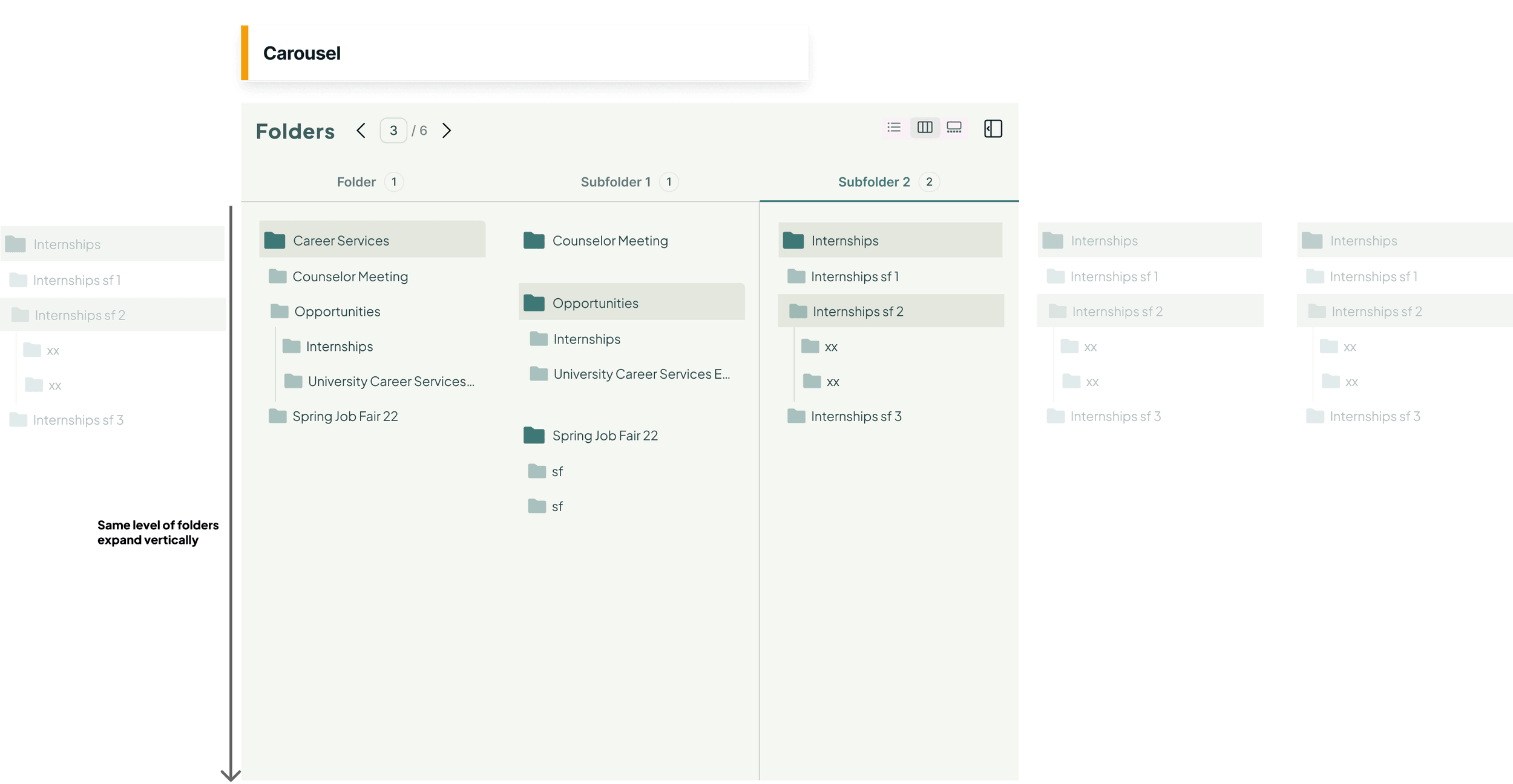
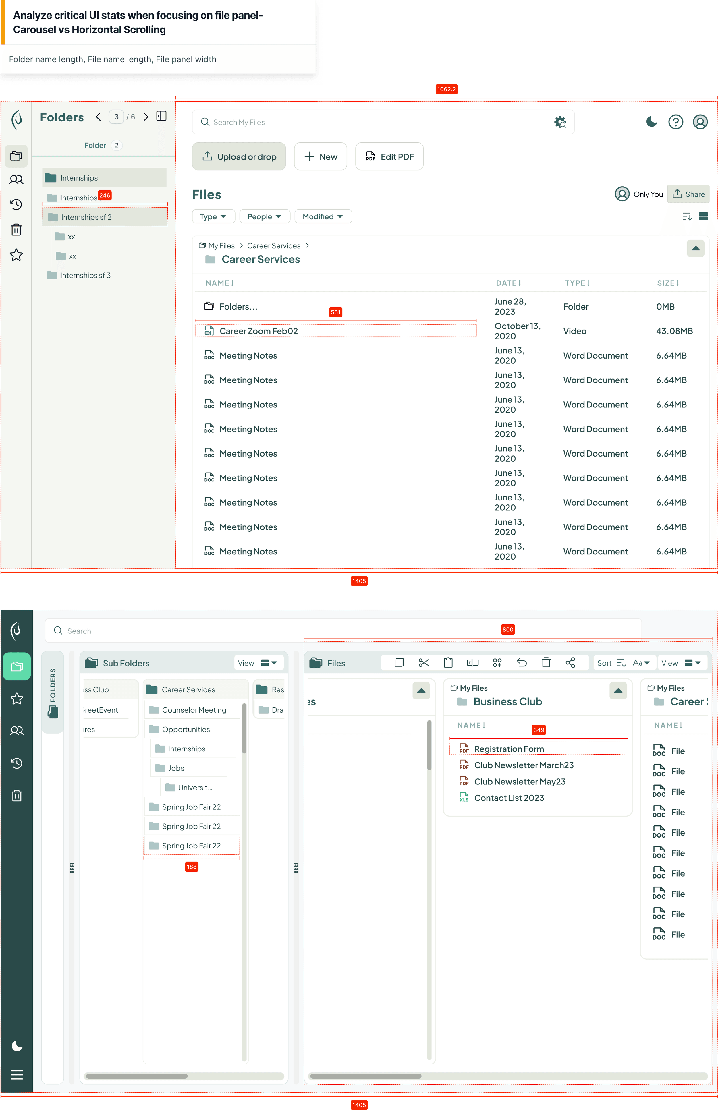
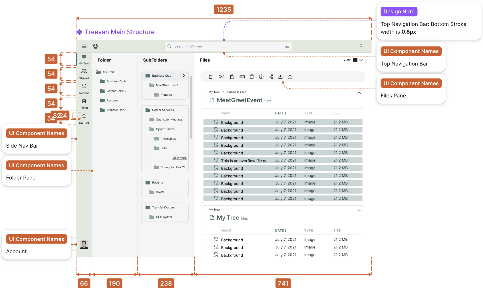
The carousel also won on a budget nobody had measured yet. A file manager's file panel is the panel that has to be wide: it's where names live, and a name that truncates is a name the user has to expand something to read. So I measured both options in the same 1405px frame and compared what each one left for files.
Free horizontal scrolling spent that frame on folder panes marching rightward, and left the file panel 800px. The carousel folds those levels into one paged panel and leaves it 1062px — a file-name column of 551px against 349px — while the folder pane it navigates from gets narrower, not wider. The option that reads as the more restrictive one is the one that gives the user's most important panel a third more room.
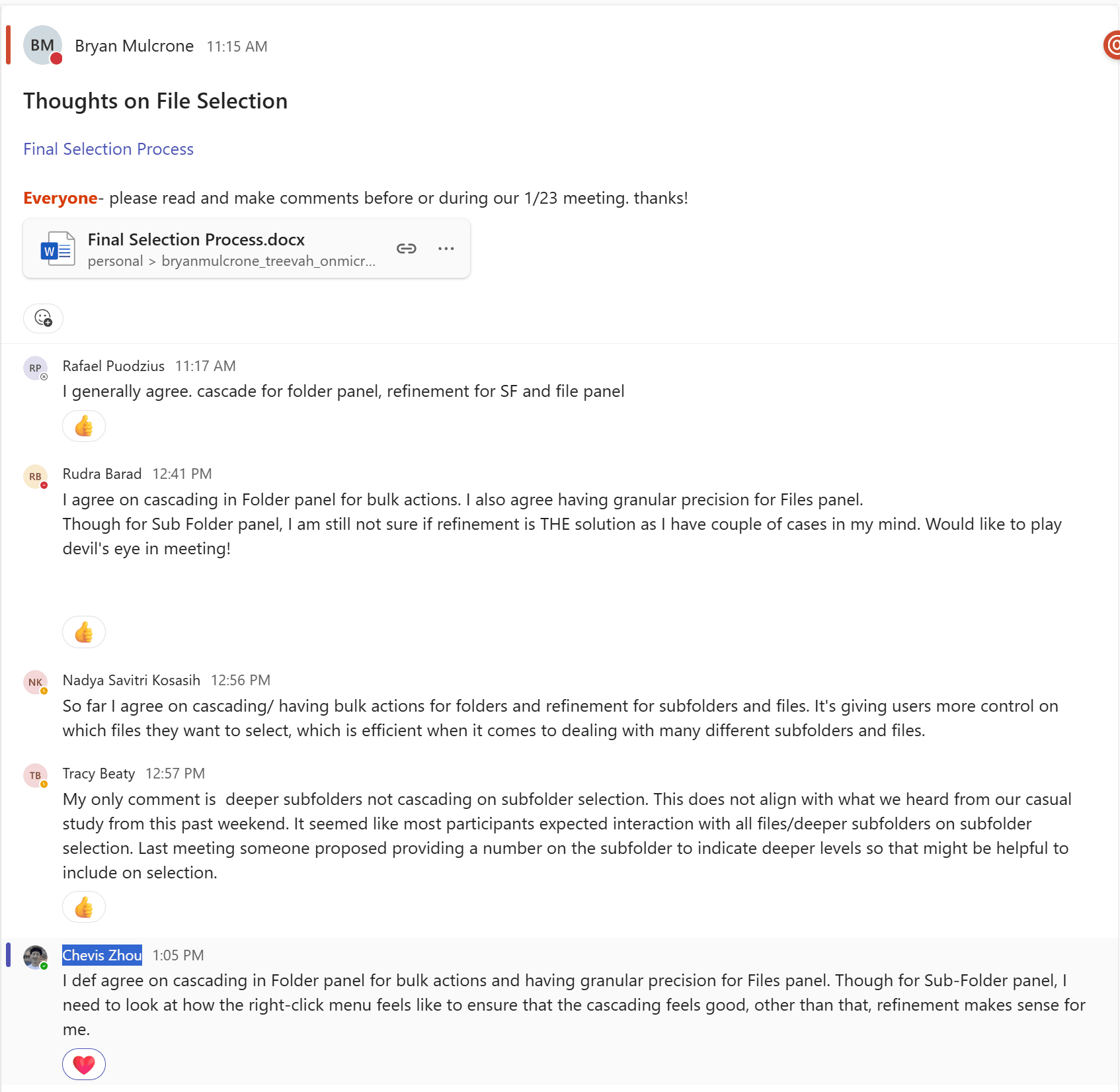
Testimonial“This actually makes a lot of sense — it eliminates the nested problem… It's like Mac in a way, but it's not: we're able to do multi-select, which makes it more manageable. Super interesting concept.”
Bryan MulcroneFounder & CEO, Treevah — reviewing the carousel proposal
Selection Semantics
Folders behave like containers; subfolders behave like filters. That split resolved the tension.
Layout decides where things are; selection decides what an action touches, and selection is where the power-user-versus-simplicity tension actually lived. Traditional file systems give one answer everywhere: a folder is a container, and selecting it selects everything inside, recursively. That model reads instantly, and at Treevah's depths it breaks. Recursive cascades applied to levels you can't see are slow and unpredictable, and they produce "partially selected" states nobody can reason about.
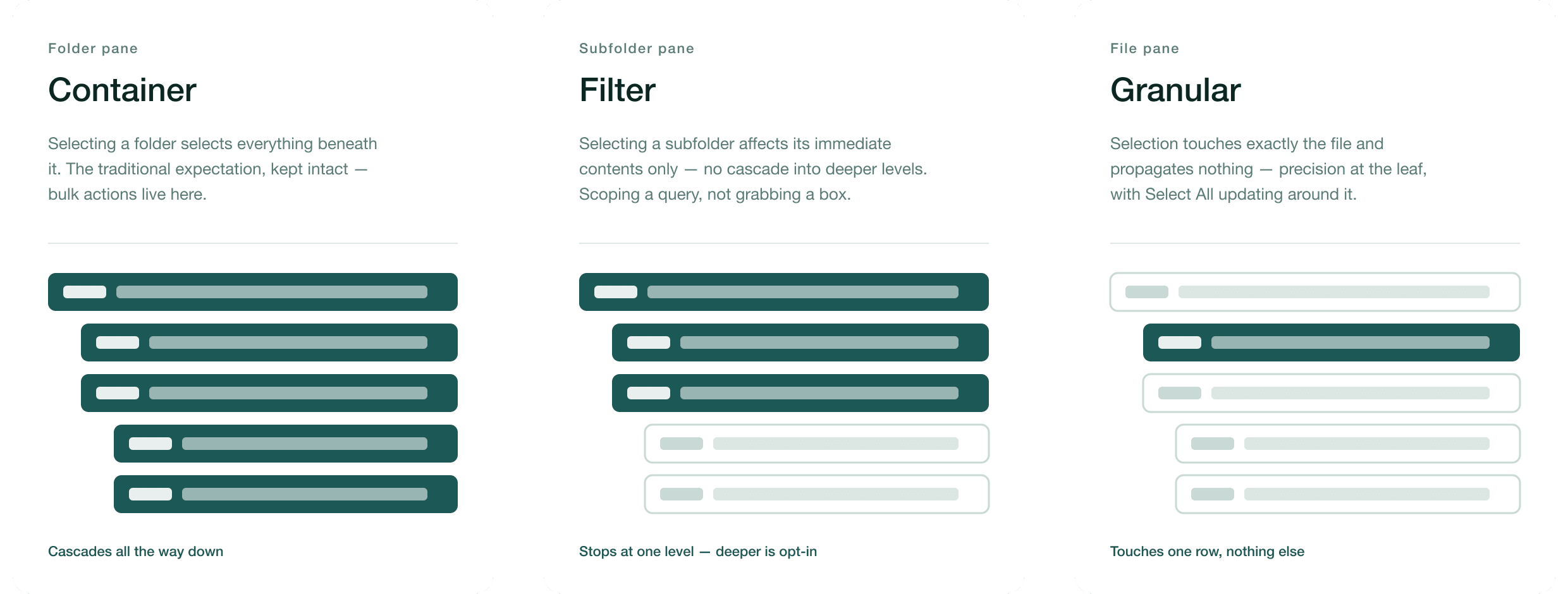
The resolution was to stop pretending the three panes are the same object at three zoom levels, and give each pane its own mental model:
- Folders are containers. The Folder pane keeps the traditional expectation intact: selecting a folder selects everything beneath it. Bulk actions live here, where the hierarchy metaphor is doing honest work.
- Subfolders are filters. The Subfolder pane deliberately breaks the container model: selecting a subfolder affects its immediate contents only, with no cascade into deeper levels. It behaves like scoping a query, not grabbing a box. Users who genuinely want the cascade get it explicitly, from the right-click menu, as an advanced action.
- Files are granular. Selection in the File pane touches exactly the file and propagates nothing: precision at the leaf, with the Select All state updating around it rather than overriding it.
The payoff lands in exactly the places that were fighting each other. The everyday user gets binary feedback — a thing is selected or it isn't, with no ambiguous half-states — and a Select All whose scope is always predictable. The power user gets refinement: specific files inside one subfolder, at any depth, with no sibling or descendant side effects, because nothing recurses unless asked. One interaction model, and both audiences read it as built for them.
Breaking a mental model as old as the desktop isn't something you do casually. We broke it in one pane, kept it intact in the pane where it still earned its keep, and wrote down why, pane by pane, cascade rule by cascade rule. That document became the spec the selection behavior was locked and built from.
Responsiveness
Responsive behavior shouldn't take away a control the user just had.
The obvious responsive strategy was view switching: when the file panel gets narrow, swap its column view for a list view. I flagged the flaw before it shipped.
If the system switches you to list view to fit the width, you can no longer switch back manually until the width changes. Responsiveness has quietly revoked a control the user had a moment ago. A layout rule was overriding an interaction contract, and users would experience it as the interface being arbitrary.
So I steered the team to the pattern Microsoft Teams and Notion use: keep the views intact and let panels hide, revealed on demand. The default experience shows the full multi-pane structure; as breakpoints bite, panels collapse behind a toggle rather than mutating into something else. One debate remained — reveal on hover or on click — and it resolved toward click, on accidental-trigger grounds: a panel that appears because your cursor drifted is a panel you didn't ask for.
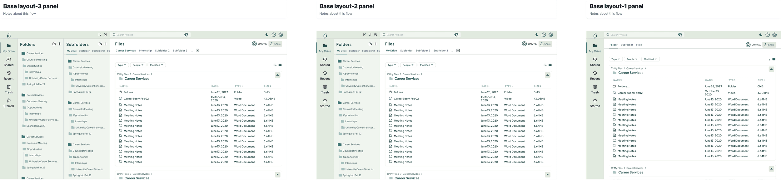
The principle generalized past this screen and into the system work that follows: responsiveness may reorganize an interface, but it may not silently take agency away.
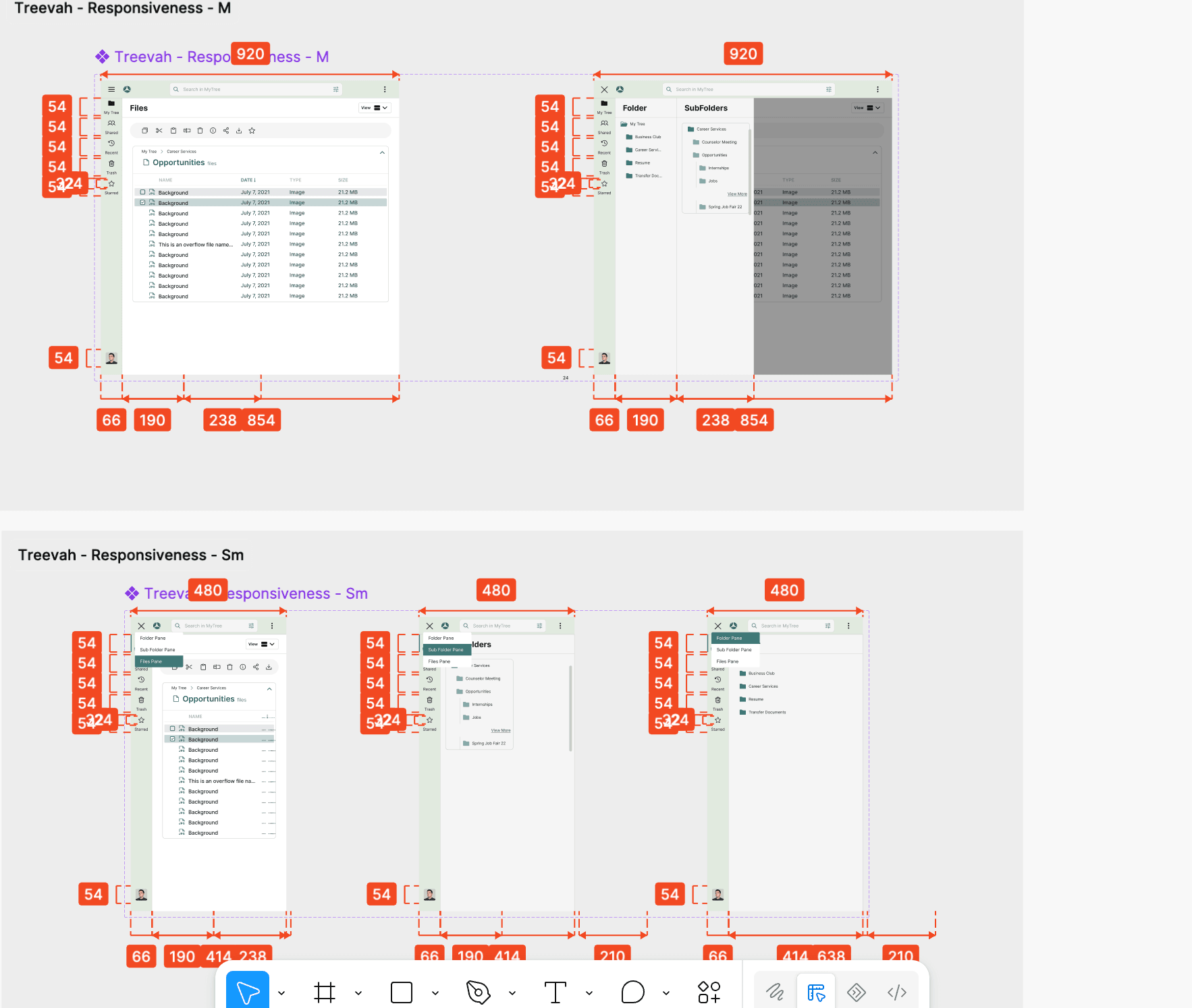
Validation
Fifteen rounds of testing, and the ones that changed my mind mattered most.
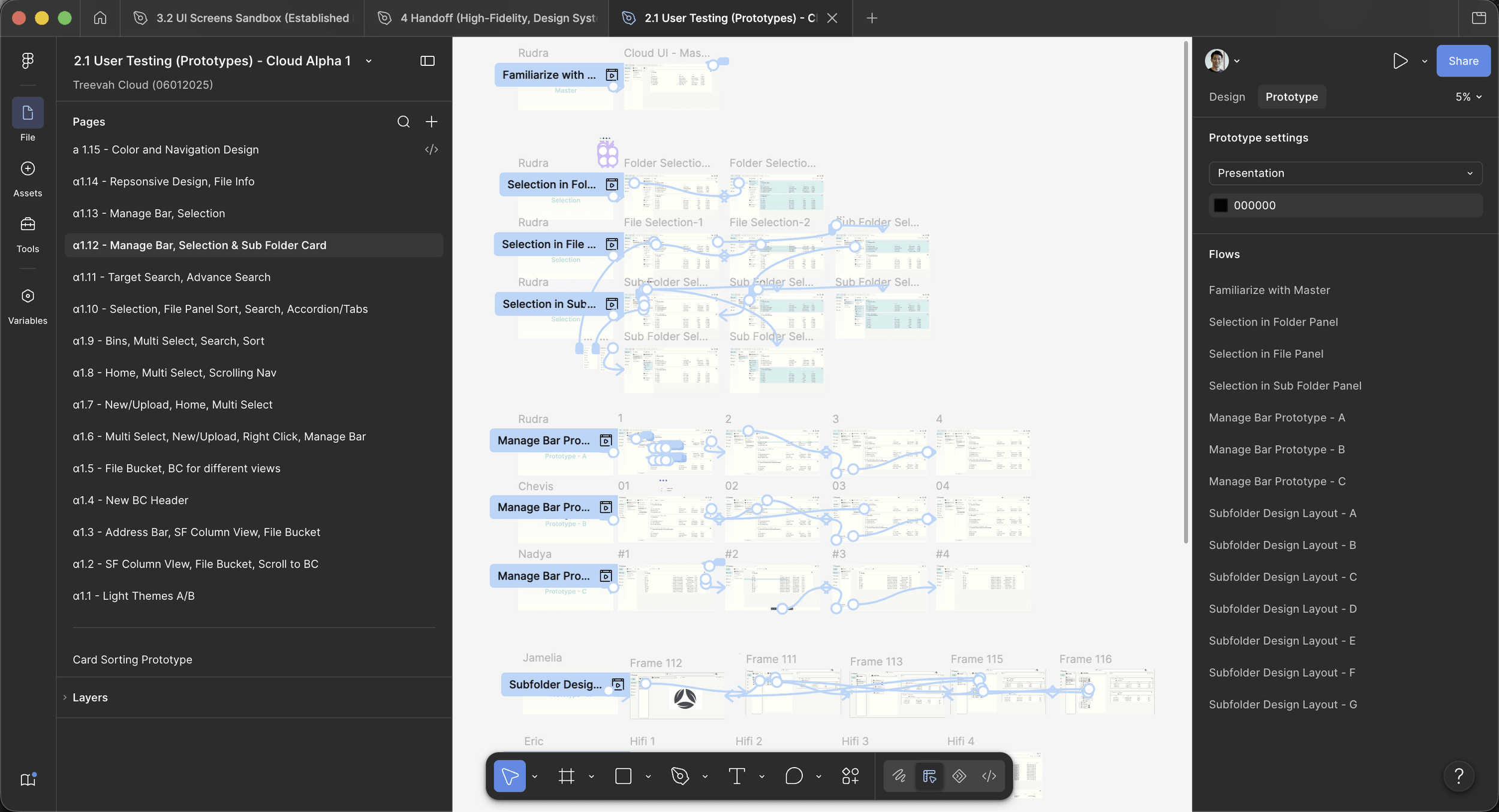
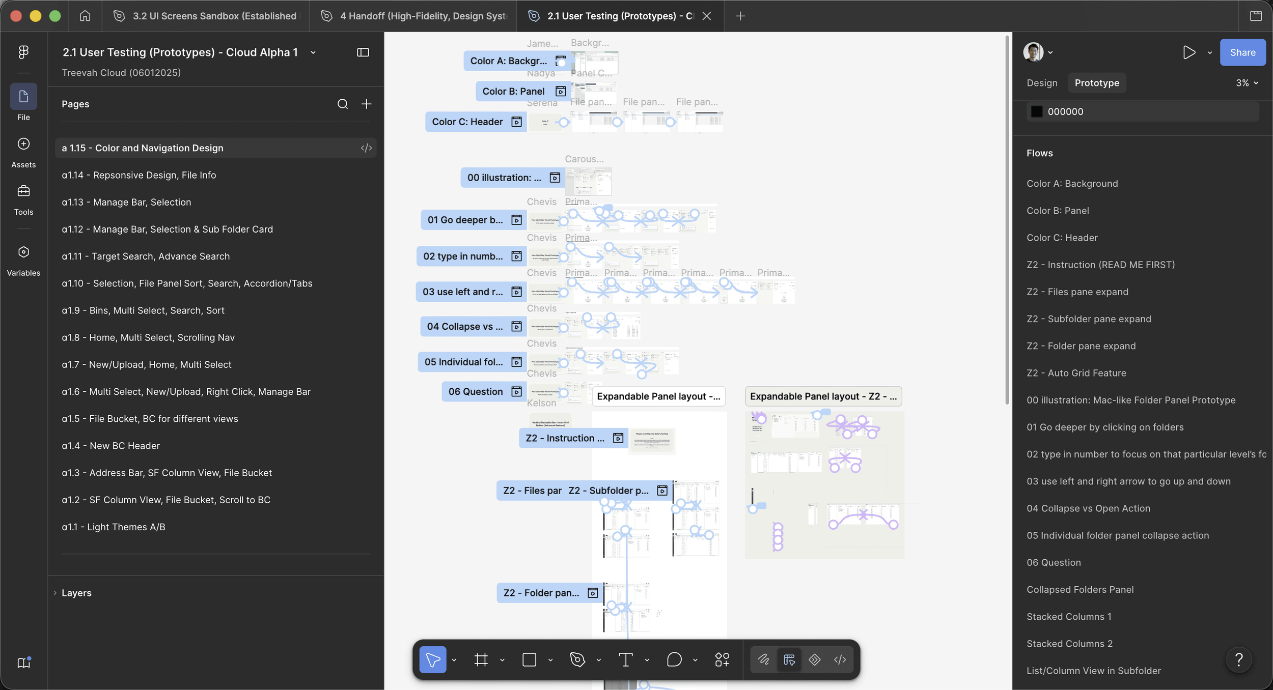
None of the calls above shipped on argument alone. Across the Cloud Alpha sprint I led more than fifteen rounds of user testing at a weekly cadence — accordion versus tabs in the navigation, target and advanced search, the subfolder card and its manage bar, three competing download flows — each round logged as a stamp-voted analysis board in Figma, page by page, participant by participant.
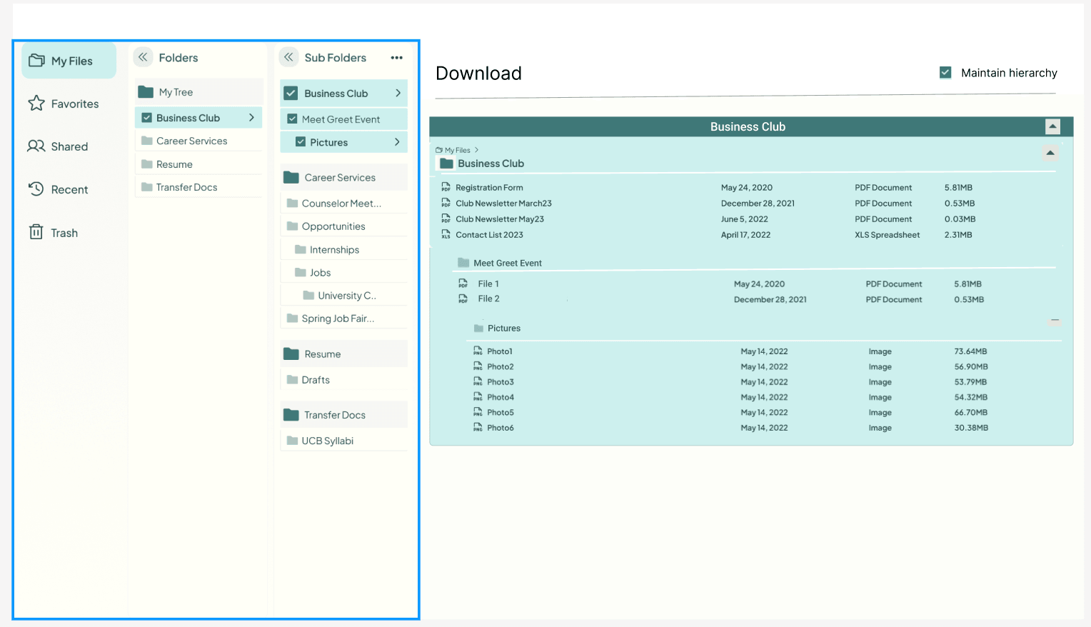
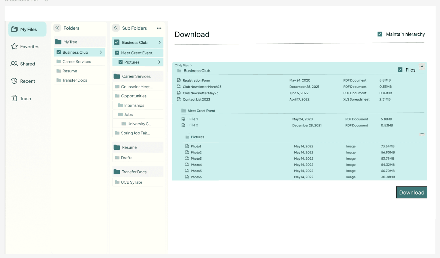
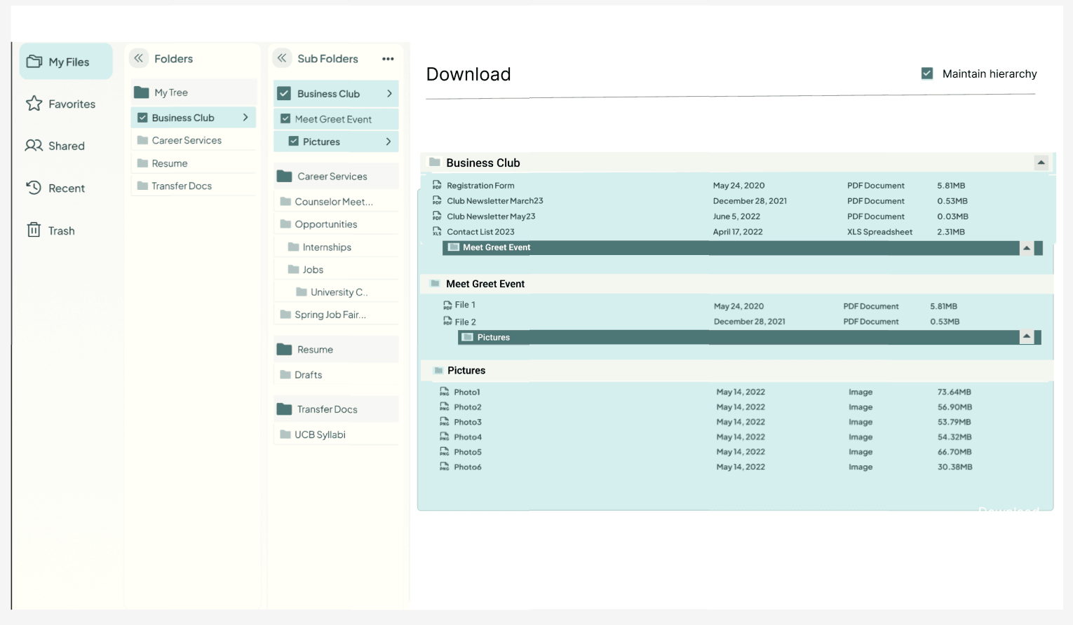
The rounds I value most are the ones that overruled me. The carousel I believed was self-evident tested as harder to learn than I'd allowed for, which pushed the breadcrumb and onboarding cues from concession to requirement. And my stronger early color treatments lost to muted ones so consistently that the finding folded back into the card-heavy-UI analysis behind the layout decision. A testing program that only confirms the designer is a rubber stamp; this one drew blood, and the design is better for it.
Top: α1.1 through α1.15 down the left rail: light themes, address bar, file bucket, multi-select, search and sort, manage bar, selection, responsiveness, colour and navigation.
Bottom: Inside one round: named flows per participant, with the prototype paths they were asked to walk.
Two research streams I didn't run sharpened the picture further, and they deserve their names. Mounica Vijayender's Product Tour survey — forty participants — mapped how users actually wanted to be introduced to the product: context I designed the navigation's learnability against. And the AI team's thirty-response survey found users consistently preferring rule-based automation over autonomous AI, with real anxiety around privacy and undo, a finding that kept the file manager's core behavior deterministic and legible. Their work isn't mine to claim; designing against it honestly is.
The Operating Model
Product teams stopped shipping high-fidelity work, and quality went up.
Every decision in the first movement was won the same way: argued in the open, tested, absorbed into the design. But those wins were landing in an org with no reliable way to carry them. Product designers drove research and early design, then handed developers whatever fidelity they personally could reach, so the quality of what shipped depended on who happened to touch it last.
Fixing handoffs one at a time is persuasion. I wanted structure.
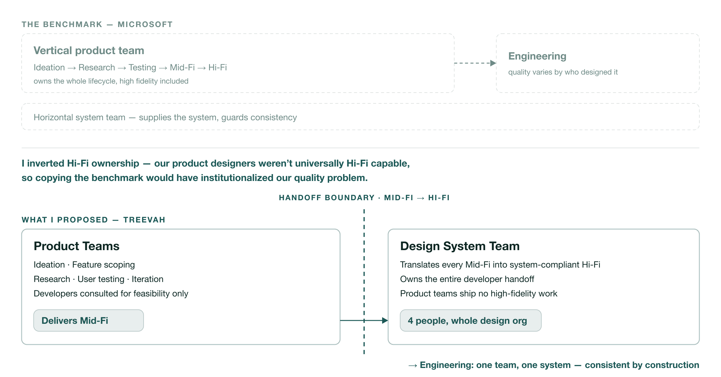
I started from a benchmark rather than a blank page. Microsoft runs vertical product teams that own their design lifecycle end to end — high fidelity included — with horizontal teams supplying the system and guarding consistency. It's a good model, and I deliberately broke from it, because it assumes something Treevah didn't have: product designers who can all produce production-grade Hi-Fi. Copying that structure would have institutionalized our exact quality problem.
The model I proposed inverts the Hi-Fi ownership. Product Teams own the early and middle of the lifecycle — ideation, feature scoping, research, user testing, iteration — and deliver Mid-Fi, talking to developers only for feasibility. The central Design System Team takes every Mid-Fi design and translates it into system-compliant Hi-Fi, then runs the entire developer handoff.
Product teams explicitly do not ship high-fidelity work, and because everything now passes through one team and one system, what reaches engineering is consistent by construction. Bryan approved the proposal and handed me the Design System Team to run it: four people, serving the whole design org.
The model also carries a second path for one specific failure mode. Brand and identity work — colors, typography, anything users would be asked to compare — routes through my team onto a unified master mockup before testing, because asking users to judge color schemes across differently built layouts biases the result toward the better-built layout. Process design and research design turned out to be the same discipline wearing different clothes.
Figma Governance
Two tracks, not one pipeline: the file structure enforced the team structure.
The two tracks
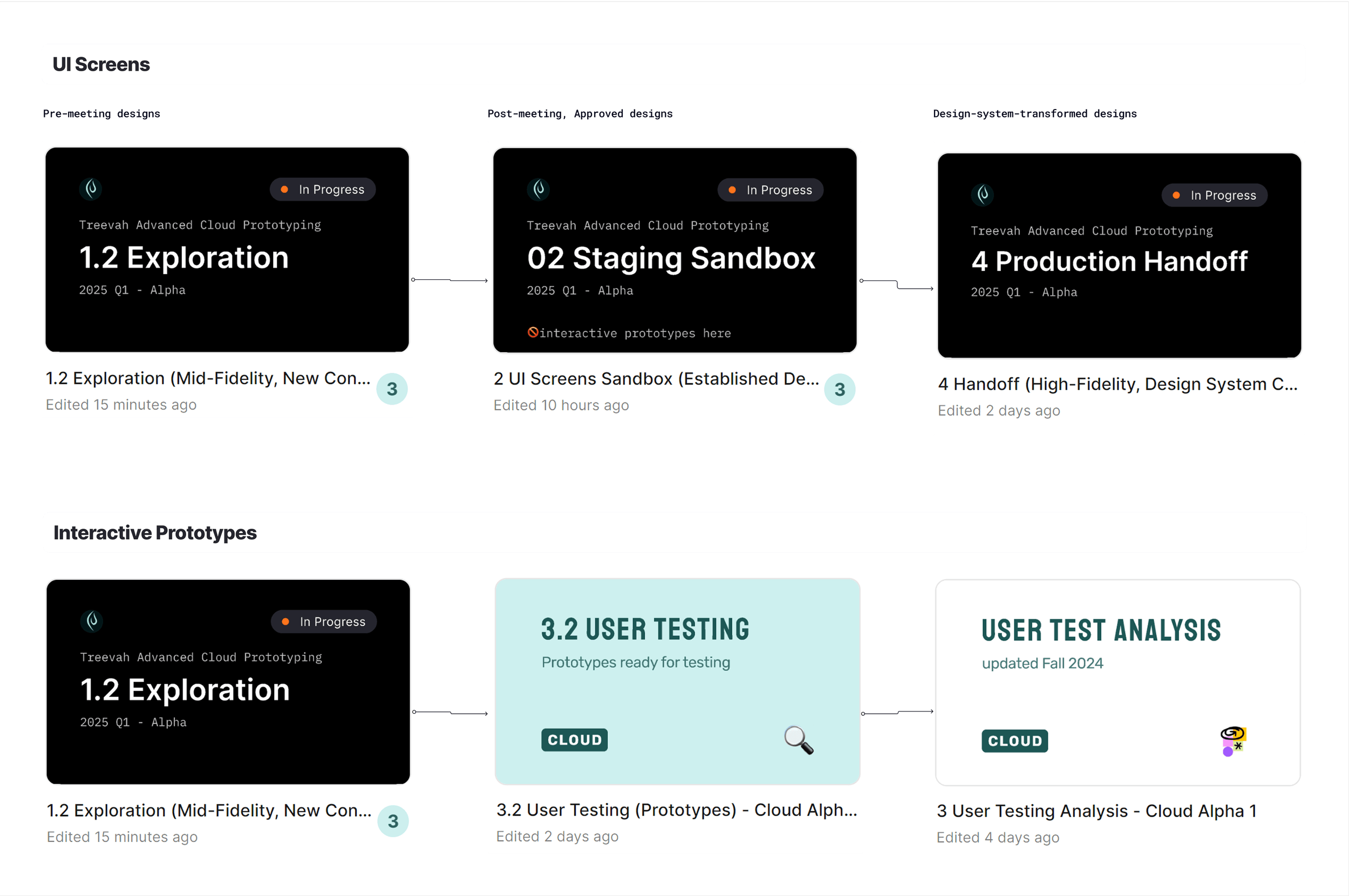
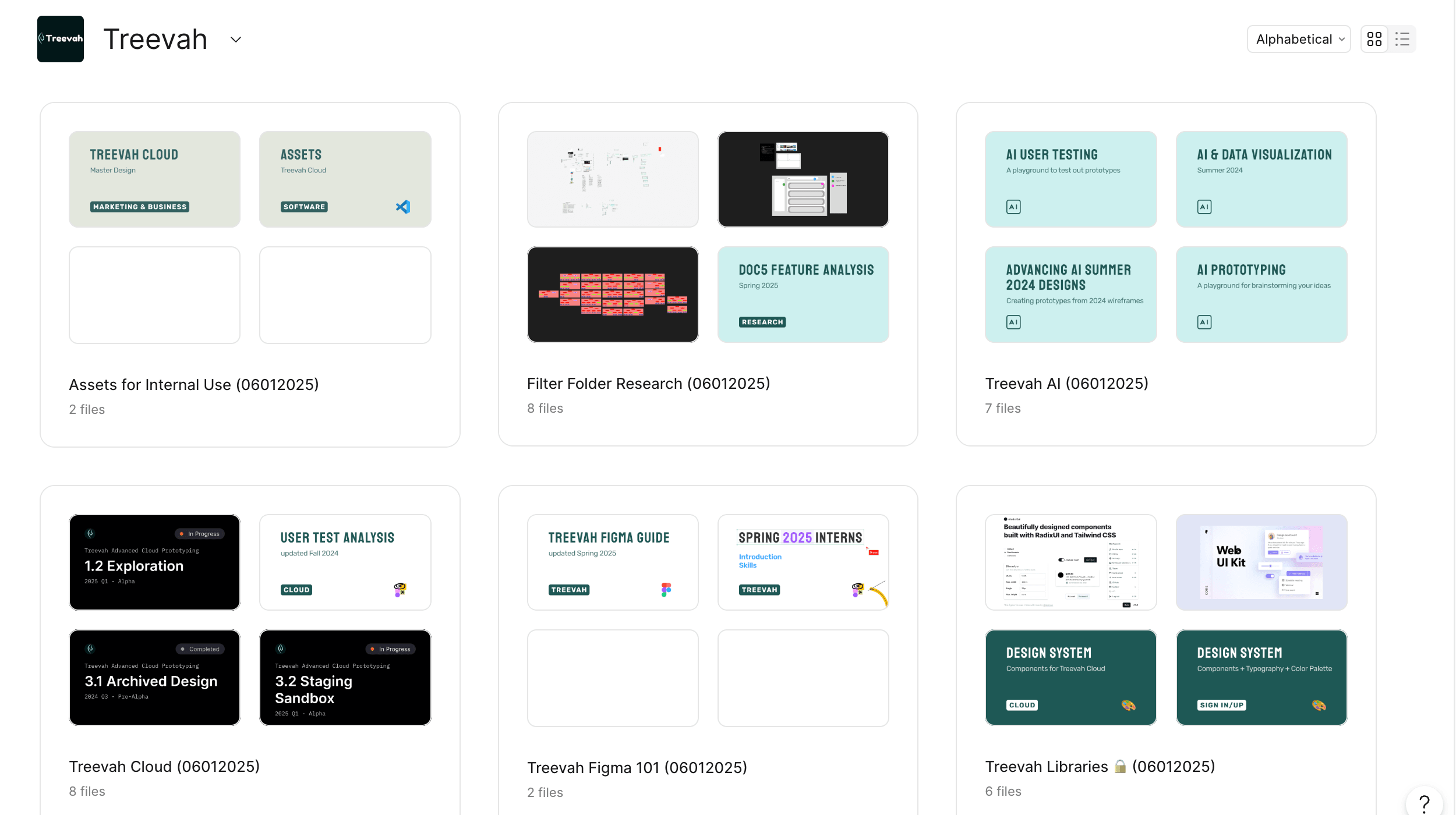
An operating model is a slide until the files agree with it. The Figma hierarchy I governed is two parallel tracks, not one pipeline. Screens travel toward production: 1 Exploration for early concepts, 2 Sandbox for established designs still in play, 4 Handoff for high-fidelity, design-system-compliant screens, and only the Design System Team works in Handoff. Prototypes travel toward evidence: 1.2 Exploration into 3 User Testing and its analysis boards, owned by the product teams and researchers.
The consequence is the point: a product designer has no file to put high-fidelity work into. Compliance with the operating model isn't requested in a meeting or policed in reviews. It's structural. The file where Hi-Fi lives is a file only my team touches, so the two-tier split enforces itself. Conway's law usually describes what happens to a team; this time it was applied on purpose.
The conventions underneath it
The rest is the unglamorous work that makes structure usable by people who aren't its author. Versioning is a convention — "1.1 → 1.2" means same purpose, fresh file, usually because the old one overloaded — and tabs are categorized by function rather than by owner, so finding a design never requires knowing who made it.
On May 1, 2025, I published the whole thing org-wide as "[Shared] Navigating Treevah's Figma DesignOps — A Guide for All Teams," v1.0, written for everyone else, down to a "how to find information" section.
The same instinct produced the user-flow template: a COPY ME file with numbered steps and slots for the date a flow is ready for handoff and the date it ships: a small ritual designed so other people's work arrives in a shape developers can consume.
![The user-flow template file, headed '[Review Me] An illustrative template for user flow designs' and labelled 'TrashTab - Chevis - April 24, 2025', with two filled slots reading 'Date ready for handoff: APR 22, 2025' and 'Date that is deved: APR XXX, 2025' above a checklist of flow decisions.](/_next/image?url=%2Fimages%2Ftreevah%2Fuserflow-handoff-template.png&w=3840&q=90)
The System
A new AI team plugged into the structure without my involvement, which is the real test of whether it worked.
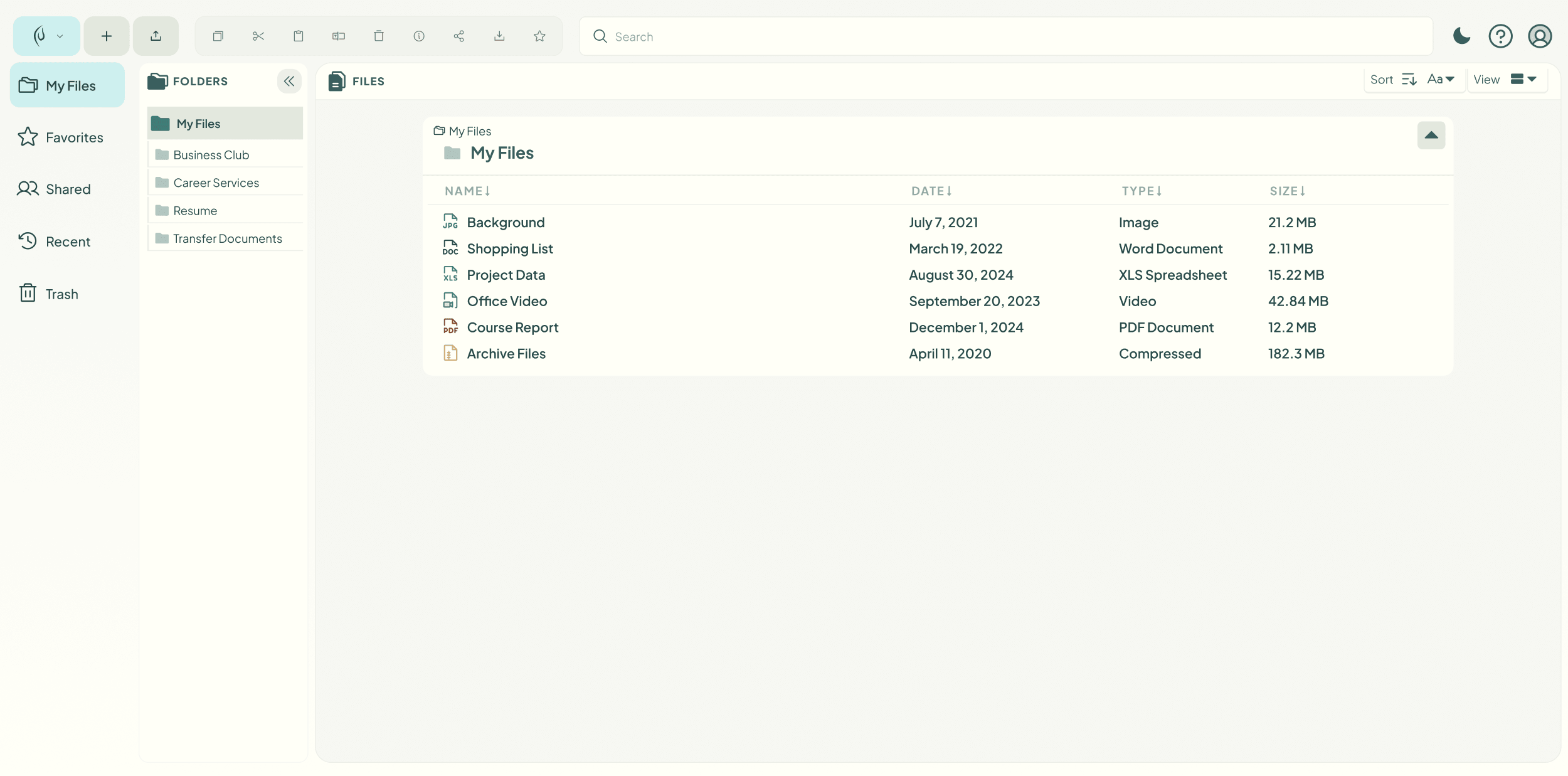
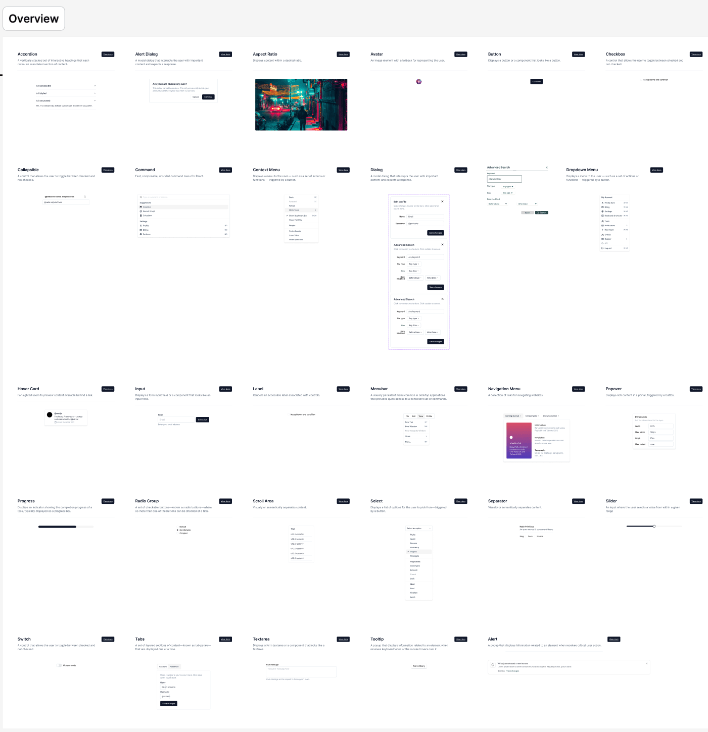
The Handoff file's consistency comes from the library underneath it. I architected it as two rails: an Atomic Component Library — components, primitives, empty states, icons — and a Complex Component Library holding the assembled surfaces: the sidebars, the folder and subfolder panes, the file panel.
Above them sits a semantic scale: Display 2xl→xs and Text xl→xs for type, with color styles organized by role rather than value: File Select, Master Color, Staging, Container, Base. The library grew past eighty components, and every one of them is a decision the next screen doesn't have to re-make.
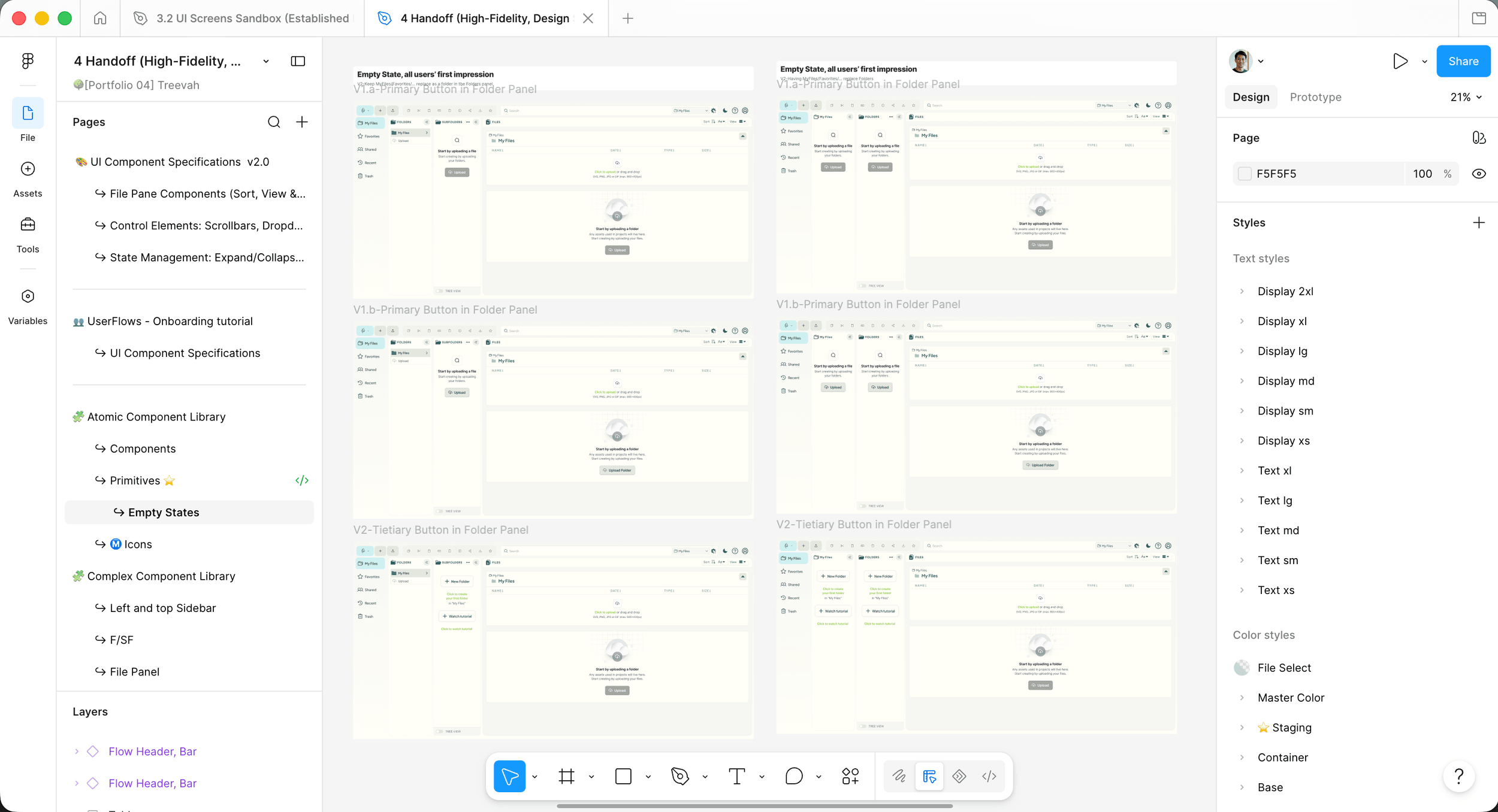
The tokenization strategy — semantic styles over raw values, so a brand change is one edit instead of a hunt — was mine to set and initiate. The implementation was co-owned: Kelson Liu and Rudra Barad built the library out alongside me, and that's a fact worth stating plainly, because a system two other people can build inside is already evidence the architecture holds.
The stronger evidence arrived mid-tenure, uninvited. Treevah spun up an AI team I had no involvement in: new designers, a new problem space, moving fast on their own research. They ran their prototypes through my Figma structure, built on my master components, and pushed their testing through the same pipeline; when Rafael and Rudra hit component-interaction problems, they resolved them inside the system without asking its author.
A design system's owner making it work proves nothing. Strangers making it work is the whole claim.
Outcome
Alpha shipped, and teammates were routing work through my structure without being asked.
Treevah's Cloud Alpha shipped in April 2025: the three-pane carousel navigation, the selection semantics, the responsive behavior, all of it built from the Handoff file, on the system's components. That's the headline outcome, and it's not the one I trust most.
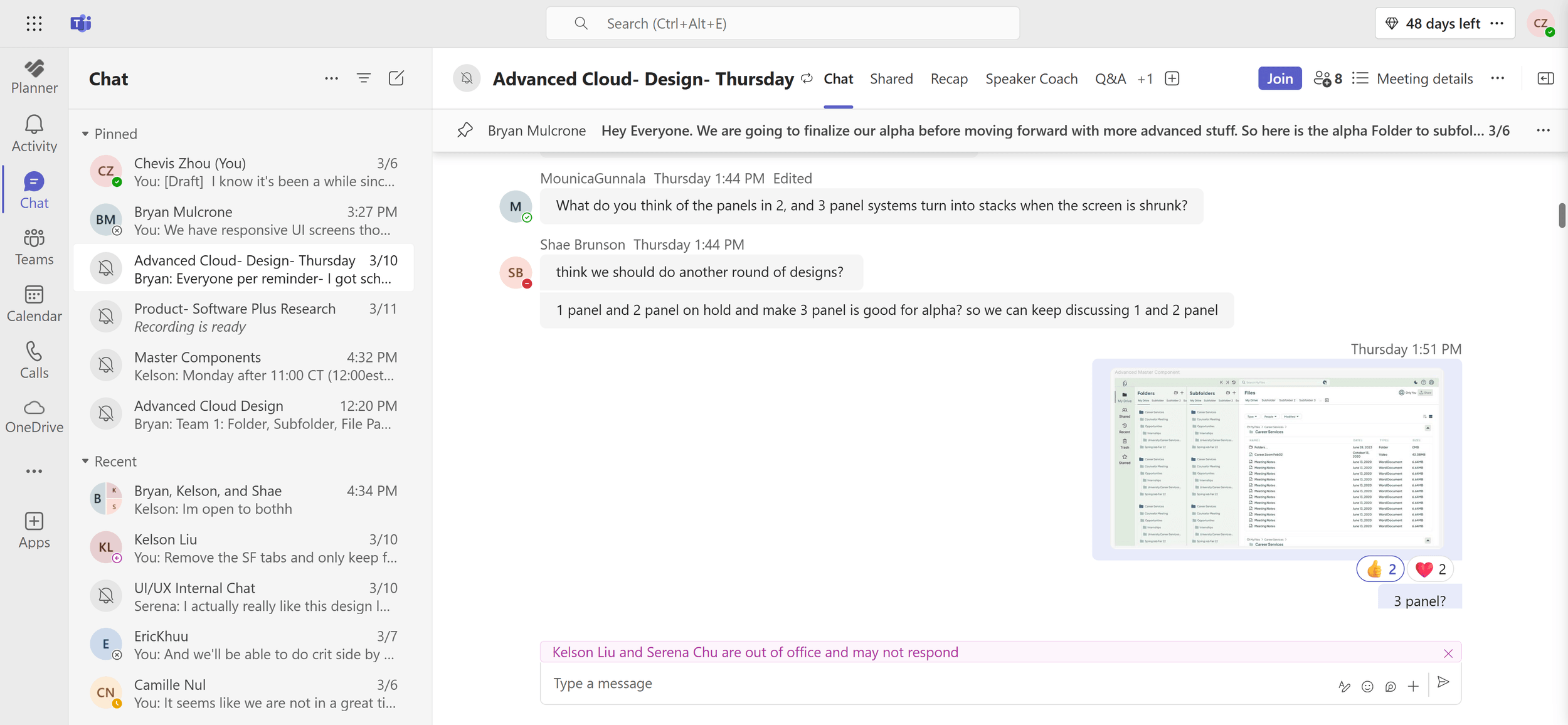
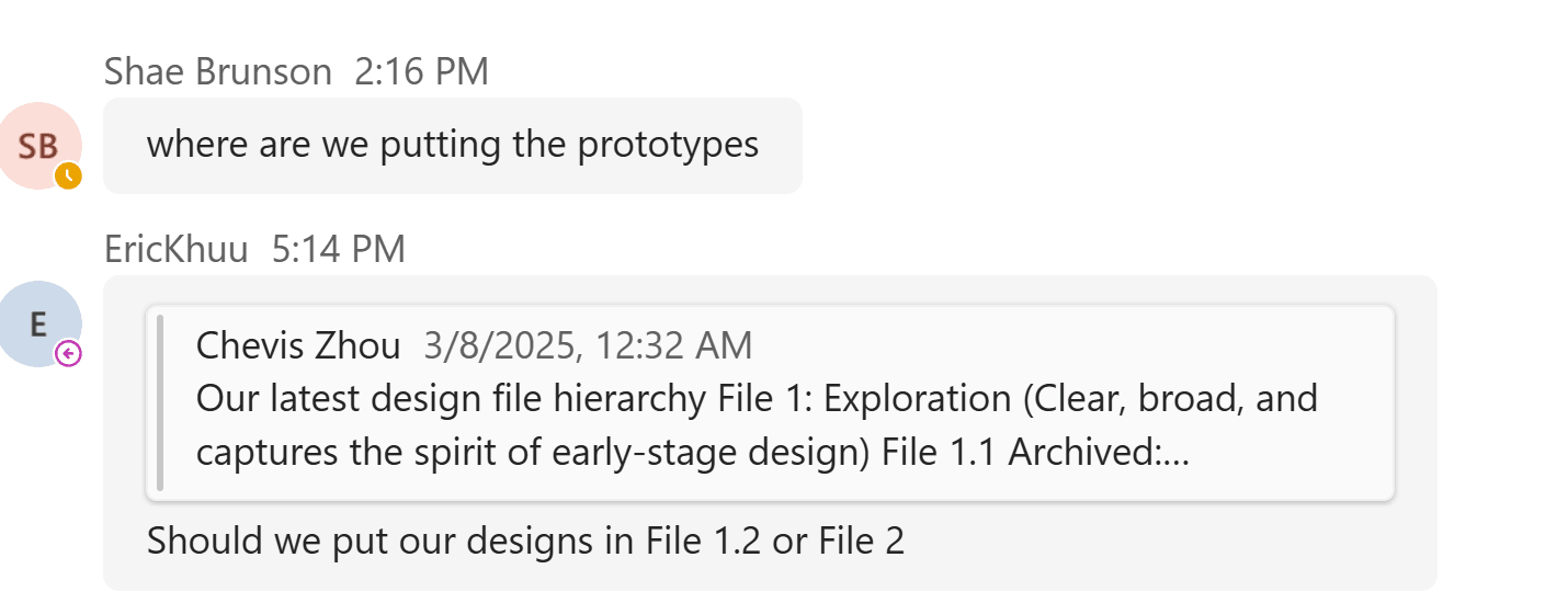
The one I trust most is what the record shows people doing when nobody was performing for a case study. By early March, teammates were asking me where their designs belonged, routing their work through the file hierarchy as the default rather than as a favor. A week later the team formally approved the three-pane direction. Adoption you have to request is compliance; adoption people ask you for is infrastructure.
The business numbers came later, and I report them at one remove. I left Treevah in June 2025; the beta launched after my exit. Per Treevah's post-launch data, the redesigned experience drove an 8% increase in adoption, a double-digit NPS improvement, and 23% less friction in key flows. I didn't measure those outcomes, but the design they measured is the one this study just walked through.
And one exchange described the system better than any number. Kelson watched a batch of screens come together and said he couldn't imagine how many hours I'd poured in. I answered honestly: about five, because I have a design system. His reply is a peer naming the mechanism — the thinking was banked in the system, so the designing got cheap — and it's the study's thesis in eleven words:
Testimonial“more like 5 hours of designing, 20 hours of thinking~”
Kelson LiuDesign System Team, Treevah
Testimonial“He didn't just design screens — he took full responsibility for building a design system from the ground up. He introduced tokenization, cleaned up inconsistencies, and created a scalable foundation that other designers could easily plug into… He improved design processes, created structure where there was none, and made a measurable impact on the team's overall workflow and collaboration.”
Bryan MulcroneFounder & CEO, Treevah
Key Takeaways
Structure beats persuasion
A workflow people have to follow outperforms a workflow you have to keep asking for. The operating model worked because it lived in the file structure itself — a product designer had nowhere to put non-compliant work — not in my ability to keep repeating the rules.
The objection you absorb outperforms the argument you win
Bryan's carousel pushback was right, and designing around it produced the breadcrumbs, pinnable panels, and slider the shipped product kept. A strong stakeholder is a design input, not an obstacle between you and the design.
Design for the team you have
Both movements turned on the same honesty: choosing the layout our engineers could build well, and breaking from Microsoft's operating model because our product designers weren't universally Hi-Fi capable. Benchmarks tell you what worked somewhere else; judgment prices in who's actually in the room.
A system is finished when it works without you
The AI team plugging in unassisted, teammates routing work through the hierarchy unprompted, a peer measuring the system in hours saved. Every real outcome here is the structure operating in my absence. Bridging product and system isn't a role you hold. It's a structure you leave behind.
Related Work
AethrDesign: A spec-gated pipeline that turns one client brief into a proposal, a portal, and a typed codebase.
Solara: Design-system architecture behind a developer documentation portal, from tokens to shipped pages.
GMU: A graduate capstone testing whether assistive technology can rescue an inaccessible website.