A sunrise identity for an open-source Python framework, and the marketing homepage built from it. Live at solara.dev.
Solara's name already carried an association with sunlight. I built the framework's visual identity on it, in a market of cold neutral palettes, and designed a homepage whose motion could run on CSS alone. The engineers built the page in HTML and CSS, carrying its identity, structure and copy.
A sunrise identity for an open-source Python framework, and the marketing homepage built from it. Live at solara.dev.
A sunrise identity, and a homepage designed within what two engineers could build.
Open a dozen developer-tool websites and you'll see the same palette again and again: cold blues, neutral grays and dark gradients. Solara's name offered another direction, because "Solar-a" already suggests sunlight and warmth. I turned that association into a visual identity, then into a marketing homepage.
I designed the identity, the homepage and its motion concepts. Before designing any hover state, I agreed a constraint with the engineers: every motion concept had to be expressible with CSS opacity and color transitions. That constraint shaped the component design and the handoff.
The homepage design: sunrise identity, dark surface and detail cards from the design system.
Impact
0 JSEvery motion concept designed to run on CSS opacity and color alone
1All-hands presentation from prototype to approval
0Clarifying round-trips before engineers could start building the card system
Problem
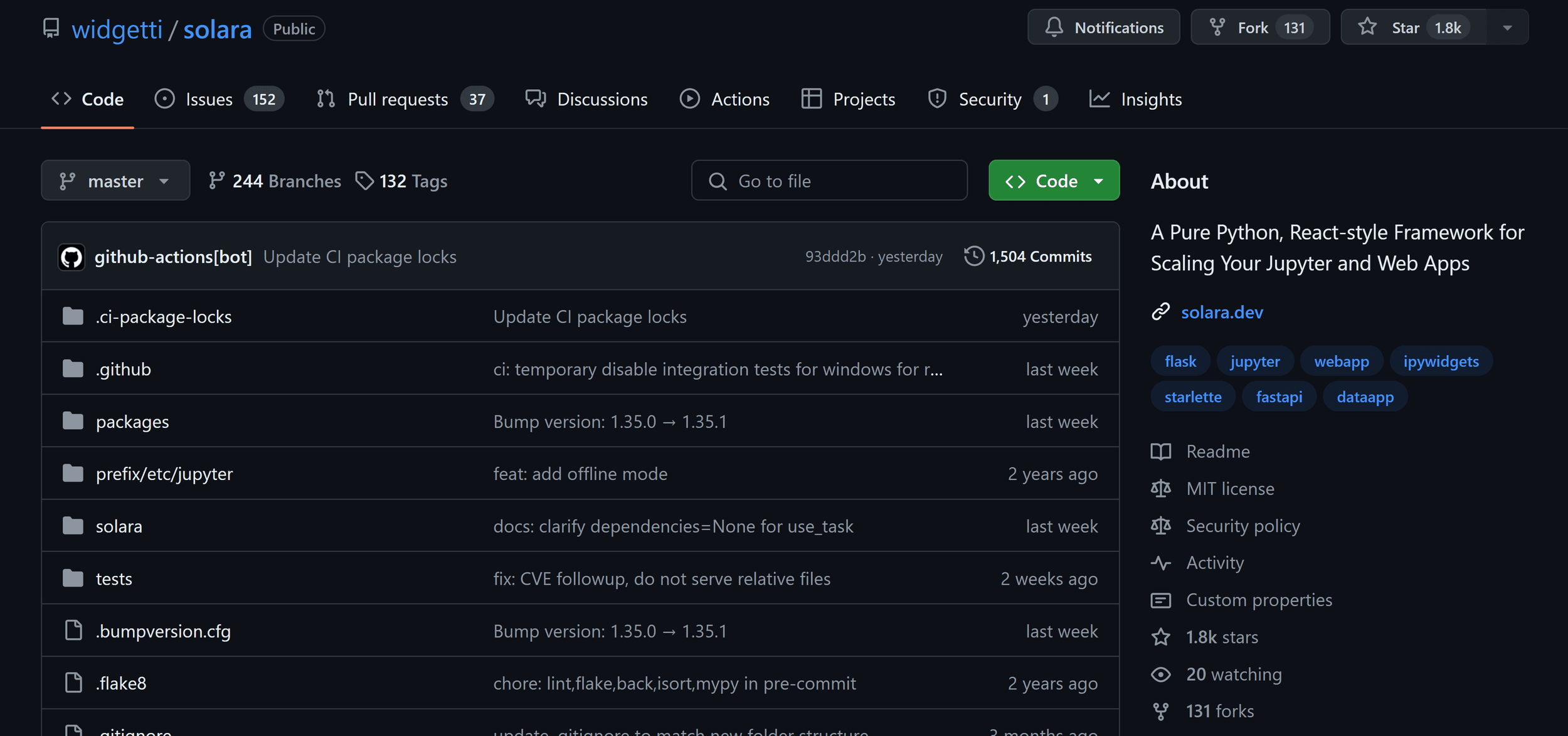
Most visitors came from GitHub, and the landing page undersold the framework they had found.
Most of Solara's inbound traffic came from its GitHub repository, so visitors usually arrived already technical and curious about the framework.
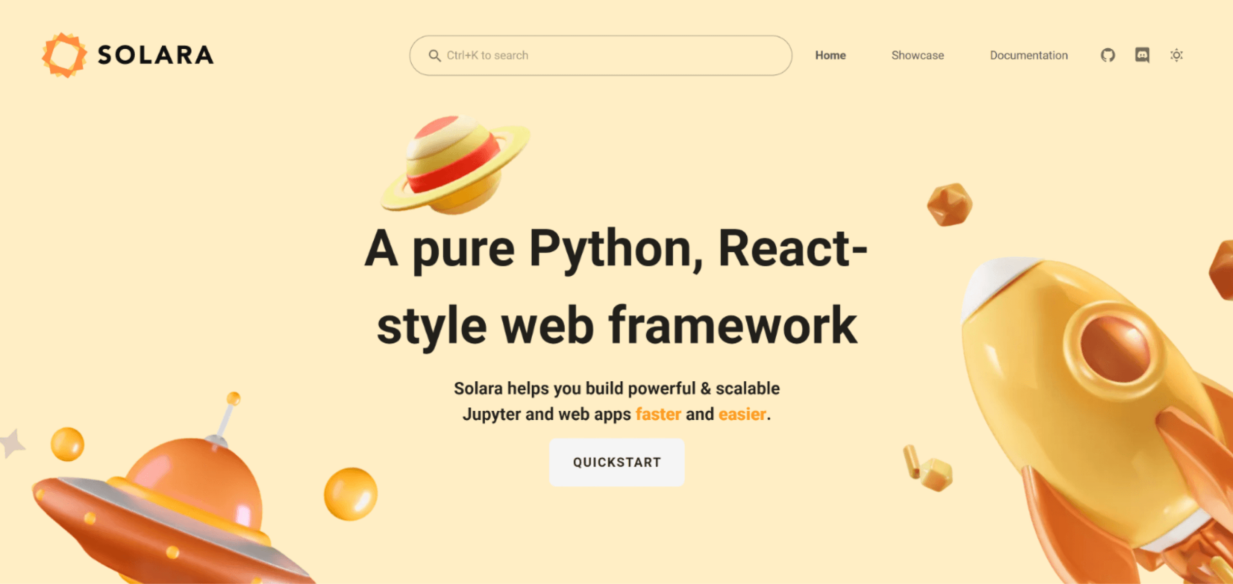
The landing page they reached used a pastel space theme with cartoon rockets and toy planets. It was charming, but it felt closer to a side project than to a framework teams could build production apps on. With the team, I set three goals for the redesign:
Clearly communicate the value proposition. What Solara is and who it's for, in one screen.
Establish a distinct visual identity. One that could stretch across the site, docs and product.
Simplify the information architecture. Focus the page on one primary action.
Where Solara gets discovered: GitHub dominates inbound traffic, so the landing page receives visitors who already know what the framework is.
Identity
The identity came from the name: a sunrise.
From association to concept
I built the identity on the one association the product already owned. In a category dominated by cold blues, warmth was a clear point of difference.
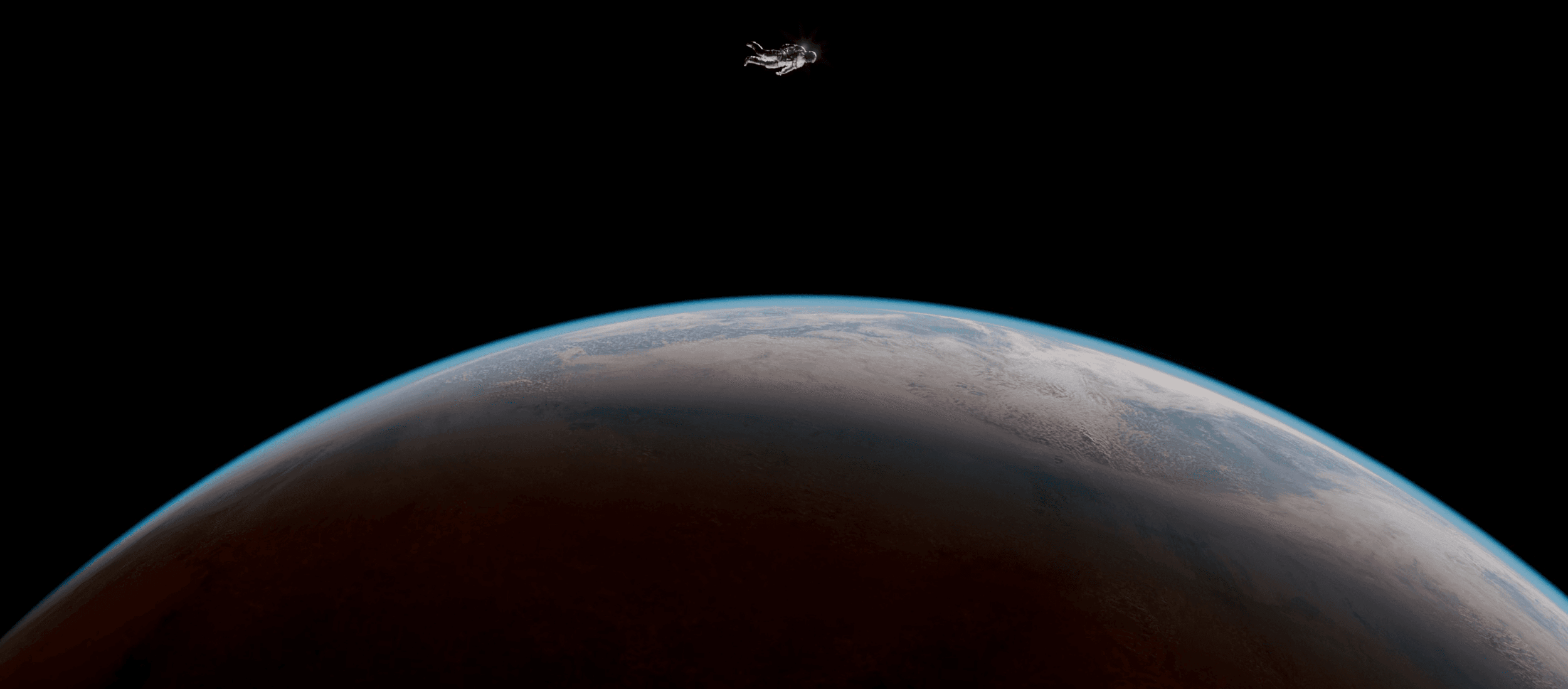
The reference that set the direction was an image of an astronaut above a planet at dawn: vast, calm and technical. I translated it into a realistic sunrise horizon for the hero, keeping the old site's sense of space while replacing its toy rockets with a calmer register.
From reference to concept: the astronaut image, distilled into the sunrise horizon that anchors the identity.
InspirationConceptInspiration: Astronaut floating above a planet at dawn, the visual reference. Concept: The sunrise horizon concept distilled into a gradient composition.
The same reference suggested the motion
The planet's rim of light in that photograph starts dim, sharpens toward the center of the curve and diffuses again. I abstracted that into one motion pattern, emerge, sharpen and diverge, for section reveals, component hovers and the hero. One gesture repeated at every scale kept the motion concepts consistent with the identity.
From toy-like to technical
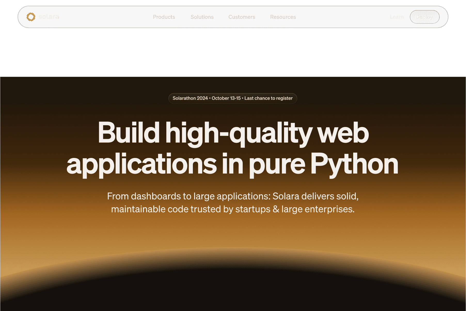
On the homepage hero, the sunrise replaced the pastel illustrations with a dark surface, a warm horizon glow and more room for typography.
The hero, before and after: from a toy-like illustration to a calmer, more technical surface.
BeforeAfterBefore: Homepage hero before redesign — pastel spatial theme with cartoon rockets. After: Homepage hero after redesign — dark sunrise horizon.
The direction arrived in versions
The sunrise was the third hero direction. The first layouts used the generic dark SaaS look the redesign was meant to leave behind. The second applied the Solara brand to a flat dark surface. The final pass committed to the sunrise horizon, which the built homepage carries as a CSS gradient.
Three passes at the hero: a generic dark template, the Solara brand on a flat surface, then the sunrise direction.
One language across surfaces
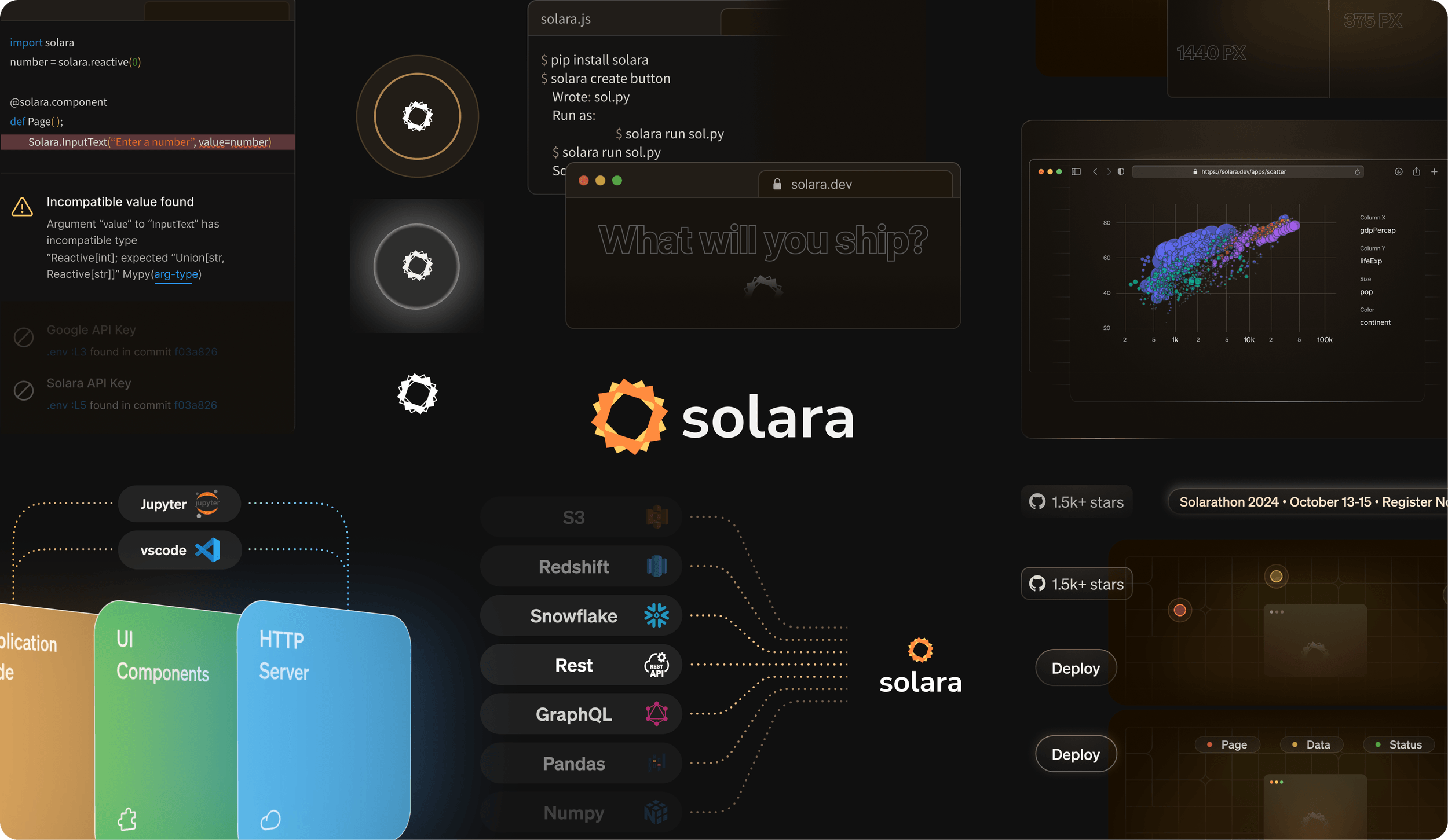
Logo treatment, palette, code-snippet styling, integration badges and event banners all draw from the same warm-on-dark language, so the repository, site and docs read as one product.
One visual language, many surfaces: the identity applied across the marketing system.
The hero motion concept in the prototype.
https://solara.dev
Design System
A motion language designed to run on CSS opacity and color.
The constraint
Solara's team had two engineers and a framework to maintain, and the marketing site shouldn't require a JavaScript animation runtime. So I set the constraint before designing any hover state: every motion concept had to use CSS opacity and color transitions alone. The emerge-sharpen-diverge pattern fit it well, because it describes light arriving rather than objects moving.
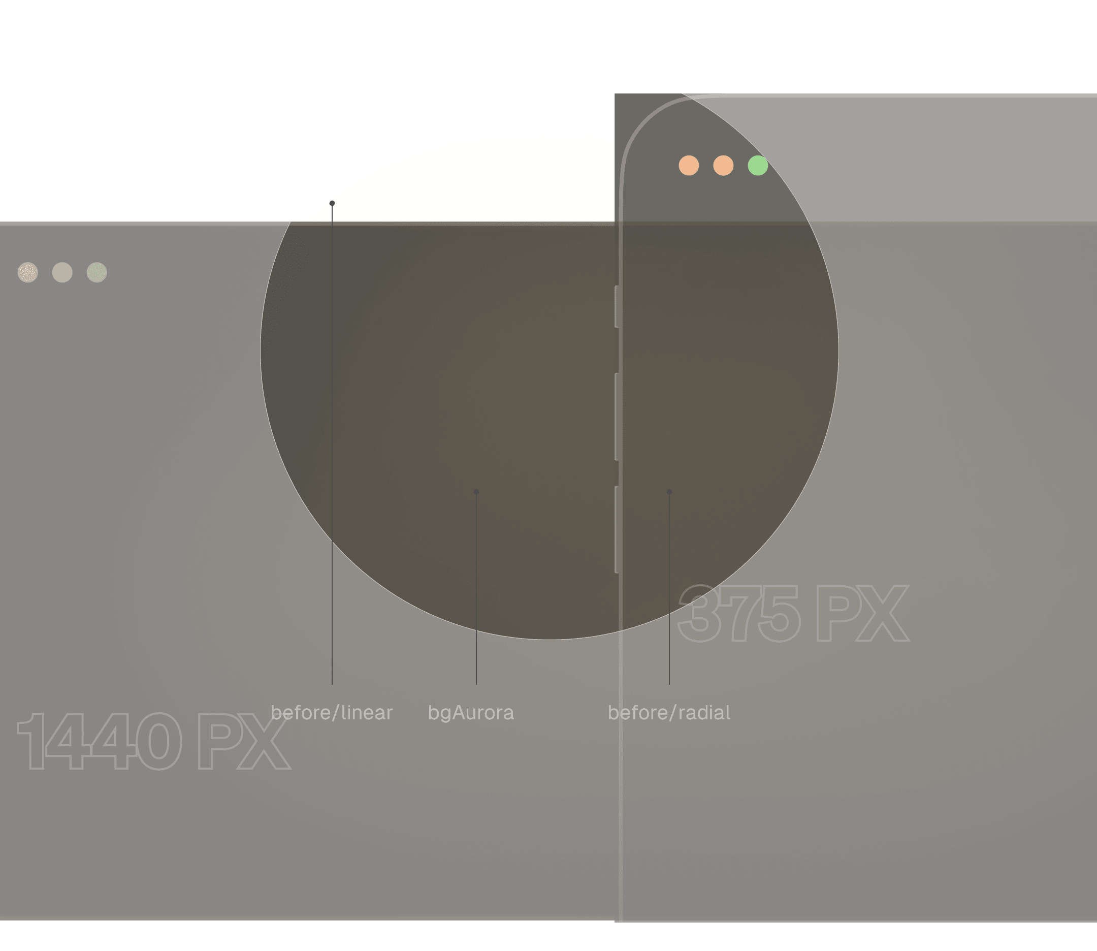
The card component shows the result. Its backdrop is a small version of the hero: the Solara emblem glow (bgAurora) sits beneath a dark foreground layer. On hover, the foreground fades and the emblem shows through, a sunrise at component scale.
Hover is also where the brand color appears. Solara's orange is hard to use as a primary interface color without failing contrast, so the product keeps it off resting states. The marketing pages used the same approach: a dark, restrained surface at rest, with warmth arriving on interaction.
The backdrop logic: foreground scrims over the emblem fill, with hover changing only opacity and color.
The marketing pages deliberately sat outside the product's semantic token layer. Those expressive one-off surfaces were styled directly; the token architecture behind the product is covered in the documentation case study.
The card hover concept: a sunrise at component scale, designed for CSS.
Homepage
One page with one primary call to action.
A simpler structure
The old site spread attention across navigation links competing for the same click. The redesign used fewer links, one primary call to action and a scroll sequence that answers a developer's questions in order: what Solara is, what it looks like, what it can do and who uses it.
Responsive and accessible in the design
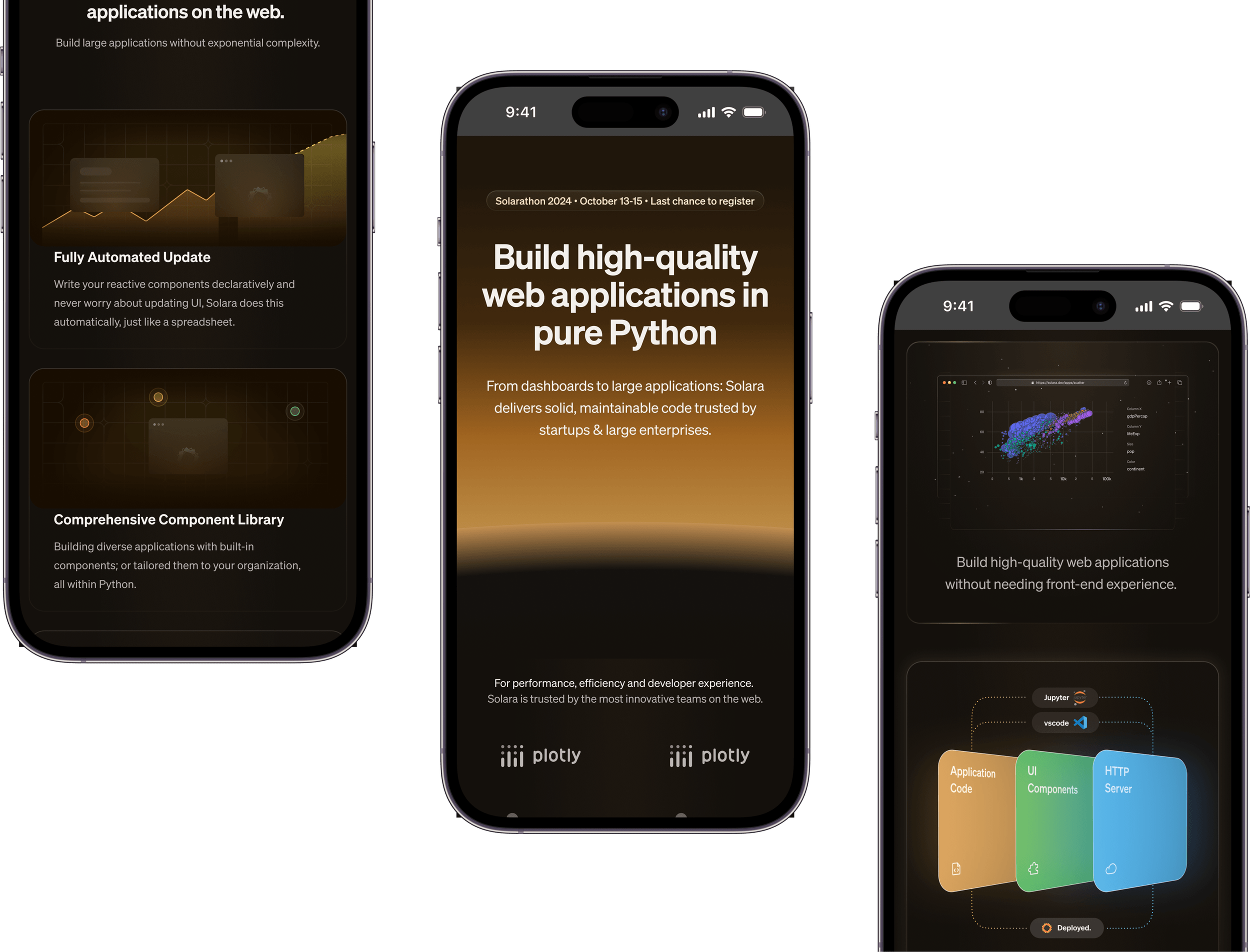
The design scales from the 1440px marketing viewport down to mobile by recomposing the same cards and motion logic. In the design, calls to action and core information meet WCAG 2.1 AA contrast and focus standards.
The same system, recomposed for mobile without a separate design or dropped content.
The showcase section in the prototype: real Solara apps, framed in the identity.
https://solara.dev
The feature section in the prototype, with the card system in context.
https://solara.dev
Handoff
Specs in the implementation's vocabulary, and a prototype engineers could build from.
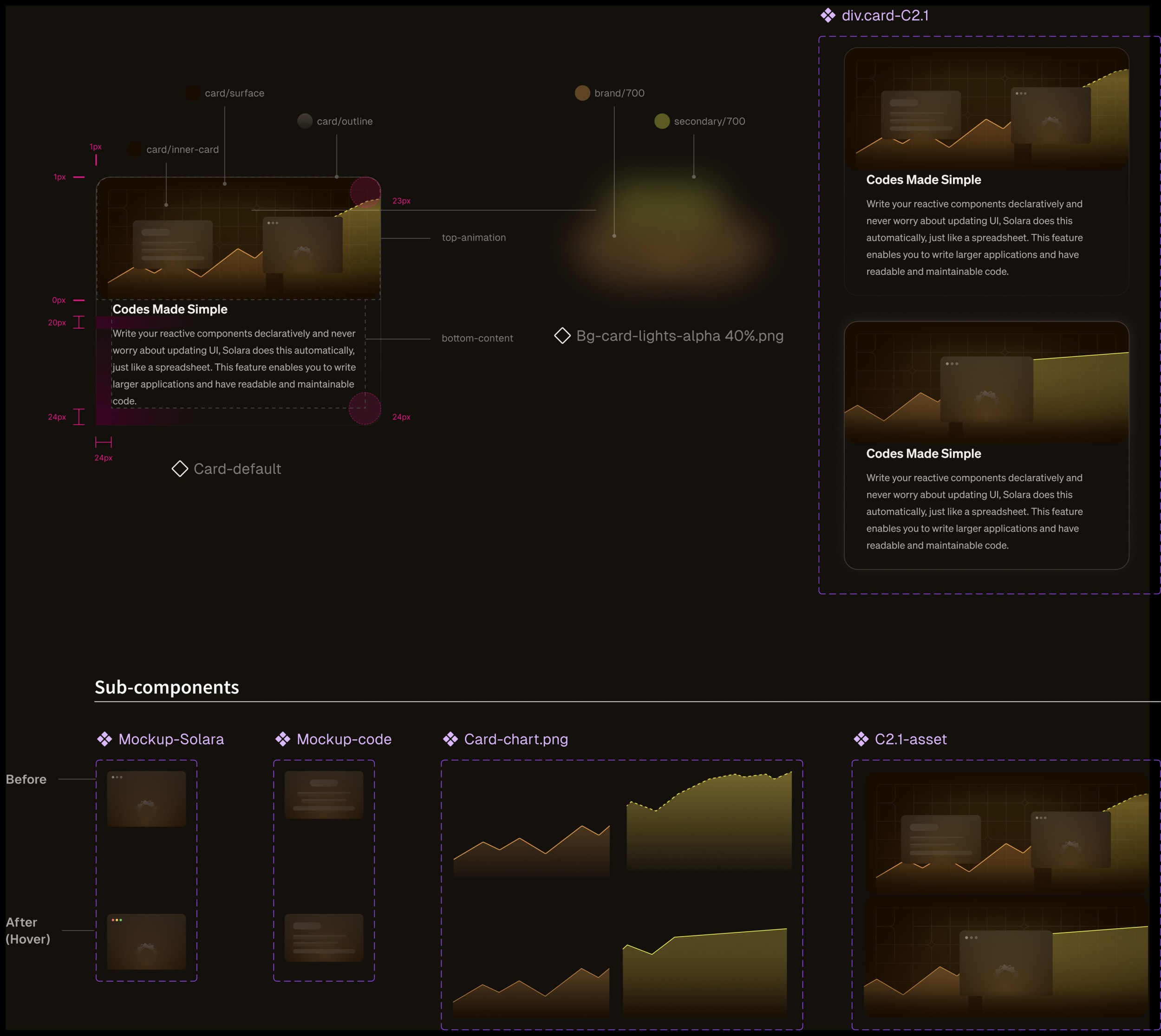
Because the motion was designed in CSS terms, the card spec could be exact: layer names, pixel padding, color tokens and before-and-after hover states for each sub-component. The engineers started building the card system without a clarifying round-trip.
The final deliverable was an interactive Figma prototype with responsive breakpoints and interaction states, plus those annotated specs. You can explore the homepage prototype or browse the curated design file.
The card spec: annotated to the pixel, states included.
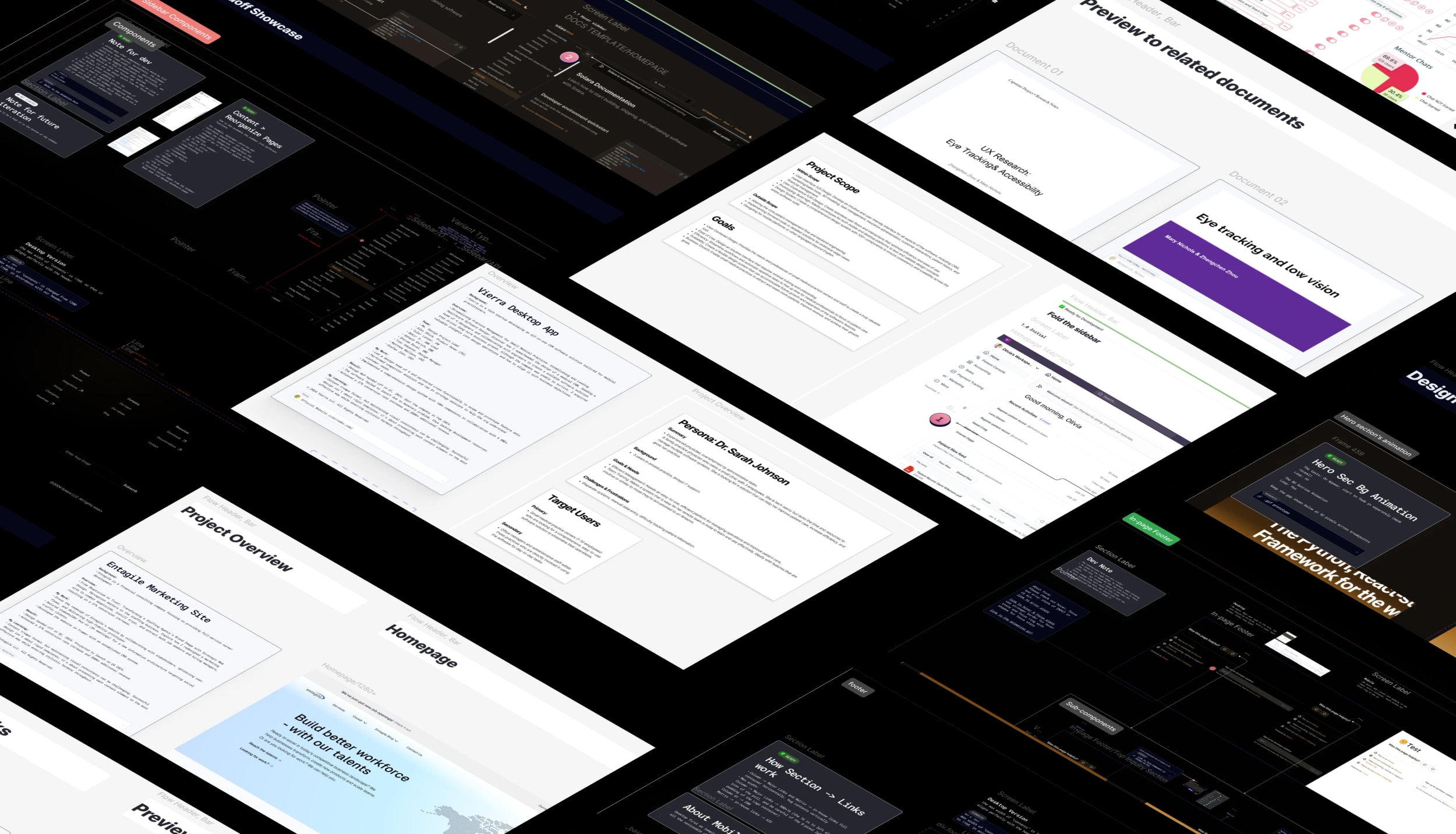
A curated sneak peek of the design files.
Outcome
Approved at the first all-hands, then built in HTML and CSS with the sunrise identity.
I presented the homepage prototype at an all-hands in January 2024, and it was approved with minor changes. The design MVP was finished in Q1, and the marketing site launched in Q3 2024.
The engineers built the homepage in HTML and CSS. It carries the structure, copy and sunrise identity, with the sunrise rendered as a CSS gradient. The designed motion layer and some visual fidelity did not make it into the build.
The site launched during a period of strong product growth. Monthly downloads grew 13× through late 2024, and Solara had 3k+ new users by the end of Q4 2024, several of them enterprise. That growth belongs to the framework, its documentation and the team's wider work; no separate effect of the marketing site was measured.
Testimonial
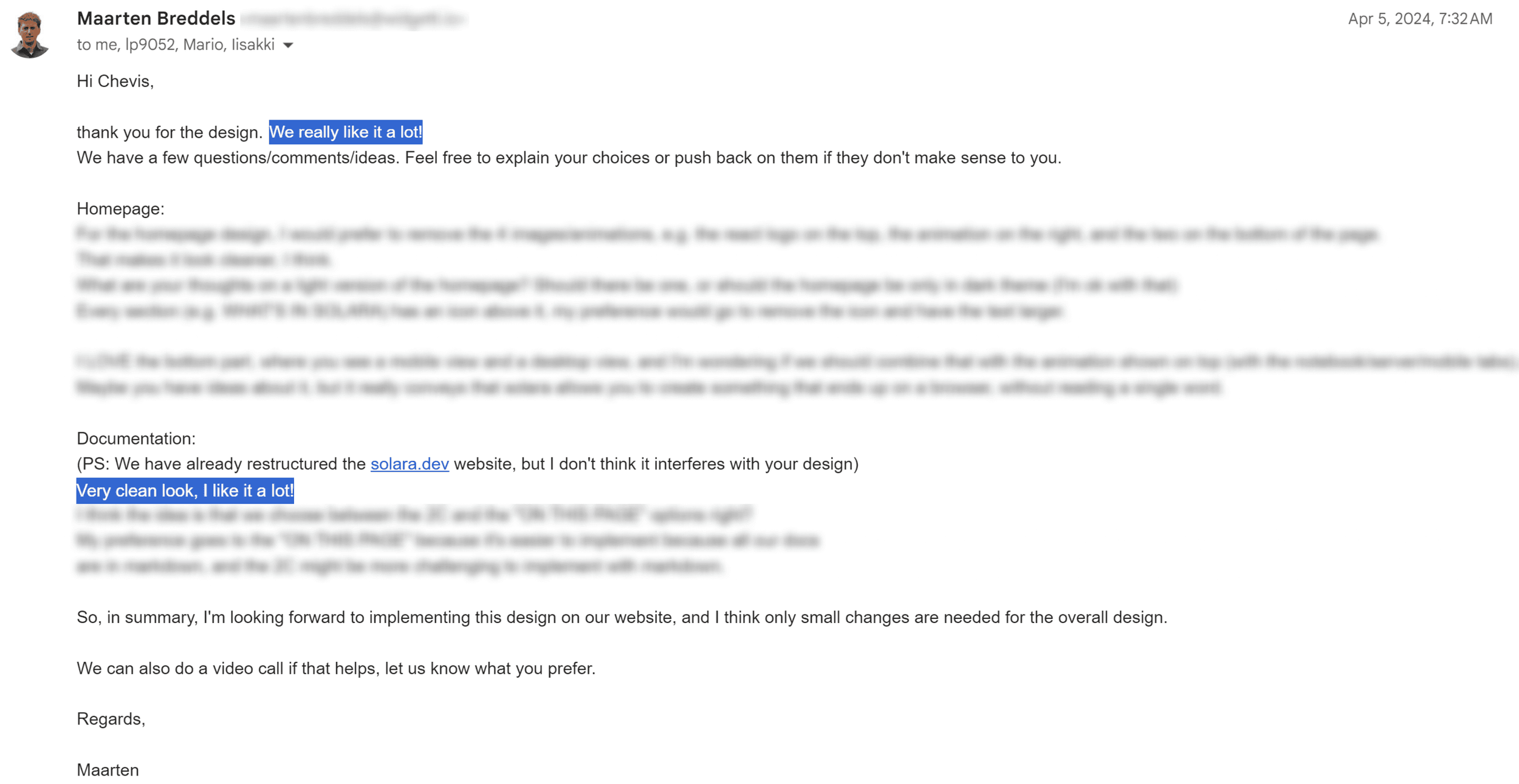
“Thank you for the design. We really like it a lot! I'm looking forward to implementing this design on our website — I think only small changes are needed for the overall design.”
The sunrise came from Solara's own name. Starting there gave the identity a reason that the team could recognize immediately, instead of a style chosen to look different.
Design motion in the implementation's language
Setting the CSS constraint early gave the engineers a motion language they could evaluate and build without a new runtime. It also made the specs precise enough to start from.
A precise prototype makes approval easier
A breakpoint-complete prototype and annotated specs let the team review the real behavior of the page, which helped the design get approval in one all-hands.
 Solara: A sunrise identity in a market of cold neutrals, approved at the first all-hands.